Willkommen bei den Top‑Schriften – hier treffen Beliebtheit und Qualität aufeinander. Das sind die in diesem Jahr am häufigsten heruntergeladenen und genutzten Fonts. Wenn Sie sichere Optionen für Logo, Web oder Social suchen, starten Sie hier.
Jeder Top‑Font überzeugt durch Balance, Lesbarkeit und Vielseitigkeit. Sie finden moderne Sans‑Serifs, elegante Scripts, Vintage‑Serifs und minimalistische Displays.
-
 Herunterladen 280 Downloads@WebFont
 -
( Fonts by Uddi Uddi )
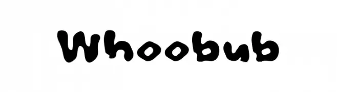
A playful, bold font with a bubbly, hand-drawn style.
![Whoobub Frei Schriftart Herunterladen]() Herunterladen 280 Downloads@WebFont
Herunterladen 280 Downloads@WebFont -
( Noto is a trademark of Google Inc. Noto fonts are open source. All Noto fonts are published under the SIL Open Font License, Version 1.1 )
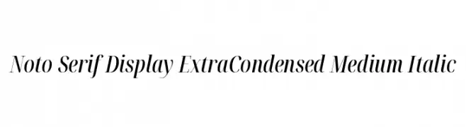
A refined, extra condensed serif font with a medium weight and italic style.
![Noto Serif Display ExtraCondensed Medium Italic Frei Schriftart Herunterladen]() Herunterladen 280 Downloads@WebFont
Herunterladen 280 Downloads@WebFont -
![Beatbox Frei Schriftart Herunterladen]() Herunterladen 280 Downloads@WebFont
Herunterladen 280 Downloads@WebFont -
( Fonts by Galdino Otten - galdinootten.com )
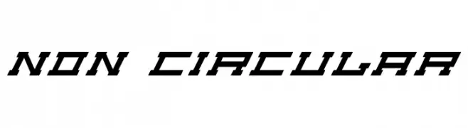
A bold, angular font with a futuristic and mechanical style.
![Non Circular Frei Schriftart Herunterladen]() Herunterladen 280 Downloads@WebFont
Herunterladen 280 Downloads@WebFont -
-
( Fonts by www.kimberlygeswein.com - Kimberly Geswein )
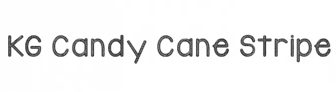
A playful, striped decorative font ideal for festive designs.
![KG Candy Cane Stripe Frei Schriftart Herunterladen]() Herunterladen 280 Downloads@WebFont
Herunterladen 280 Downloads@WebFont -
Schriftart von typotopia. For commercial use please contact the owner.
( Fonts by Typotopia - Typotopia.co - Personal Use Only, for Commercial Use, please contact us )
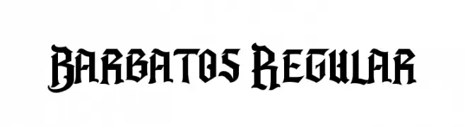
A bold, gothic blackletter font with sharp angles and intricate detailing.
![Barbatos Regular Frei Schriftart Herunterladen]() Herunterladen 280 Downloads@WebFont
Herunterladen 280 Downloads@WebFont -
( Fonts by Daniel Zadorozny - www.iconian.com - Free for personal use )
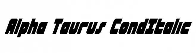
A bold, italic, geometric font with a futuristic and dynamic style.
![Alpha Taurus CondItalic Frei Schriftart Herunterladen]() Herunterladen 280 Downloads@WebFont
Herunterladen 280 Downloads@WebFont -
( Fonts by Edric Studio www.creativefabrica.com/designer/edricstudio/ - Personal-use only. For commercial use please contact owner. )
A bold, modern font with rounded edges and consistent stroke width.
![Qalin Frei Schriftart Herunterladen]() Herunterladen 280 Downloads@WebFont
Herunterladen 280 Downloads@WebFont -
( Fonts by Woodcutter )
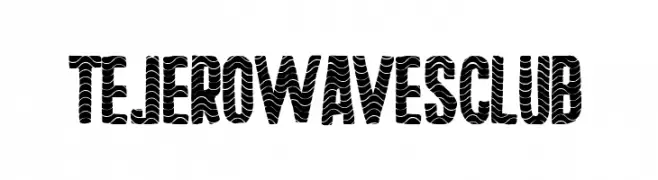
A bold, wave-patterned decorative font with a modern flair.
![Tejero Waves Club Frei Schriftart Herunterladen]() Herunterladen 280 Downloads@WebFont
Herunterladen 280 Downloads@WebFont


Welche Schriften sind gerade am populärsten?
Poppins, Roboto, Montserrat, Open Sans und Lato sind wegen ihrer klaren Formen und breiten Einsetzbarkeit sehr gefragt – von Markenauftritt über Landingpages bis hin zu Postern.
Welche Fonts eignen sich für Logos?
Geometrische Sans‑Serifs (z. B. Poppins, Familien im Gotham‑Stil) sind ein häufiger Griff für sauberes, skalierbares Branding. Für eine persönlichere Note bleiben Scripts und Handschrift‑Stile beliebt. Kombinieren Sie einen prägnanten Headline‑Font mit einer neutralen Brotschrift für Wiedererkennung und Harmonie.
Wie oft wird die Top‑Liste aktualisiert?
Regelmäßig – basierend auf realen Downloads und Interaktionen. Schauen Sie öfter vorbei, um aufstrebende Favoriten früh zu entdecken.
💡 Tipp: Seite bookmarken – Trends wechseln schnell, und heutige Top‑Schriften inspirieren morgen vielleicht das Rebranding.