Willkommen bei den Top‑Schriften – hier treffen Beliebtheit und Qualität aufeinander. Das sind die in diesem Jahr am häufigsten heruntergeladenen und genutzten Fonts. Wenn Sie sichere Optionen für Logo, Web oder Social suchen, starten Sie hier.
Jeder Top‑Font überzeugt durch Balance, Lesbarkeit und Vielseitigkeit. Sie finden moderne Sans‑Serifs, elegante Scripts, Vintage‑Serifs und minimalistische Displays.
-
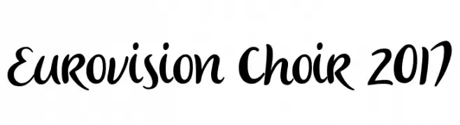
( 538Fonts - storychoice.wix.com/homepage )
A lively and expressive handwritten font with fluid, dynamic strokes.
 Herunterladen 280 Downloads@WebFont
 -
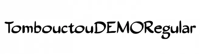
![Tombouctou DEMO Regular Frei Schriftart Herunterladen]() Herunterladen 280 Downloads@WebFont
Herunterladen 280 Downloads@WebFont -
( Fonts by a Max Infeld - XEROGRAPHER FONTS - xerographer.blogspot.com . Personal-use only. For commercial use please contact owner. )
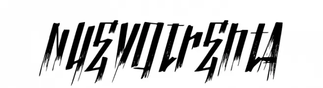
A sharp, jagged font with a distressed, energetic style.
![NuevoTrenta Frei Schriftart Herunterladen]() Herunterladen 280 Downloads@WebFont
Herunterladen 280 Downloads@WebFont -
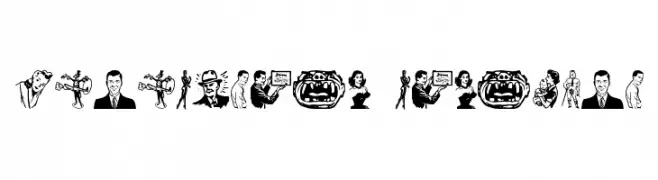
![Rotodesign Dingbats Frei Schriftart Herunterladen]() Herunterladen 280 Downloads@WebFont
Herunterladen 280 Downloads@WebFont -
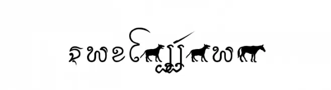
( Fonts by www.omniglot.com )
Decorative script with animal motifs and ornate curves.
![Cr-Fakkharm Frei Schriftart Herunterladen]() Herunterladen 280 Downloads@WebFont
Herunterladen 280 Downloads@WebFont -
-
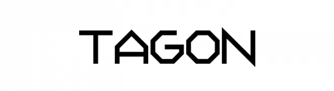
![Tagon Frei Schriftart Herunterladen]() Herunterladen 280 Downloads@WebFont
Herunterladen 280 Downloads@WebFont -
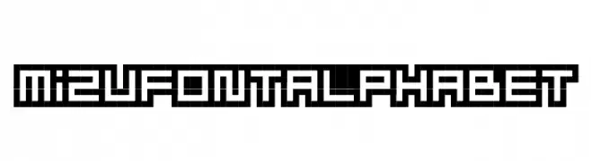
![MizuFontAlphabet Frei Schriftart Herunterladen]() Herunterladen 280 Downloads@WebFont
Herunterladen 280 Downloads@WebFont -
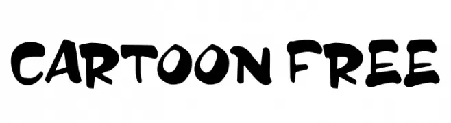
( Fonts by InspiraType )
A playful, bold, hand-drawn font with a cartoonish, energetic style.
![CARTOON FREE Frei Schriftart Herunterladen]() Herunterladen 280 Downloads@WebFont
Herunterladen 280 Downloads@WebFont -
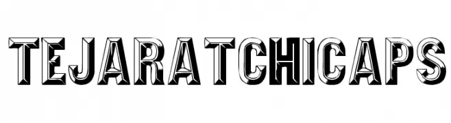
( Fonts by David Rakowski )
A bold, 3D serif font with a vintage yet modern look, perfect for impactful headlines.
![TejaratchiCaps Frei Schriftart Herunterladen]() Herunterladen 280 Downloads
Herunterladen 280 Downloads -
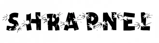
( Fonts by Dieter Steffmann )
A bold, explosive font with a fragmented, dynamic design.
![Shrapnel Frei Schriftart Herunterladen]() Herunterladen 280 Downloads@WebFont
Herunterladen 280 Downloads@WebFont
Welche Schriften sind gerade am populärsten?
Poppins, Roboto, Montserrat, Open Sans und Lato sind wegen ihrer klaren Formen und breiten Einsetzbarkeit sehr gefragt – von Markenauftritt über Landingpages bis hin zu Postern.
Welche Fonts eignen sich für Logos?
Geometrische Sans‑Serifs (z. B. Poppins, Familien im Gotham‑Stil) sind ein häufiger Griff für sauberes, skalierbares Branding. Für eine persönlichere Note bleiben Scripts und Handschrift‑Stile beliebt. Kombinieren Sie einen prägnanten Headline‑Font mit einer neutralen Brotschrift für Wiedererkennung und Harmonie.
Wie oft wird die Top‑Liste aktualisiert?
Regelmäßig – basierend auf realen Downloads und Interaktionen. Schauen Sie öfter vorbei, um aufstrebende Favoriten früh zu entdecken.
💡 Tipp: Seite bookmarken – Trends wechseln schnell, und heutige Top‑Schriften inspirieren morgen vielleicht das Rebranding.