Willkommen bei den Top‑Schriften – hier treffen Beliebtheit und Qualität aufeinander. Das sind die in diesem Jahr am häufigsten heruntergeladenen und genutzten Fonts. Wenn Sie sichere Optionen für Logo, Web oder Social suchen, starten Sie hier.
Jeder Top‑Font überzeugt durch Balance, Lesbarkeit und Vielseitigkeit. Sie finden moderne Sans‑Serifs, elegante Scripts, Vintage‑Serifs und minimalistische Displays.
-
 Herunterladen 278 Downloads@WebFont
 -
( Fonts by Baka - Kyakirun - bakafonts.kyakirun.com )
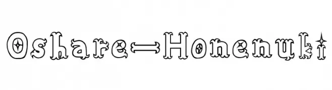
A whimsical and decorative font with star-like embellishments and curved serifs.
![Oshare-Honenuki Frei Schriftart Herunterladen]() Herunterladen 278 Downloads@WebFont
Herunterladen 278 Downloads@WebFont -
( Fonts by Zetafonts - Personal-use only. For commercial use please contact owner. )
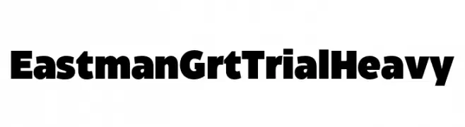
A bold, modern font with thick, uniform strokes ideal for headlines.
![Eastman Grt Trial Heavy Frei Schriftart Herunterladen]() Herunterladen 278 Downloads@WebFont
Herunterladen 278 Downloads@WebFont -
( Fonts by Omega Font Labs )
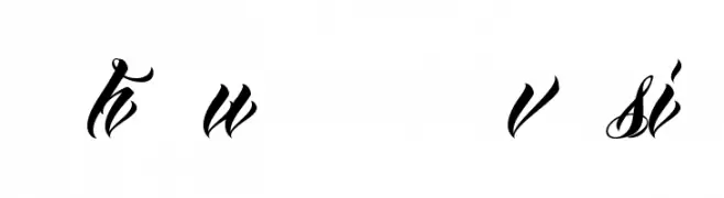
A bold, expressive handwritten font with dynamic and playful letterforms.
![Ra's Hand Frei Schriftart Herunterladen]() Herunterladen 278 Downloads@WebFont
Herunterladen 278 Downloads@WebFont -
![AnhaQueendemoversion Frei Schriftart Herunterladen]() Herunterladen 278 Downloads@WebFont
Herunterladen 278 Downloads@WebFont -
-
![HisHand Frei Schriftart Herunterladen]() Herunterladen 278 Downloads@WebFont
Herunterladen 278 Downloads@WebFont -
( Octotype - www.foundmyfont.com/ )
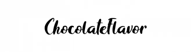
A bold, playful script font with a hand-lettered calligraphy style.
![ChocolateFlavor Frei Schriftart Herunterladen]() Herunterladen 278 Downloads@WebFont
Herunterladen 278 Downloads@WebFont -
( Fonts by Jeremy Dixon - Personal-use only. For commercial use please contact owner. )
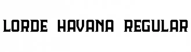
A bold, geometric font with angular lines and a modern aesthetic.
![Lorde Havana Regular Frei Schriftart Herunterladen]() Herunterladen 278 Downloads@WebFont
Herunterladen 278 Downloads@WebFont -
( Fonts by Apostrophic Lab )
A bold slab serif font with strong, block-like serifs and a modern geometric influence.
![Street Slab Upper Frei Schriftart Herunterladen]() Herunterladen 278 Downloads@WebFont
Herunterladen 278 Downloads@WebFont -
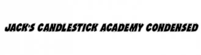
( Fonts by Daniel Zadorozny - www.iconian.com - Free for personal use )
Bold, outlined, condensed font with a playful yet assertive style.
![Jack's Candlestick Academy Condensed Frei Schriftart Herunterladen]() Herunterladen 278 Downloads@WebFont
Herunterladen 278 Downloads@WebFont


Welche Schriften sind gerade am populärsten?
Poppins, Roboto, Montserrat, Open Sans und Lato sind wegen ihrer klaren Formen und breiten Einsetzbarkeit sehr gefragt – von Markenauftritt über Landingpages bis hin zu Postern.
Welche Fonts eignen sich für Logos?
Geometrische Sans‑Serifs (z. B. Poppins, Familien im Gotham‑Stil) sind ein häufiger Griff für sauberes, skalierbares Branding. Für eine persönlichere Note bleiben Scripts und Handschrift‑Stile beliebt. Kombinieren Sie einen prägnanten Headline‑Font mit einer neutralen Brotschrift für Wiedererkennung und Harmonie.
Wie oft wird die Top‑Liste aktualisiert?
Regelmäßig – basierend auf realen Downloads und Interaktionen. Schauen Sie öfter vorbei, um aufstrebende Favoriten früh zu entdecken.
💡 Tipp: Seite bookmarken – Trends wechseln schnell, und heutige Top‑Schriften inspirieren morgen vielleicht das Rebranding.