Willkommen bei den Top‑Schriften – hier treffen Beliebtheit und Qualität aufeinander. Das sind die in diesem Jahr am häufigsten heruntergeladenen und genutzten Fonts. Wenn Sie sichere Optionen für Logo, Web oder Social suchen, starten Sie hier.
Jeder Top‑Font überzeugt durch Balance, Lesbarkeit und Vielseitigkeit. Sie finden moderne Sans‑Serifs, elegante Scripts, Vintage‑Serifs und minimalistische Displays.
-
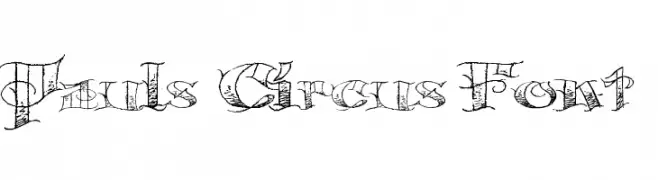
( Fonts by Paul - viciousink.net )
A whimsical, decorative font inspired by vintage circus posters.
 Herunterladen 276 Downloads@WebFont
 -
![FaceplateSansLV-AGauge Frei Schriftart Herunterladen]() Herunterladen 276 Downloads@WebFont
Herunterladen 276 Downloads@WebFont -
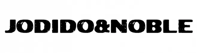
( Woodcutter - woodcutter Manero - www.woodcutter.es )
A bold, distressed font with a vintage, grunge aesthetic.
![Jodido&Noble Frei Schriftart Herunterladen]() Herunterladen 276 Downloads@WebFont
Herunterladen 276 Downloads@WebFont -
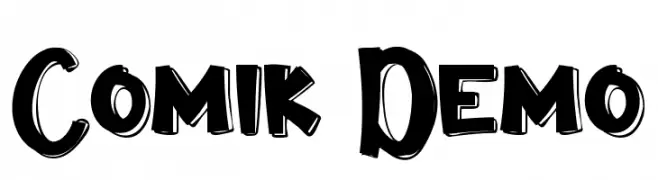
( Fonts by VinType )
A bold, playful font with a comic book style and hand-drawn appearance.
![Comik Demo Frei Schriftart Herunterladen]() Herunterladen 276 Downloads@WebFont
Herunterladen 276 Downloads@WebFont -
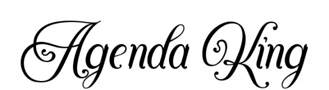
( Fonts by StringLabs - stringlabscreative.com - Personal-use only. For commercial use please contact owner. )
An elegant and sophisticated script font with decorative flourishes.
![Agenda King Frei Schriftart Herunterladen]() Herunterladen 276 Downloads@WebFont
Herunterladen 276 Downloads@WebFont -
-
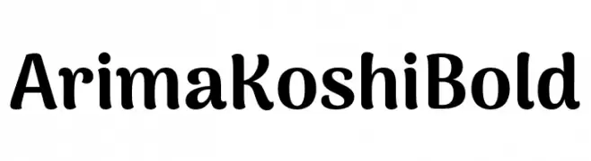
( Fonts by NDISCOVER )
A bold, rounded font with a playful and friendly style.
![Arima Koshi Bold Frei Schriftart Herunterladen]() Herunterladen 276 Downloads@WebFont
Herunterladen 276 Downloads@WebFont -
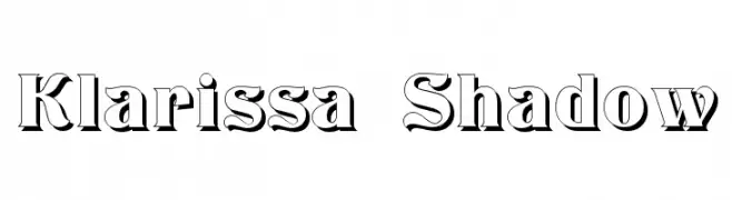
( Fonts by Dieter Steffmann )
A bold, shadowed serif font with a three-dimensional effect.
![Klarissa Shadow Frei Schriftart Herunterladen]() Herunterladen 276 Downloads@WebFont
Herunterladen 276 Downloads@WebFont -
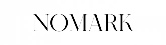
( Fonts by BrandSemut - A Sidiq - Personal-use only. For commercial use please contact owner. )
An elegant serif font with high contrast and elongated serifs, blending classic and modern styles.
![Nomark Frei Schriftart Herunterladen]() Herunterladen 276 Downloads@WebFont
Herunterladen 276 Downloads@WebFont -
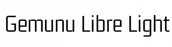
( Copyright 2017 The Gemunu Libre Project Authors (https://github.com/mooniak/gemunu-libre-font) )
A modern, geometric sans-serif font with a clean and minimalistic design.
![Gemunu Libre Light Frei Schriftart Herunterladen]() Herunterladen 276 Downloads@WebFont
Herunterladen 276 Downloads@WebFont -
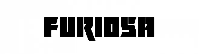
![Furiosa Frei Schriftart Herunterladen]() Herunterladen 276 Downloads@WebFont
Herunterladen 276 Downloads@WebFont
Welche Schriften sind gerade am populärsten?
Poppins, Roboto, Montserrat, Open Sans und Lato sind wegen ihrer klaren Formen und breiten Einsetzbarkeit sehr gefragt – von Markenauftritt über Landingpages bis hin zu Postern.
Welche Fonts eignen sich für Logos?
Geometrische Sans‑Serifs (z. B. Poppins, Familien im Gotham‑Stil) sind ein häufiger Griff für sauberes, skalierbares Branding. Für eine persönlichere Note bleiben Scripts und Handschrift‑Stile beliebt. Kombinieren Sie einen prägnanten Headline‑Font mit einer neutralen Brotschrift für Wiedererkennung und Harmonie.
Wie oft wird die Top‑Liste aktualisiert?
Regelmäßig – basierend auf realen Downloads und Interaktionen. Schauen Sie öfter vorbei, um aufstrebende Favoriten früh zu entdecken.
💡 Tipp: Seite bookmarken – Trends wechseln schnell, und heutige Top‑Schriften inspirieren morgen vielleicht das Rebranding.