Willkommen bei den Top‑Schriften – hier treffen Beliebtheit und Qualität aufeinander. Das sind die in diesem Jahr am häufigsten heruntergeladenen und genutzten Fonts. Wenn Sie sichere Optionen für Logo, Web oder Social suchen, starten Sie hier.
Jeder Top‑Font überzeugt durch Balance, Lesbarkeit und Vielseitigkeit. Sie finden moderne Sans‑Serifs, elegante Scripts, Vintage‑Serifs und minimalistische Displays.
-
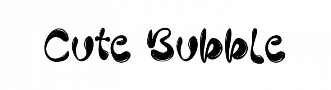
( Fonts by Creaditive Design )
A playful, bubble-like font with rounded, bold characters.
 Herunterladen 1076 Downloads@WebFont
 -
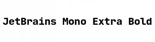
( Fonts by Philipp Nurullin )
A bold, monospaced font ideal for coding with clear, geometric characters.
![JetBrains Mono Extra Bold Frei Schriftart Herunterladen]() Herunterladen 1076 Downloads@WebFont
Herunterladen 1076 Downloads@WebFont -
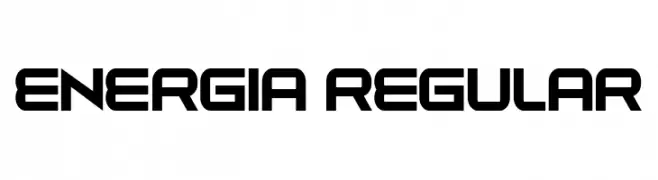
( Fonts by Vladimir Nikolic - www.creativefabrica.com/designer/vladimirnikolic/ - Personal-use only. For commercial use please contact owner. )
A bold, geometric font with a futuristic and industrial style.
![Energia Regular Frei Schriftart Herunterladen]() Herunterladen 1076 Downloads@WebFont
Herunterladen 1076 Downloads@WebFont -
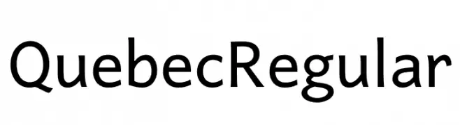
( Fonts by Victor Gaultney, Annie Olsen, Pablo Ugerman - Personal-use only. For commercial use please contact owner. )
A clean, modern sans-serif font with balanced proportions and excellent readability.
![Quebec Regular Frei Schriftart Herunterladen]() Herunterladen 1076 Downloads@WebFont
Herunterladen 1076 Downloads@WebFont -
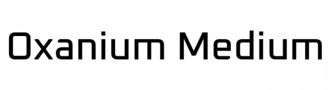
( Copyright 2019 The Oxanium Project Authors (https://github.com/sevmeyer/oxanium) )
A modern, geometric font with a clean, futuristic design.
![Oxanium Medium Frei Schriftart Herunterladen]() Herunterladen 1076 Downloads@WebFont
Herunterladen 1076 Downloads@WebFont -
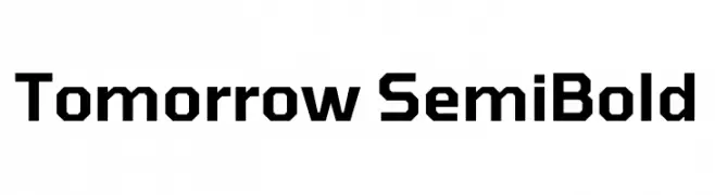
( Copyright 2019 The Tomorrow Project Authors (github.com/MonicaRizzolli/Tomorrow) )
A bold, geometric sans-serif font with a modern and structured design.
![Tomorrow SemiBold Frei Schriftart Herunterladen]() Herunterladen 1076 Downloads@WebFont
Herunterladen 1076 Downloads@WebFont -
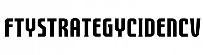
( Fontry - M.G. Adkins - www.thefontry.com/ )
A bold, modern font with tall, condensed characters and consistent stroke width.
![FTYSTRATEGYCIDENCV Frei Schriftart Herunterladen]() Herunterladen 1076 Downloads@WebFont
Herunterladen 1076 Downloads@WebFont -
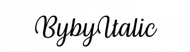
( 7NTypes - Situjuh Nazara - 7ntypes.com )
A graceful, cursive script font with elegant, flowing strokes and an italic slant.
![Byby Italic Frei Schriftart Herunterladen]() Herunterladen 1076 Downloads@WebFont
Herunterladen 1076 Downloads@WebFont -
( Fonts by CannotIntoSpaceFonts - KineticPlasma Fonts - Personal-use only. For commercial use please contact owner. )
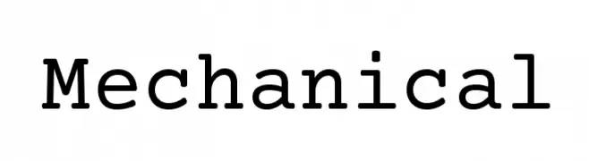
A bold, slab serif font with a mechanical and structured design.
![Mechanical Frei Schriftart Herunterladen]() Herunterladen 1076 Downloads@WebFont
Herunterladen 1076 Downloads@WebFont -
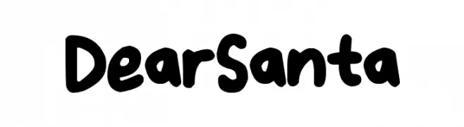
( Fonts by Darrell Flood - Personal-use only. For commercial use please contact owner. )
A playful, bold handwritten font with rounded edges and a friendly appearance.
![Dear Santa Frei Schriftart Herunterladen]() Herunterladen 1076 Downloads@WebFont
Herunterladen 1076 Downloads@WebFont -
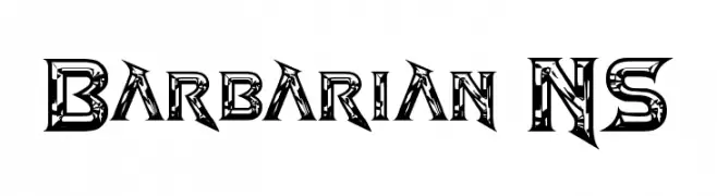
( www.redbubble.com/people/anfa/portfolio )
A bold, angular font with intricate tribal-like patterns.
![Barbarian NS Frei Schriftart Herunterladen]() Herunterladen 1076 Downloads@WebFont
Herunterladen 1076 Downloads@WebFont -
( Copyright © 2013, 2015 Adobe Systems Incorporated (http://www.adobe.com/). )
A font with no visible characters.
![Adobe Blank Frei Schriftart Herunterladen]() Herunterladen 1076 Downloads@WebFont
Herunterladen 1076 Downloads@WebFont -
![Allema Frei Schriftart Herunterladen]() Herunterladen 1076 Downloads@WebFont
Herunterladen 1076 Downloads@WebFont -
![Kraftwagen-Grotesk SmallCaps NBP Frei Schriftart Herunterladen]() Herunterladen 1076 Downloads@WebFont
Herunterladen 1076 Downloads@WebFont -
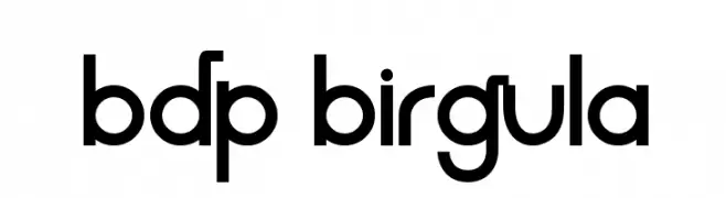
( Fonts by Alvaro Thomaz - alvarothomaz.com )
A modern, geometric sans-serif font with clean lines and a minimalist aesthetic.
![BDP Birgula Frei Schriftart Herunterladen]() Herunterladen 1076 Downloads@WebFont
Herunterladen 1076 Downloads@WebFont -
Schriftart von JuanCasco. For commercial use please contact the owner.
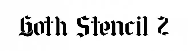
( Fonts by Juan Casco - www.juancasco.net )
A bold, gothic-inspired stencil font with sharp, angular lines and a medieval flair.
![Goth Stencil 2 Frei Schriftart Herunterladen]() Herunterladen 1076 Downloads@WebFont
Herunterladen 1076 Downloads@WebFont -
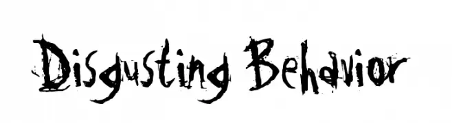
( Fonts by www.misprintedtype.com )
A grungy, distressed font with jagged, irregular strokes and a rebellious vibe.
![Disgusting Behavior Frei Schriftart Herunterladen]() Herunterladen 1076 Downloads@WebFont
Herunterladen 1076 Downloads@WebFont -
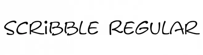
( Fonts by or from www.graffitifonts.net )
A playful, handwritten font with a casual and informal style.
![Scribble Regular Frei Schriftart Herunterladen]() Herunterladen 1076 Downloads@WebFont
Herunterladen 1076 Downloads@WebFont -
![Parafuse Ultra Black Frei Schriftart Herunterladen]() Herunterladen 1076 Downloads@WebFont
Herunterladen 1076 Downloads@WebFont -
![game powerRegular Frei Schriftart Herunterladen]() Herunterladen 1076 Downloads@WebFont
Herunterladen 1076 Downloads@WebFont -
( Font by Ben Nathan - www.hafontia.com )
A modern, geometric font with clean lines and rounded corners.
![BN Deep Blue Frei Schriftart Herunterladen]() Herunterladen 1076 Downloads@WebFont
Herunterladen 1076 Downloads@WebFont -
![Terpsichore!]() Herunterladen 1076 Downloads@WebFont
Herunterladen 1076 Downloads@WebFont -
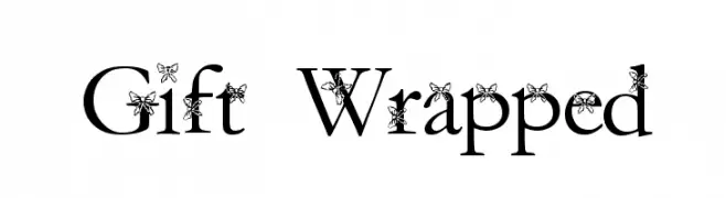
![Gift Wrapped Frei Schriftart Herunterladen]() Herunterladen 1076 Downloads@WebFont
Herunterladen 1076 Downloads@WebFont -
( Fonts by madeDeduk - Personal-use only. For commercial use please contact owner. )
A bold, cursive font with elegant curves and a strong presence.
![Donatello Frei Schriftart Herunterladen]() Herunterladen 1075 Downloads@WebFont
Herunterladen 1075 Downloads@WebFont -
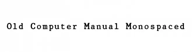
![Old Computer Manual Monospaced Frei Schriftart Herunterladen]() Herunterladen 1075 Downloads@WebFont
Herunterladen 1075 Downloads@WebFont -
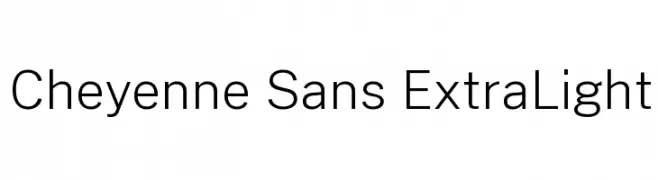
( Fonts by Cristiano Sobral - Personal-use only. For commercial use please contact owner. )
A clean, modern sans-serif font with an extra light weight and high legibility.
![Cheyenne Sans ExtraLight Frei Schriftart Herunterladen]() Herunterladen 1075 Downloads@WebFont
Herunterladen 1075 Downloads@WebFont -
( Matias Romero - matiasromero.deviantart.com )
A bold, geometric font with a modern, tech-inspired style.
![Quanta Frei Schriftart Herunterladen]() Herunterladen 1075 Downloads@WebFont
Herunterladen 1075 Downloads@WebFont -
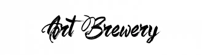
![Art Brewery Frei Schriftart Herunterladen]() Herunterladen 1075 Downloads@WebFont
Herunterladen 1075 Downloads@WebFont -
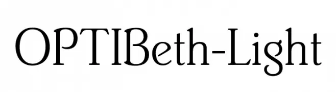
( Fonts by Castcraft Software - opti.netii.net - check the website before use )
A classic serif font with elegant strokes and high contrast, ideal for refined designs.
![OPTIBeth-Light Frei Schriftart Herunterladen]() Herunterladen 1075 Downloads@WebFont
Herunterladen 1075 Downloads@WebFont -
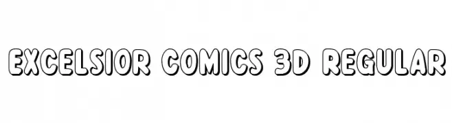
( Fonts by Daniel Zadorozny - www.iconian.com - Free for personal use )
A bold, 3D comic-style font with playful, rounded characters.
![Excelsior Comics 3D Regular Frei Schriftart Herunterladen]() Herunterladen 1075 Downloads@WebFont
Herunterladen 1075 Downloads@WebFont -
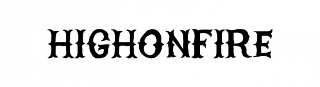
( Fonts by billyargel.blogspot.com - Billy Argel )
A bold, gothic-inspired font with sharp, angular edges and intricate details.
![HIGHONFIRE Frei Schriftart Herunterladen]() Herunterladen 1075 Downloads@WebFont
Herunterladen 1075 Downloads@WebFont -
( Fonts by Have Fun with Fonts )
A decorative font inspired by traditional Chinese dragons, featuring intricate and bold designs.
![HFF Chinese Dragon Frei Schriftart Herunterladen]() Herunterladen 1075 Downloads@WebFont
Herunterladen 1075 Downloads@WebFont -
![Flug Frei Schriftart Herunterladen]() Herunterladen 1075 Downloads
Herunterladen 1075 Downloads -
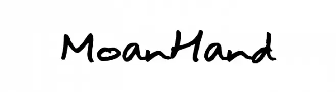
( Fonts by joeBob graff-X )
A casual, handwritten font with fluid and organic strokes.
![MoanHand Frei Schriftart Herunterladen]() Herunterladen 1075 Downloads@WebFont
Herunterladen 1075 Downloads@WebFont -
![BV_Rondes2 ital Frei Schriftart Herunterladen]() Herunterladen 1075 Downloads@WebFont
Herunterladen 1075 Downloads@WebFont


Welche Schriften sind gerade am populärsten?
Poppins, Roboto, Montserrat, Open Sans und Lato sind wegen ihrer klaren Formen und breiten Einsetzbarkeit sehr gefragt – von Markenauftritt über Landingpages bis hin zu Postern.
Welche Fonts eignen sich für Logos?
Geometrische Sans‑Serifs (z. B. Poppins, Familien im Gotham‑Stil) sind ein häufiger Griff für sauberes, skalierbares Branding. Für eine persönlichere Note bleiben Scripts und Handschrift‑Stile beliebt. Kombinieren Sie einen prägnanten Headline‑Font mit einer neutralen Brotschrift für Wiedererkennung und Harmonie.
Wie oft wird die Top‑Liste aktualisiert?
Regelmäßig – basierend auf realen Downloads und Interaktionen. Schauen Sie öfter vorbei, um aufstrebende Favoriten früh zu entdecken.
💡 Tipp: Seite bookmarken – Trends wechseln schnell, und heutige Top‑Schriften inspirieren morgen vielleicht das Rebranding.