Willkommen bei den Top‑Schriften – hier treffen Beliebtheit und Qualität aufeinander. Das sind die in diesem Jahr am häufigsten heruntergeladenen und genutzten Fonts. Wenn Sie sichere Optionen für Logo, Web oder Social suchen, starten Sie hier.
Jeder Top‑Font überzeugt durch Balance, Lesbarkeit und Vielseitigkeit. Sie finden moderne Sans‑Serifs, elegante Scripts, Vintage‑Serifs und minimalistische Displays.
-
 Herunterladen 1058 Downloads@WebFont
 -
( JoannaVu - ioannaladopoulou.com )
A bold, gothic-style font with sharp edges and a distressed texture.
![Frozito Frei Schriftart Herunterladen]() Herunterladen 1057 Downloads@WebFont
Herunterladen 1057 Downloads@WebFont -
( Zetafonts - www.zetafonts.com )
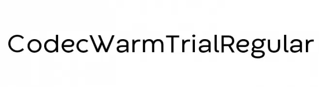
A modern sans-serif font with clean lines and balanced proportions.
![Codec Warm Trial Regular Frei Schriftart Herunterladen]() Herunterladen 1057 Downloads@WebFont
Herunterladen 1057 Downloads@WebFont -
( 7NTypes - Situjuh Nazara - 7ntypes.com )
A bold, flowing script font with elegant, connected letters.
![Veni Frei Schriftart Herunterladen]() Herunterladen 1057 Downloads@WebFont
Herunterladen 1057 Downloads@WebFont -
( Fonts by artimasa studio )
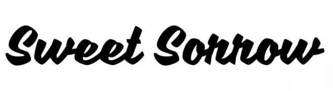
A bold, dynamic script font with fluid, cursive letterforms.
![Sweet Sorrow Frei Schriftart Herunterladen]() Herunterladen 1057 Downloads@WebFont
Herunterladen 1057 Downloads@WebFont -
( Copyright 2017 The Sedgwick Ave Project Authors (https://github.com/googlefonts/sedgwickave) )
A bold, brush-style font with a playful and energetic character.
![Sedgwick Ave Display Regular Frei Schriftart Herunterladen]() Herunterladen 1057 Downloads@WebFont
Herunterladen 1057 Downloads@WebFont -
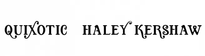
![Quixotic, Haley Kershaw Frei Schriftart Herunterladen]() Herunterladen 1057 Downloads@WebFont
Herunterladen 1057 Downloads@WebFont -
( Fonts by Daniel Zadorozny - www.iconian.com - Free for personal use )
A bold, italic font with a dynamic, futuristic style.
![Federal Escort Italic Frei Schriftart Herunterladen]() Herunterladen 1057 Downloads@WebFont
Herunterladen 1057 Downloads@WebFont -
( Fonts by Castcraft Software - opti.netii.net - check the website before use )
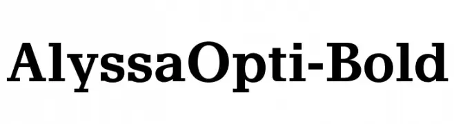
A bold serif font with strong, authoritative strokes and classic elegance.
![AlyssaOpti-Bold Frei Schriftart Herunterladen]() Herunterladen 1057 Downloads@WebFont
Herunterladen 1057 Downloads@WebFont -
Schriftart von spideraysfonts. For commercial use please contact the owner.
![OLYMPIAD XXX Frei Schriftart Herunterladen]() Herunterladen 1057 Downloads@WebFont
Herunterladen 1057 Downloads@WebFont -
![peach sundress ~ Frei Schriftart Herunterladen]() Herunterladen 1057 Downloads@WebFont
Herunterladen 1057 Downloads@WebFont -
( Fonts by Dennis Ludlow - Sharkshock Productions )
A bold, decorative font with intricate details and strong serifs.
![TGIFriday Frei Schriftart Herunterladen]() Herunterladen 1057 Downloads@WebFont
Herunterladen 1057 Downloads@WebFont -
( Fonts by www.fontpanda.com. Personal-use only. For commercial use please contact owner. )
A casual, handwritten font with a playful and spontaneous style.
![ChickenScratch Frei Schriftart Herunterladen]() Herunterladen 1057 Downloads@WebFont
Herunterladen 1057 Downloads@WebFont -
( Fonts by Slub Design - Raymond Buetens - www.slubdesign.com )
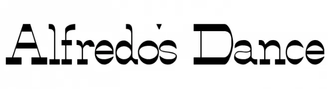
A bold, geometric font with a modern and versatile style.
![Alfredo's Dance Frei Schriftart Herunterladen]() Herunterladen 1057 Downloads
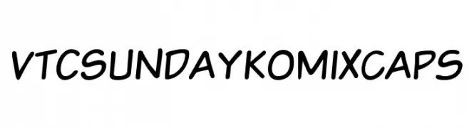
Herunterladen 1057 Downloads -
![VTCSundaykomixcaps Frei Schriftart Herunterladen]() Herunterladen 1057 Downloads@WebFont
Herunterladen 1057 Downloads@WebFont -
( Fonts by Gassstype )
A bold, rounded font with a playful and friendly style.
![Soap Opera Frei Schriftart Herunterladen]() Herunterladen 1056 Downloads@WebFont
Herunterladen 1056 Downloads@WebFont -
( Fonts by Luluk Surotul )
A playful, hand-drawn font with whimsical, wavy lines and exaggerated curves.
![Sugar Baby Frei Schriftart Herunterladen]() Herunterladen 1056 Downloads@WebFont
Herunterladen 1056 Downloads@WebFont -
( Fonts by Daniel Zadorozny - www.iconian.com - Personal-use only. For commercial use please contact owner. )
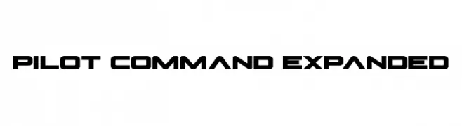
A bold, geometric font with a futuristic and technical style.
![Pilot Command Expanded Frei Schriftart Herunterladen]() Herunterladen 1056 Downloads@WebFont
Herunterladen 1056 Downloads@WebFont -
Schriftart von twinletter. For commercial use please contact the owner.
( THIS FONT IS DEMO ONLY commercial on www.twinletter.com )
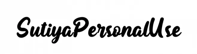
A bold, flowing script font with elegant, cursive letterforms.
![Sutiya Personal Use Frei Schriftart Herunterladen]() Herunterladen 1056 Downloads@WebFont
Herunterladen 1056 Downloads@WebFont -
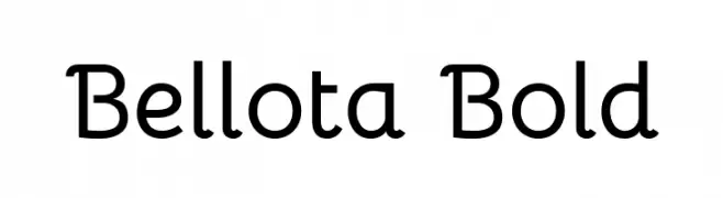
( Copyright 2019 The Bellota Project Authors (https://github.com/kemie/Bellota-Font) )
A playful and modern font with rounded edges and smooth curves.
![Bellota Bold Frei Schriftart Herunterladen]() Herunterladen 1056 Downloads@WebFont
Herunterladen 1056 Downloads@WebFont -
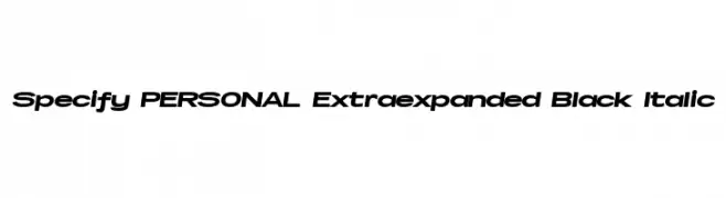
( Måns Grebäck - www.mansgreback.com )
A bold, extra-expanded italic font with a modern and dynamic style.
![Specify PERSONAL Extraexpanded Black Italic Frei Schriftart Herunterladen]() Herunterladen 1056 Downloads@WebFont
Herunterladen 1056 Downloads@WebFont -
( Fonts by Maelle.K | Thomas Boucherie )
An elegant, flowing script font with intricate loops and swashes.
![Adventures on the Mountains Frei Schriftart Herunterladen]() Herunterladen 1056 Downloads@WebFont
Herunterladen 1056 Downloads@WebFont -
![TheRamble-Bold Frei Schriftart Herunterladen]() Herunterladen 1056 Downloads@WebFont
Herunterladen 1056 Downloads@WebFont -
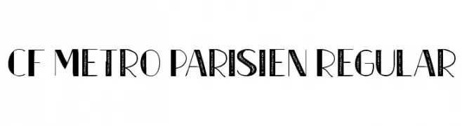
( Fonts by CloutierFontes )
A geometric, Art Deco-inspired font with bold lines and a modern aesthetic.
![CF Metro Parisien Regular Frei Schriftart Herunterladen]() Herunterladen 1056 Downloads@WebFont
Herunterladen 1056 Downloads@WebFont -
( Copyright (c) <17/12/07>,
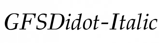
( An elegant serif font with a classic italic style and high contrast strokes.
![GFSDidot-Italic Frei Schriftart Herunterladen]() Herunterladen 1056 Downloads@WebFont
Herunterladen 1056 Downloads@WebFont -
( Fonts by Steve Cloutier - www.cloutierfontes.ca )
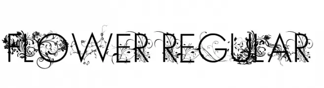
An ornate decorative font with intricate floral embellishments.
![FLOWER Regular Frei Schriftart Herunterladen]() Herunterladen 1056 Downloads@WebFont
Herunterladen 1056 Downloads@WebFont -
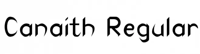
![Canaith Regular Frei Schriftart Herunterladen]() Herunterladen 1056 Downloads@WebFont
Herunterladen 1056 Downloads@WebFont -
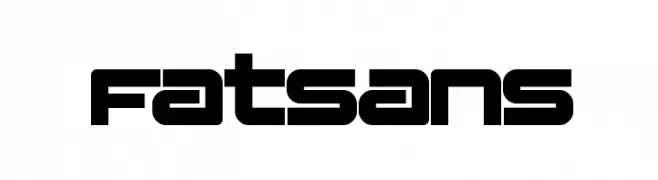
( Fonts by Manfred Klein - manfred-klein.ina-mar.com )
A bold, geometric font with a modern and futuristic style.
![Fatsans Frei Schriftart Herunterladen]() Herunterladen 1056 Downloads@WebFont
Herunterladen 1056 Downloads@WebFont -
![Sardonic-owl Frei Schriftart Herunterladen]() Herunterladen 1056 Downloads@WebFont
Herunterladen 1056 Downloads@WebFont -
( Paul Lloyd Fonts )
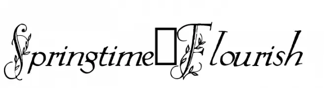
An elegant, decorative font with floral embellishments and script-like lowercase letters.
![Springtime_Flourish Frei Schriftart Herunterladen]() Herunterladen 1056 Downloads@WebFont
Herunterladen 1056 Downloads@WebFont -
![Criminal Italic Frei Schriftart Herunterladen]() Herunterladen 1056 Downloads@WebFont
Herunterladen 1056 Downloads@WebFont -
( Fonts by www.typodermicfonts.com - Ray Larabie )
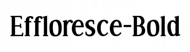
A bold serif font with high contrast and classic elegance.
![Effloresce-Bold Frei Schriftart Herunterladen]() Herunterladen 1056 Downloads@WebFont
Herunterladen 1056 Downloads@WebFont -
( Fonts by Nirmala Creative )
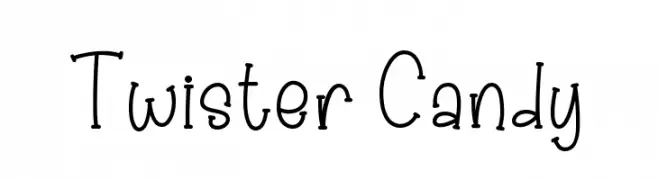
A playful, hand-drawn font with a whimsical and friendly style.
![Twister Candy Frei Schriftart Herunterladen]() Herunterladen 1055 Downloads@WebFont
Herunterladen 1055 Downloads@WebFont -
( Fonts by Khurasan )
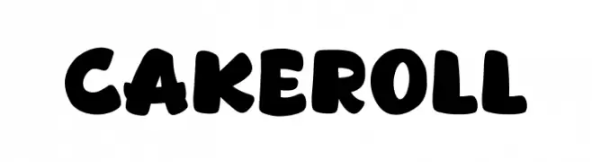
A playful, bold font with rounded characters and a friendly appearance.
![Cakeroll Frei Schriftart Herunterladen]() Herunterladen 1055 Downloads@WebFont
Herunterladen 1055 Downloads@WebFont -
( Fonts by Khurasan )
A playful, hand-drawn font with bold, whimsical characters.
![Coffee Show Frei Schriftart Herunterladen]() Herunterladen 1055 Downloads@WebFont
Herunterladen 1055 Downloads@WebFont


Welche Schriften sind gerade am populärsten?
Poppins, Roboto, Montserrat, Open Sans und Lato sind wegen ihrer klaren Formen und breiten Einsetzbarkeit sehr gefragt – von Markenauftritt über Landingpages bis hin zu Postern.
Welche Fonts eignen sich für Logos?
Geometrische Sans‑Serifs (z. B. Poppins, Familien im Gotham‑Stil) sind ein häufiger Griff für sauberes, skalierbares Branding. Für eine persönlichere Note bleiben Scripts und Handschrift‑Stile beliebt. Kombinieren Sie einen prägnanten Headline‑Font mit einer neutralen Brotschrift für Wiedererkennung und Harmonie.
Wie oft wird die Top‑Liste aktualisiert?
Regelmäßig – basierend auf realen Downloads und Interaktionen. Schauen Sie öfter vorbei, um aufstrebende Favoriten früh zu entdecken.
💡 Tipp: Seite bookmarken – Trends wechseln schnell, und heutige Top‑Schriften inspirieren morgen vielleicht das Rebranding.