Willkommen bei den Top‑Schriften – hier treffen Beliebtheit und Qualität aufeinander. Das sind die in diesem Jahr am häufigsten heruntergeladenen und genutzten Fonts. Wenn Sie sichere Optionen für Logo, Web oder Social suchen, starten Sie hier.
Jeder Top‑Font überzeugt durch Balance, Lesbarkeit und Vielseitigkeit. Sie finden moderne Sans‑Serifs, elegante Scripts, Vintage‑Serifs und minimalistische Displays.
-
( Fonts by Gassstype )
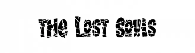
A bold, fragmented font with a shattered, decorative style.
 Herunterladen 263 Downloads@WebFont
 -
![Summerisle Demo Frei Schriftart Herunterladen]() Herunterladen 263 Downloads@WebFont
Herunterladen 263 Downloads@WebFont -
![[style] scripty Frei Schriftart Herunterladen]() Herunterladen 263 Downloads@WebFont
Herunterladen 263 Downloads@WebFont -
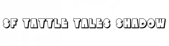
![SF Tattle Tales Shadow Frei Schriftart Herunterladen]() Herunterladen 263 Downloads@WebFont
Herunterladen 263 Downloads@WebFont -
( Fonts by Aly K. Salazar )
A playful, hand-drawn font with a sketch-like texture and bold outlines.
![Delusional Frei Schriftart Herunterladen]() Herunterladen 263 Downloads@WebFont
Herunterladen 263 Downloads@WebFont -
-
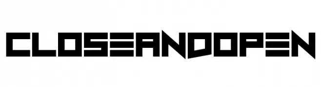
![Close and Open Frei Schriftart Herunterladen]() Herunterladen 263 Downloads@WebFont
Herunterladen 263 Downloads@WebFont -
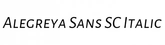
( Copyright 2013 The Alegreya Sans Project Authors (https://github.com/huertatipografica/Alegreya-Sans) )
A modern, italic sans-serif font with clean lines and balanced spacing.
![Alegreya Sans SC Italic Frei Schriftart Herunterladen]() Herunterladen 263 Downloads@WebFont
Herunterladen 263 Downloads@WebFont -
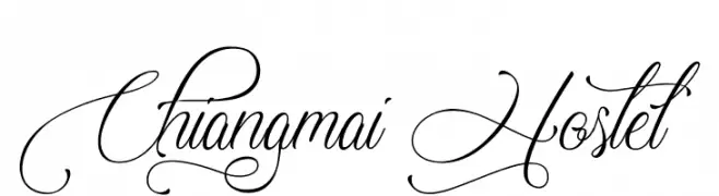
( http://www.typhoontype.net/category/fonts/ OFF SITE )
An elegant script font with intricate swirls and flourishes.
![Chiangmai Hostel Frei Schriftart Herunterladen]() Herunterladen 263 Downloads
Herunterladen 263 Downloads -
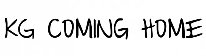
( Fonts by www.kimberlygeswein.com - Kimberly Geswein )
A playful, handwritten font with bold, smooth lines and a casual style.
![KG Coming Home Frei Schriftart Herunterladen]() Herunterladen 263 Downloads@WebFont
Herunterladen 263 Downloads@WebFont -
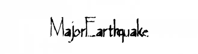
( Fonts by a Max Infeld - XEROGRAPHER FONTS - xerographer.blogspot.com . Personal-use only. For commercial use please contact owner. )
A distressed, hand-drawn style font with irregular, jagged characters.
![MajorEarthquake Frei Schriftart Herunterladen]() Herunterladen 263 Downloads@WebFont
Herunterladen 263 Downloads@WebFont
![[style] scripty Frei Schriftart Herunterladen](https://d144mzi0q5mijx.cloudfront.net/img/0/S/style-scripty.webp)

Welche Schriften sind gerade am populärsten?
Poppins, Roboto, Montserrat, Open Sans und Lato sind wegen ihrer klaren Formen und breiten Einsetzbarkeit sehr gefragt – von Markenauftritt über Landingpages bis hin zu Postern.
Welche Fonts eignen sich für Logos?
Geometrische Sans‑Serifs (z. B. Poppins, Familien im Gotham‑Stil) sind ein häufiger Griff für sauberes, skalierbares Branding. Für eine persönlichere Note bleiben Scripts und Handschrift‑Stile beliebt. Kombinieren Sie einen prägnanten Headline‑Font mit einer neutralen Brotschrift für Wiedererkennung und Harmonie.
Wie oft wird die Top‑Liste aktualisiert?
Regelmäßig – basierend auf realen Downloads und Interaktionen. Schauen Sie öfter vorbei, um aufstrebende Favoriten früh zu entdecken.
💡 Tipp: Seite bookmarken – Trends wechseln schnell, und heutige Top‑Schriften inspirieren morgen vielleicht das Rebranding.