Willkommen bei den Top‑Schriften – hier treffen Beliebtheit und Qualität aufeinander. Das sind die in diesem Jahr am häufigsten heruntergeladenen und genutzten Fonts. Wenn Sie sichere Optionen für Logo, Web oder Social suchen, starten Sie hier.
Jeder Top‑Font überzeugt durch Balance, Lesbarkeit und Vielseitigkeit. Sie finden moderne Sans‑Serifs, elegante Scripts, Vintage‑Serifs und minimalistische Displays.
-
 Herunterladen 263 Downloads@WebFont
 -
( Fonts by www.peter-wiegel.de. Personal-use only. For commercial use please contact owner. )
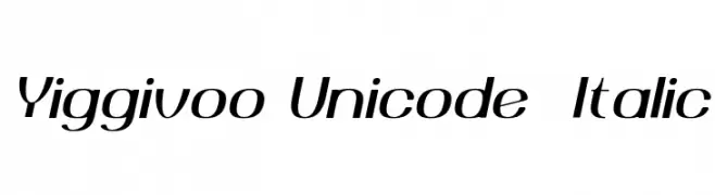
A modern italic font with a sleek and dynamic style.
![Yiggivoo Unicode Italic Frei Schriftart Herunterladen]() Herunterladen 263 Downloads@WebFont
Herunterladen 263 Downloads@WebFont -
( Fonts by Wahyu Eka Prasetya - wepfont.com - Personal-use only. For commercial use please contact owner. )
A dynamic handwritten font with fluid strokes and artistic flair.
![Fastea Frei Schriftart Herunterladen]() Herunterladen 263 Downloads@WebFont
Herunterladen 263 Downloads@WebFont -
( Fonts by Daniel Zadorozny - www.iconian.com - Free for personal use )
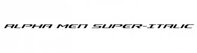
A dynamic, italicized font with a futuristic and bold design.
![Alpha Men Super-Italic Frei Schriftart Herunterladen]() Herunterladen 263 Downloads@WebFont
Herunterladen 263 Downloads@WebFont -
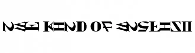
![NEW KIND OF ENGLISH Frei Schriftart Herunterladen]() Herunterladen 263 Downloads@WebFont
Herunterladen 263 Downloads@WebFont -
-
( Fonts by billyargel.blogspot.com - Billy Argel )
A bold, distressed font with a grunge texture and strong visual impact.
![PDRPT Frei Schriftart Herunterladen]() Herunterladen 263 Downloads@WebFont
Herunterladen 263 Downloads@WebFont -
( Fonts by a cenz qobbal - www.facebook.com/cenzqobbalfonts. Personal-use only. For commercial use please contact owner. )
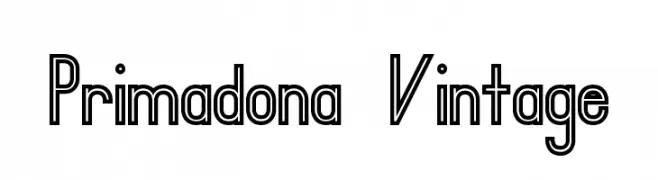
A bold, geometric font with a vintage and decorative style.
![Primadona Vintage Frei Schriftart Herunterladen]() Herunterladen 263 Downloads@WebFont
Herunterladen 263 Downloads@WebFont -
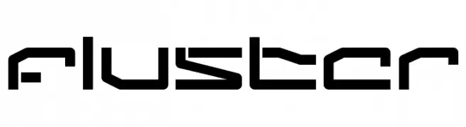
![Fluster Frei Schriftart Herunterladen]() Herunterladen 263 Downloads@WebFont
Herunterladen 263 Downloads@WebFont -
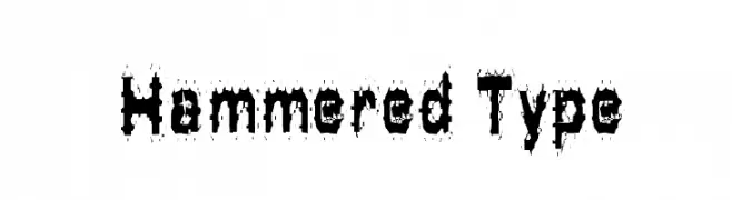
![Hammered Type Frei Schriftart Herunterladen]() Herunterladen 263 Downloads@WebFont
Herunterladen 263 Downloads@WebFont -
( madeDeduk )
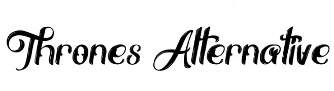
An ornate and decorative font with elegant swirls and loops.
![Thrones Alternative Frei Schriftart Herunterladen]() Herunterladen 263 Downloads@WebFont
Herunterladen 263 Downloads@WebFont


Welche Schriften sind gerade am populärsten?
Poppins, Roboto, Montserrat, Open Sans und Lato sind wegen ihrer klaren Formen und breiten Einsetzbarkeit sehr gefragt – von Markenauftritt über Landingpages bis hin zu Postern.
Welche Fonts eignen sich für Logos?
Geometrische Sans‑Serifs (z. B. Poppins, Familien im Gotham‑Stil) sind ein häufiger Griff für sauberes, skalierbares Branding. Für eine persönlichere Note bleiben Scripts und Handschrift‑Stile beliebt. Kombinieren Sie einen prägnanten Headline‑Font mit einer neutralen Brotschrift für Wiedererkennung und Harmonie.
Wie oft wird die Top‑Liste aktualisiert?
Regelmäßig – basierend auf realen Downloads und Interaktionen. Schauen Sie öfter vorbei, um aufstrebende Favoriten früh zu entdecken.
💡 Tipp: Seite bookmarken – Trends wechseln schnell, und heutige Top‑Schriften inspirieren morgen vielleicht das Rebranding.