Willkommen bei den Top‑Schriften – hier treffen Beliebtheit und Qualität aufeinander. Das sind die in diesem Jahr am häufigsten heruntergeladenen und genutzten Fonts. Wenn Sie sichere Optionen für Logo, Web oder Social suchen, starten Sie hier.
Jeder Top‑Font überzeugt durch Balance, Lesbarkeit und Vielseitigkeit. Sie finden moderne Sans‑Serifs, elegante Scripts, Vintage‑Serifs und minimalistische Displays.
-
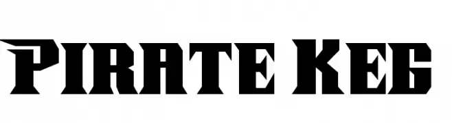
( Fonts by Dennis Ludlow - Sharkshock Productions )
A bold, adventurous font with sharp, angular edges, perfect for dramatic themes.
 Herunterladen 1030 Downloads
 -
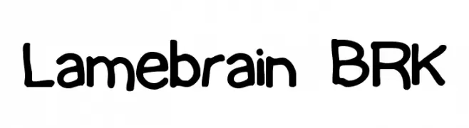
( Fonts by www.aenigmafonts.com )
A playful, handwritten font with bold, rounded characters.
![Lamebrain BRK Frei Schriftart Herunterladen]() Herunterladen 1030 Downloads@WebFont
Herunterladen 1030 Downloads@WebFont -
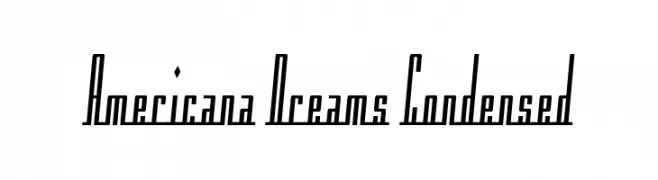
![Americana Dreams Condensed Frei Schriftart Herunterladen]() Herunterladen 1030 Downloads@WebFont
Herunterladen 1030 Downloads@WebFont -
![Opticon One1 Frei Schriftart Herunterladen]() Herunterladen 1030 Downloads@WebFont
Herunterladen 1030 Downloads@WebFont -
( Fonts by Stefani Letter )
A playful, bold, and rounded font with a hand-drawn feel.
![Christmas Sheep - Personal Use Frei Schriftart Herunterladen]() Herunterladen 1029 Downloads@WebFont
Herunterladen 1029 Downloads@WebFont -
-
( Noto is a trademark of Google Inc. Noto fonts are open source. All Noto fonts are published under the SIL Open Font License, Version 1.1 )
A bold, monospaced sans-serif font with uniform character width for clarity and precision.
![Noto Sans Mono Black Frei Schriftart Herunterladen]() Herunterladen 1029 Downloads@WebFont
Herunterladen 1029 Downloads@WebFont -
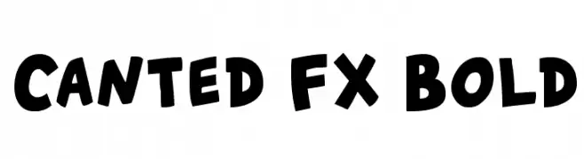
( Fonts by Nils Cordes )
A bold, playful font with a hand-drawn, rounded style.
![Canted FX Bold Frei Schriftart Herunterladen]() Herunterladen 1029 Downloads@WebFont
Herunterladen 1029 Downloads@WebFont -
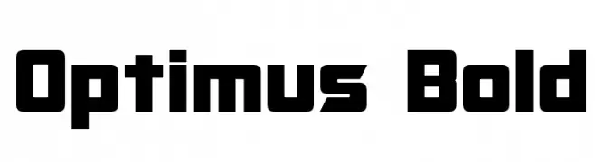
( Fonts by a Neale Davidson - www.pixelsagas.com. Personal-use only. For commercial use please contact owner. )
A bold, geometric font with a futuristic and industrial aesthetic.
![Optimus Bold Frei Schriftart Herunterladen]() Herunterladen 1029 Downloads@WebFont
Herunterladen 1029 Downloads@WebFont -
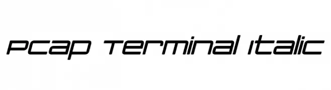
( Fonts by a Neale Davidson - www.pixelsagas.com. Personal-use only. For commercial use please contact owner. )
A sleek, modern italic font with a geometric and futuristic design.
![PCap Terminal Italic Frei Schriftart Herunterladen]() Herunterladen 1029 Downloads@WebFont
Herunterladen 1029 Downloads@WebFont -
( Fonts by Maelle.K - Thomas Boucherie )
A bold, graffiti-inspired font with sharp angles and dynamic strokes.
![Zenzai Itachi Frei Schriftart Herunterladen]() Herunterladen 1029 Downloads@WebFont
Herunterladen 1029 Downloads@WebFont -
Schriftart von Qbotype. For commercial use please contact the owner.
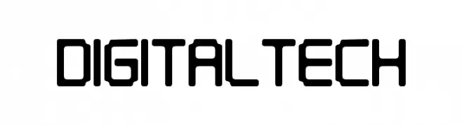
( Fonts by www.phuxerdesigns.com.ar - Non-commercial use of any typeface free version, only buying the full version )
A futuristic, digital-inspired font with bold, geometric shapes and rounded corners.
![Digitaltech Frei Schriftart Herunterladen]() Herunterladen 1029 Downloads@WebFont
Herunterladen 1029 Downloads@WebFont -
![Jizz Mass creamy Frei Schriftart Herunterladen]() Herunterladen 1029 Downloads@WebFont
Herunterladen 1029 Downloads@WebFont -
( Fonts by Apostrophic Lab )
A bold, geometric font with a modern, futuristic style.
![Republikaps Exp - Ultra Frei Schriftart Herunterladen]() Herunterladen 1029 Downloads@WebFont
Herunterladen 1029 Downloads@WebFont -
![SaturdaysGirl Frei Schriftart Herunterladen]() Herunterladen 1029 Downloads@WebFont
Herunterladen 1029 Downloads@WebFont -
![Hoffman Frei Schriftart Herunterladen]() Herunterladen 1029 Downloads@WebFont
Herunterladen 1029 Downloads@WebFont -
( Fonts by www.TomzWeb.com - Thomas E. Harvey - NOT free - Commercial use requires license )
A bold, playful font with a modern yet vintage appeal.
![Mirisch Normal Frei Schriftart Herunterladen]() Herunterladen 1029 Downloads@WebFont
Herunterladen 1029 Downloads@WebFont -
![SUMO Frei Schriftart Herunterladen]() Herunterladen 1029 Downloads@WebFont
Herunterladen 1029 Downloads@WebFont -
![Sandoval Frei Schriftart Herunterladen]() Herunterladen 1029 Downloads@WebFont
Herunterladen 1029 Downloads@WebFont -
![Wild West Wind Frei Schriftart Herunterladen]() Herunterladen 1029 Downloads@WebFont
Herunterladen 1029 Downloads@WebFont -
( Fonts by www.blambot.com )
A bold, playful handwritten font with rounded, slanted characters.
![LetterOMatic! Bold Frei Schriftart Herunterladen]() Herunterladen 1029 Downloads@WebFont
Herunterladen 1029 Downloads@WebFont -
( Fonts by junkohanhero )
A bold, playful font with a hand-drawn, chunky style.
![Divisible Invisible High Frei Schriftart Herunterladen]() Herunterladen 1028 Downloads@WebFont
Herunterladen 1028 Downloads@WebFont -
( Copyright (c) 2012, Impallari Type (www.impallari.com), with Reserved Font Name Encode Sans. )
A bold, wide sans-serif font with a strong geometric structure.
![Encode Sans Wide Black Frei Schriftart Herunterladen]() Herunterladen 1028 Downloads@WebFont
Herunterladen 1028 Downloads@WebFont -
( Free - www.mauroespindola.com )
A geometric, modern font with clean, angular lines and a technical appearance.
![blank-Regular Frei Schriftart Herunterladen]() Herunterladen 1028 Downloads@WebFont
Herunterladen 1028 Downloads@WebFont -
( Fonts by Castcraft Software - opti.netii.net - check the website before use )
A classic serif font with high contrast and elegant curves.
![OPTIHowland Frei Schriftart Herunterladen]() Herunterladen 1028 Downloads@WebFont
Herunterladen 1028 Downloads@WebFont -
Schriftart von defharo. For commercial use please contact the owner.
![K.O. Activista* Bold Frei Schriftart Herunterladen]() Herunterladen 1028 Downloads@WebFont
Herunterladen 1028 Downloads@WebFont -
![Glametrix Bold Frei Schriftart Herunterladen]() Herunterladen 1028 Downloads@WebFont
Herunterladen 1028 Downloads@WebFont -
( Font by Jonathan Harris - www.tattoowoo.com )
A playful, fluid font with organic, water-like shapes and bold, rounded forms.
![Water Park Frei Schriftart Herunterladen]() Herunterladen 1028 Downloads@WebFont
Herunterladen 1028 Downloads@WebFont -
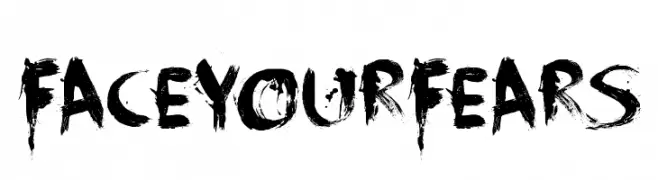
( Fonts by David Kerkhoff - www.hanodedphotography.com )
A bold, distressed font with a brush-like texture and chaotic aesthetic.
![FaceYourFears Frei Schriftart Herunterladen]() Herunterladen 1028 Downloads@WebFont
Herunterladen 1028 Downloads@WebFont -
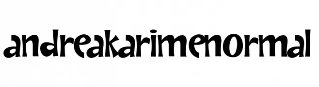
( Fonts by Grafito Design - dibujosenlinea.ideasintegrales.net )
A playful, whimsical font with bold, hand-drawn characters.
![AndreaKarimeNormal Frei Schriftart Herunterladen]() Herunterladen 1028 Downloads@WebFont
Herunterladen 1028 Downloads@WebFont -
( Fonts by Daniel Zadorozny - www.iconian.com - Free for personal use )
A bold, ornate Blackletter font with dramatic, angular letterforms.
![Biergärten Frei Schriftart Herunterladen]() Herunterladen 1028 Downloads@WebFont
Herunterladen 1028 Downloads@WebFont -
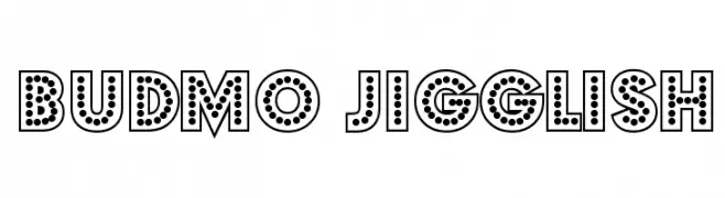
![Budmo Jigglish Frei Schriftart Herunterladen]() Herunterladen 1028 Downloads@WebFont
Herunterladen 1028 Downloads@WebFont -
( Fonts by billyargel.blogspot.com - Billy Argel )
A bold, distressed font with a grunge texture and tight spacing.
![SNIPER Frei Schriftart Herunterladen]() Herunterladen 1028 Downloads@WebFont
Herunterladen 1028 Downloads@WebFont -
( Fonts by Jacob Fisher - www.pizzadude.dk )
A bold, geometric stencil font with a modern industrial aesthetic.
![Mute Fruit Frei Schriftart Herunterladen]() Herunterladen 1028 Downloads@WebFont
Herunterladen 1028 Downloads@WebFont -
![BrickShapers Frei Schriftart Herunterladen]() Herunterladen 1027 Downloads@WebFont
Herunterladen 1027 Downloads@WebFont -
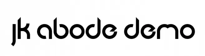
( Jacob King - Jacob King - www.typespace.co.uk )
A modern, geometric font with consistent strokes and a futuristic style.
![JK Abode Demo Frei Schriftart Herunterladen]() Herunterladen 1027 Downloads@WebFont
Herunterladen 1027 Downloads@WebFont


Welche Schriften sind gerade am populärsten?
Poppins, Roboto, Montserrat, Open Sans und Lato sind wegen ihrer klaren Formen und breiten Einsetzbarkeit sehr gefragt – von Markenauftritt über Landingpages bis hin zu Postern.
Welche Fonts eignen sich für Logos?
Geometrische Sans‑Serifs (z. B. Poppins, Familien im Gotham‑Stil) sind ein häufiger Griff für sauberes, skalierbares Branding. Für eine persönlichere Note bleiben Scripts und Handschrift‑Stile beliebt. Kombinieren Sie einen prägnanten Headline‑Font mit einer neutralen Brotschrift für Wiedererkennung und Harmonie.
Wie oft wird die Top‑Liste aktualisiert?
Regelmäßig – basierend auf realen Downloads und Interaktionen. Schauen Sie öfter vorbei, um aufstrebende Favoriten früh zu entdecken.
💡 Tipp: Seite bookmarken – Trends wechseln schnell, und heutige Top‑Schriften inspirieren morgen vielleicht das Rebranding.