Willkommen bei den Top‑Schriften – hier treffen Beliebtheit und Qualität aufeinander. Das sind die in diesem Jahr am häufigsten heruntergeladenen und genutzten Fonts. Wenn Sie sichere Optionen für Logo, Web oder Social suchen, starten Sie hier.
Jeder Top‑Font überzeugt durch Balance, Lesbarkeit und Vielseitigkeit. Sie finden moderne Sans‑Serifs, elegante Scripts, Vintage‑Serifs und minimalistische Displays.
-
( Font by Jayvee D. Enaguas - grandchaos9000.deviantart.com )
A bold, cartoonish font with wacky, hand-drawn characters.
 Herunterladen 260 Downloads@WebFont
 -
( Fonts by Letteralle Studios - Annas Yahya - Personal-use only. For commercial use please contact owner. )
A playful, handwritten font with bold strokes and a casual style.
![AvocadoCake-Regular Frei Schriftart Herunterladen]() Herunterladen 260 Downloads@WebFont
Herunterladen 260 Downloads@WebFont -
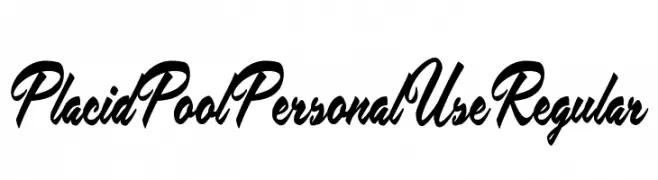
![Placid Pool Personal Use Regular Frei Schriftart Herunterladen]() Herunterladen 260 Downloads@WebFont
Herunterladen 260 Downloads@WebFont -
( Fonts by Tharique Azeez - Personal-use only. For commercial use please contact owner. )
A playful, hand-drawn font with tall, narrow characters and a whimsical style.
![Neythal Frei Schriftart Herunterladen]() Herunterladen 260 Downloads@WebFont
Herunterladen 260 Downloads@WebFont -
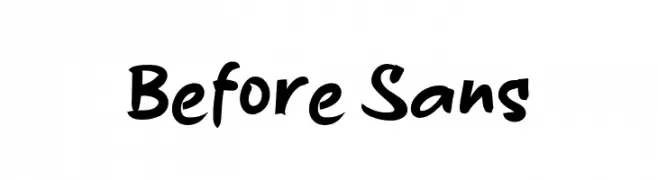
( Fonts by wep )
A bold, handwritten-style font with dynamic and expressive strokes.
![Before Sans Frei Schriftart Herunterladen]() Herunterladen 260 Downloads@WebFont
Herunterladen 260 Downloads@WebFont -
-
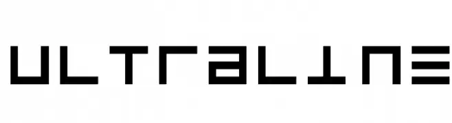
![UltraLine Frei Schriftart Herunterladen]() Herunterladen 260 Downloads
Herunterladen 260 Downloads -
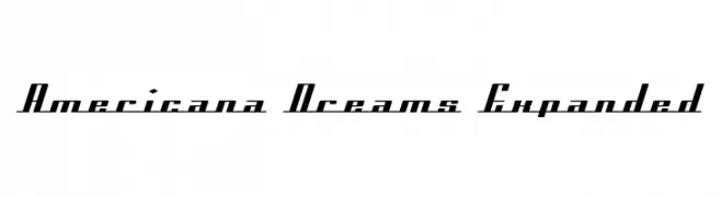
![Americana Dreams Expanded Frei Schriftart Herunterladen]() Herunterladen 260 Downloads@WebFont
Herunterladen 260 Downloads@WebFont -
( Fonts by Yadhie Setiawan - typelinestudio.com - Personal-use only. For commercial use please contact owner. )
An elegant, flowing script font with a handwritten feel.
![the Rochester Frei Schriftart Herunterladen]() Herunterladen 260 Downloads@WebFont
Herunterladen 260 Downloads@WebFont -
![LMS By The Power of Grayskull Frei Schriftart Herunterladen]() Herunterladen 260 Downloads@WebFont
Herunterladen 260 Downloads@WebFont -
( Fonts by Jonathan S. Harris - www.tattoowoo.com. Personal-use only. For commercial use please contact owner. )
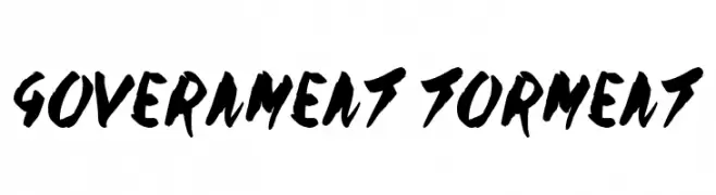
A bold, hand-painted style font with expressive, dynamic strokes.
![Government Torment Frei Schriftart Herunterladen]() Herunterladen 260 Downloads@WebFont
Herunterladen 260 Downloads@WebFont


Welche Schriften sind gerade am populärsten?
Poppins, Roboto, Montserrat, Open Sans und Lato sind wegen ihrer klaren Formen und breiten Einsetzbarkeit sehr gefragt – von Markenauftritt über Landingpages bis hin zu Postern.
Welche Fonts eignen sich für Logos?
Geometrische Sans‑Serifs (z. B. Poppins, Familien im Gotham‑Stil) sind ein häufiger Griff für sauberes, skalierbares Branding. Für eine persönlichere Note bleiben Scripts und Handschrift‑Stile beliebt. Kombinieren Sie einen prägnanten Headline‑Font mit einer neutralen Brotschrift für Wiedererkennung und Harmonie.
Wie oft wird die Top‑Liste aktualisiert?
Regelmäßig – basierend auf realen Downloads und Interaktionen. Schauen Sie öfter vorbei, um aufstrebende Favoriten früh zu entdecken.
💡 Tipp: Seite bookmarken – Trends wechseln schnell, und heutige Top‑Schriften inspirieren morgen vielleicht das Rebranding.