Willkommen bei den Top‑Schriften – hier treffen Beliebtheit und Qualität aufeinander. Das sind die in diesem Jahr am häufigsten heruntergeladenen und genutzten Fonts. Wenn Sie sichere Optionen für Logo, Web oder Social suchen, starten Sie hier.
Jeder Top‑Font überzeugt durch Balance, Lesbarkeit und Vielseitigkeit. Sie finden moderne Sans‑Serifs, elegante Scripts, Vintage‑Serifs und minimalistische Displays.
-
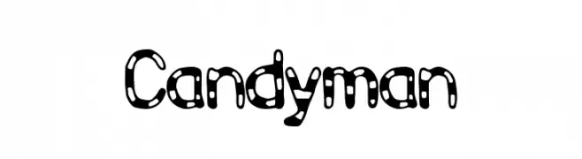
( Fonts by Ditya Ananto )
A playful, polka-dotted font with bold, rounded characters.
 Herunterladen 258 Downloads@WebFont
 -
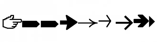
( truefonts.blogspot.com )
A versatile set of arrow designs with varied styles and directions.
![Arrows tfb Frei Schriftart Herunterladen]() Herunterladen 258 Downloads@WebFont
Herunterladen 258 Downloads@WebFont -
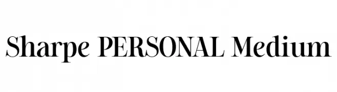
( Fonts by Mans Greback - Personal-use only. For commercial use please contact owner. )
A bold, high-contrast serif font with elegant and classic features.
![Sharpe PERSONAL Medium Frei Schriftart Herunterladen]() Herunterladen 258 Downloads@WebFont
Herunterladen 258 Downloads@WebFont -
( Fonts by www.aenigmafonts.com )
A bold, jagged font with sharp, thorny edges and a striking appearance.
![Dark Side [BRK] Frei Schriftart Herunterladen]() Herunterladen 258 Downloads@WebFont
Herunterladen 258 Downloads@WebFont -
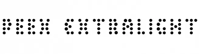
( Fonts by Levi Halmos )
A dot-based, modern font with a digital and futuristic aesthetic.
![Peex ExtraLight Frei Schriftart Herunterladen]() Herunterladen 258 Downloads@WebFont
Herunterladen 258 Downloads@WebFont -
-
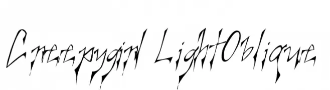
( Fonts by www.kiwi-media.com )
A sharp, angular font with an eerie, dynamic style.
![Creepygirl LightOblique Frei Schriftart Herunterladen]() Herunterladen 258 Downloads@WebFont
Herunterladen 258 Downloads@WebFont -
Schriftart von yiningchen. For commercial use please contact the owner.
![Arvin Regular Italic Frei Schriftart Herunterladen]() Herunterladen 258 Downloads@WebFont
Herunterladen 258 Downloads@WebFont -
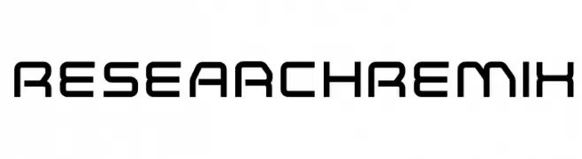
( Fonts by www.neogrey.com - Neogrey Creative )
A futuristic, geometric font with bold, angular shapes and a modern aesthetic.
![ResearchRemix Frei Schriftart Herunterladen]() Herunterladen 258 Downloads@WebFont
Herunterladen 258 Downloads@WebFont -
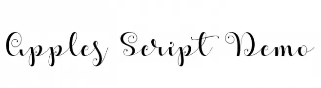
( Fonts by Misti`s Fonts - mistifonts.com - Personal-use only. For commercial use please contact owner. )
A decorative script font with elegant swirls and loops, perfect for adding sophistication.
![Apples Script Demo Frei Schriftart Herunterladen]() Herunterladen 258 Downloads@WebFont
Herunterladen 258 Downloads@WebFont -
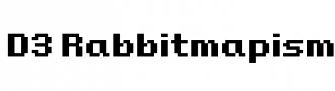
( Fonts by www.DigitalDreamDesign.net )
A pixelated, blocky font with a retro digital aesthetic.
![D3 Rabbitmapism Frei Schriftart Herunterladen]() Herunterladen 258 Downloads@WebFont
Herunterladen 258 Downloads@WebFont
![Dark Side [BRK] Frei Schriftart Herunterladen](https://d144mzi0q5mijx.cloudfront.net/img/D/A/Dark-Side-BRK.webp)

Welche Schriften sind gerade am populärsten?
Poppins, Roboto, Montserrat, Open Sans und Lato sind wegen ihrer klaren Formen und breiten Einsetzbarkeit sehr gefragt – von Markenauftritt über Landingpages bis hin zu Postern.
Welche Fonts eignen sich für Logos?
Geometrische Sans‑Serifs (z. B. Poppins, Familien im Gotham‑Stil) sind ein häufiger Griff für sauberes, skalierbares Branding. Für eine persönlichere Note bleiben Scripts und Handschrift‑Stile beliebt. Kombinieren Sie einen prägnanten Headline‑Font mit einer neutralen Brotschrift für Wiedererkennung und Harmonie.
Wie oft wird die Top‑Liste aktualisiert?
Regelmäßig – basierend auf realen Downloads und Interaktionen. Schauen Sie öfter vorbei, um aufstrebende Favoriten früh zu entdecken.
💡 Tipp: Seite bookmarken – Trends wechseln schnell, und heutige Top‑Schriften inspirieren morgen vielleicht das Rebranding.