Willkommen bei den Top‑Schriften – hier treffen Beliebtheit und Qualität aufeinander. Das sind die in diesem Jahr am häufigsten heruntergeladenen und genutzten Fonts. Wenn Sie sichere Optionen für Logo, Web oder Social suchen, starten Sie hier.
Jeder Top‑Font überzeugt durch Balance, Lesbarkeit und Vielseitigkeit. Sie finden moderne Sans‑Serifs, elegante Scripts, Vintage‑Serifs und minimalistische Displays.
-
 Herunterladen 256 Downloads@WebFont
 -
![HYPD BD Bardust Remix Frei Schriftart Herunterladen]() Herunterladen 256 Downloads@WebFont
Herunterladen 256 Downloads@WebFont -
( Fonts by www.studiotypo.com - Personal-use only. For commercial use please contact owner. )
A modern, geometric font with tall, narrow characters and consistent stroke width.
![WOX~Modelist Light Demo Frei Schriftart Herunterladen]() Herunterladen 256 Downloads@WebFont
Herunterladen 256 Downloads@WebFont -
![Mobile Sans Frei Schriftart Herunterladen]() Herunterladen 256 Downloads@WebFont
Herunterladen 256 Downloads@WebFont -
( Fonts by Castcraft Software - opti.netii.net - check the website before use )
Elegant serif font with an italic slant and moderate stroke contrast.
![OPTIBarMay-BookItalic Frei Schriftart Herunterladen]() Herunterladen 256 Downloads@WebFont
Herunterladen 256 Downloads@WebFont -
-
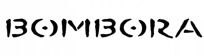
![BOMBORA Frei Schriftart Herunterladen]() Herunterladen 256 Downloads@WebFont
Herunterladen 256 Downloads@WebFont -
( Fonts by Arkandis Digital Foundry )
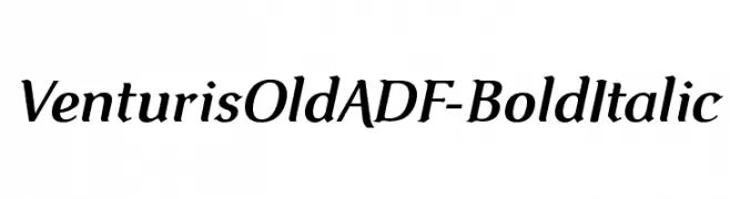
A bold, italic serif font with a classic and elegant style.
![VenturisOldADF-BoldItalic Frei Schriftart Herunterladen]() Herunterladen 256 Downloads@WebFont
Herunterladen 256 Downloads@WebFont -
( Fonts by www.waltervelezart.com )
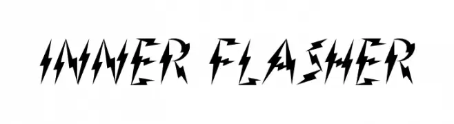
A bold, angular font with a lightning-like, energetic design.
![Inner Flasher Frei Schriftart Herunterladen]() Herunterladen 256 Downloads@WebFont
Herunterladen 256 Downloads@WebFont -
( Fonts by Wino S Kadir - weknow - www.revolge.com/shop/weknow/ - Personal-use only. For commercial use please contact owner. )
A bold, geometric font with a modern, industrial aesthetic.
![underground Frei Schriftart Herunterladen]() Herunterladen 256 Downloads@WebFont
Herunterladen 256 Downloads@WebFont -
( Noto is a trademark of Google Inc. Noto fonts are open source. All Noto fonts are published under the SIL Open Font License, Version 1.1 )
A bold, structured font with medium contrast and elegant serif elements.
![Noto Serif Ethiopic Bold Frei Schriftart Herunterladen]() Herunterladen 256 Downloads@WebFont
Herunterladen 256 Downloads@WebFont


Welche Schriften sind gerade am populärsten?
Poppins, Roboto, Montserrat, Open Sans und Lato sind wegen ihrer klaren Formen und breiten Einsetzbarkeit sehr gefragt – von Markenauftritt über Landingpages bis hin zu Postern.
Welche Fonts eignen sich für Logos?
Geometrische Sans‑Serifs (z. B. Poppins, Familien im Gotham‑Stil) sind ein häufiger Griff für sauberes, skalierbares Branding. Für eine persönlichere Note bleiben Scripts und Handschrift‑Stile beliebt. Kombinieren Sie einen prägnanten Headline‑Font mit einer neutralen Brotschrift für Wiedererkennung und Harmonie.
Wie oft wird die Top‑Liste aktualisiert?
Regelmäßig – basierend auf realen Downloads und Interaktionen. Schauen Sie öfter vorbei, um aufstrebende Favoriten früh zu entdecken.
💡 Tipp: Seite bookmarken – Trends wechseln schnell, und heutige Top‑Schriften inspirieren morgen vielleicht das Rebranding.