Willkommen bei den Top‑Schriften – hier treffen Beliebtheit und Qualität aufeinander. Das sind die in diesem Jahr am häufigsten heruntergeladenen und genutzten Fonts. Wenn Sie sichere Optionen für Logo, Web oder Social suchen, starten Sie hier.
Jeder Top‑Font überzeugt durch Balance, Lesbarkeit und Vielseitigkeit. Sie finden moderne Sans‑Serifs, elegante Scripts, Vintage‑Serifs und minimalistische Displays.
-
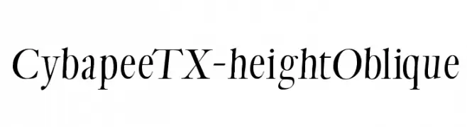
( Fonts by Manfred Klein. Free for private and charity use. Free for commercial with donation to organizations )
Elegant oblique serif font with high contrast and sharp serifs.
 Herunterladen 256 Downloads@WebFont
 -
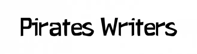
( Fonts by Alvaro Thomaz - alvarothomaz.com )
A bold, modern font with sharp angles and a slightly condensed style.
![Pirates Writers Frei Schriftart Herunterladen]() Herunterladen 256 Downloads@WebFont
Herunterladen 256 Downloads@WebFont -
( Fonts by Fillo Graphic )
A playful, balloon-like font with decorative dots and a whimsical style.
![Balloon Frei Schriftart Herunterladen]() Herunterladen 256 Downloads@WebFont
Herunterladen 256 Downloads@WebFont -
![launchpad Frei Schriftart Herunterladen]() Herunterladen 256 Downloads@WebFont
Herunterladen 256 Downloads@WebFont -
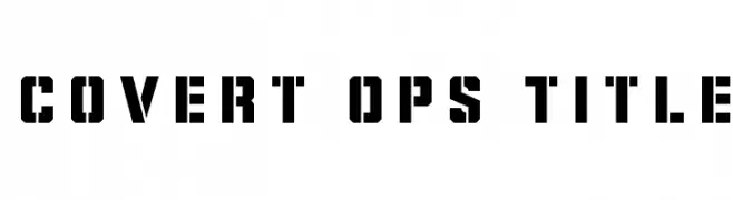
( Iconian Fonts - Daniel Zadorozny - www.iconian.com )
A bold, stencil-style font with high contrast and geometric shapes.
![Covert Ops Title Frei Schriftart Herunterladen]() Herunterladen 256 Downloads@WebFont
Herunterladen 256 Downloads@WebFont -
-
( Fonts by Font Monger - Chris Vile - Personal-use only. For commercial use please contact owner. )
A bold, high-contrast font with strong, thick strokes for impactful design.
![LCt50 Frei Schriftart Herunterladen]() Herunterladen 256 Downloads@WebFont
Herunterladen 256 Downloads@WebFont -
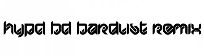
![HYPD BD Bardust Remix Frei Schriftart Herunterladen]() Herunterladen 256 Downloads@WebFont
Herunterladen 256 Downloads@WebFont -
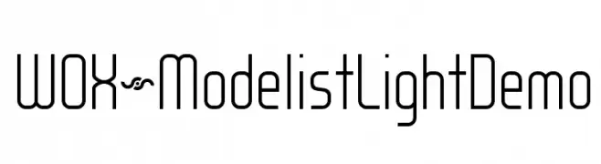
( Fonts by www.studiotypo.com - Personal-use only. For commercial use please contact owner. )
A modern, geometric font with tall, narrow characters and consistent stroke width.
![WOX~Modelist Light Demo Frei Schriftart Herunterladen]() Herunterladen 256 Downloads@WebFont
Herunterladen 256 Downloads@WebFont -
( Fonts by Xerographer Fonts )
A bold, 3D font with a halftone texture and dynamic tilt.
![Action Frei Schriftart Herunterladen]() Herunterladen 256 Downloads@WebFont
Herunterladen 256 Downloads@WebFont -
![Mobile Sans Frei Schriftart Herunterladen]() Herunterladen 256 Downloads@WebFont
Herunterladen 256 Downloads@WebFont


Welche Schriften sind gerade am populärsten?
Poppins, Roboto, Montserrat, Open Sans und Lato sind wegen ihrer klaren Formen und breiten Einsetzbarkeit sehr gefragt – von Markenauftritt über Landingpages bis hin zu Postern.
Welche Fonts eignen sich für Logos?
Geometrische Sans‑Serifs (z. B. Poppins, Familien im Gotham‑Stil) sind ein häufiger Griff für sauberes, skalierbares Branding. Für eine persönlichere Note bleiben Scripts und Handschrift‑Stile beliebt. Kombinieren Sie einen prägnanten Headline‑Font mit einer neutralen Brotschrift für Wiedererkennung und Harmonie.
Wie oft wird die Top‑Liste aktualisiert?
Regelmäßig – basierend auf realen Downloads und Interaktionen. Schauen Sie öfter vorbei, um aufstrebende Favoriten früh zu entdecken.
💡 Tipp: Seite bookmarken – Trends wechseln schnell, und heutige Top‑Schriften inspirieren morgen vielleicht das Rebranding.