Willkommen bei den Top‑Schriften – hier treffen Beliebtheit und Qualität aufeinander. Das sind die in diesem Jahr am häufigsten heruntergeladenen und genutzten Fonts. Wenn Sie sichere Optionen für Logo, Web oder Social suchen, starten Sie hier.
Jeder Top‑Font überzeugt durch Balance, Lesbarkeit und Vielseitigkeit. Sie finden moderne Sans‑Serifs, elegante Scripts, Vintage‑Serifs und minimalistische Displays.
-
 Herunterladen 253 Downloads@WebFont
 -
( Fonts by LyonsType - Daniel Lyons - Personal-use only. For commercial use please contact owner. )
A modern, clean sans-serif font with balanced proportions and excellent readability.
![LT Amber Frei Schriftart Herunterladen]() Herunterladen 253 Downloads@WebFont
Herunterladen 253 Downloads@WebFont -
( Jane Bond )
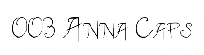
A whimsical, hand-drawn font with playful loops and swirls.
![003 Anna Caps Frei Schriftart Herunterladen]() Herunterladen 253 Downloads@WebFont
Herunterladen 253 Downloads@WebFont -
( Fonts by Manfred Klein. Free for private and charity use. Free for commercial with donation to organizations )
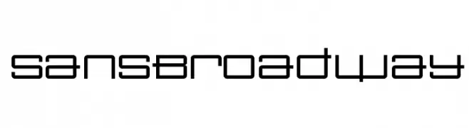
A geometric, modern font with a grid-like structure and clean lines.
![SansBroadway Frei Schriftart Herunterladen]() Herunterladen 253 Downloads@WebFont
Herunterladen 253 Downloads@WebFont -
( Fonts by imagex )
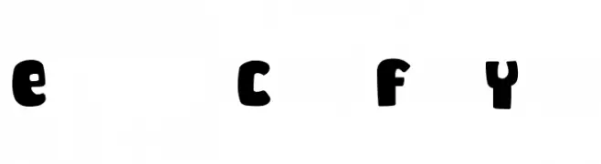
A playful, bold font with rounded, chunky letters.
![Enough Cute For You Frei Schriftart Herunterladen]() Herunterladen 253 Downloads@WebFont
Herunterladen 253 Downloads@WebFont -
-
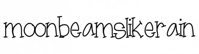
![moonbeamslikerain Frei Schriftart Herunterladen]() Herunterladen 253 Downloads@WebFont
Herunterladen 253 Downloads@WebFont -
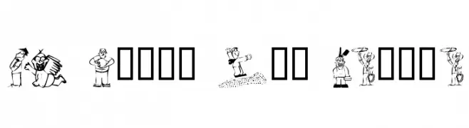
![KR Silly Art People Frei Schriftart Herunterladen]() Herunterladen 253 Downloads@WebFont
Herunterladen 253 Downloads@WebFont -
( Fonts by billyargel.blogspot.com - Billy Argel )
A bold, hand-drawn font with a textured, artistic style.
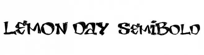
![LEMON DAY SemiBold Frei Schriftart Herunterladen]() Herunterladen 253 Downloads@WebFont
Herunterladen 253 Downloads@WebFont -
( Fonts by Ahmad Rofingi - AR Studio - Personal-use only. For commercial use please contact owner. )
An elegant, flowing script font with graceful loops and cursive strokes.
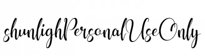
![shunligh Personal Use Only Frei Schriftart Herunterladen]() Herunterladen 253 Downloads@WebFont
Herunterladen 253 Downloads@WebFont -
( Fonts by Jacob Fisher - www.pizzadude.dk )
A bold, angular font with a dynamic, slanted design.
![Flaphead Frei Schriftart Herunterladen]() Herunterladen 253 Downloads@WebFont
Herunterladen 253 Downloads@WebFont


Welche Schriften sind gerade am populärsten?
Poppins, Roboto, Montserrat, Open Sans und Lato sind wegen ihrer klaren Formen und breiten Einsetzbarkeit sehr gefragt – von Markenauftritt über Landingpages bis hin zu Postern.
Welche Fonts eignen sich für Logos?
Geometrische Sans‑Serifs (z. B. Poppins, Familien im Gotham‑Stil) sind ein häufiger Griff für sauberes, skalierbares Branding. Für eine persönlichere Note bleiben Scripts und Handschrift‑Stile beliebt. Kombinieren Sie einen prägnanten Headline‑Font mit einer neutralen Brotschrift für Wiedererkennung und Harmonie.
Wie oft wird die Top‑Liste aktualisiert?
Regelmäßig – basierend auf realen Downloads und Interaktionen. Schauen Sie öfter vorbei, um aufstrebende Favoriten früh zu entdecken.
💡 Tipp: Seite bookmarken – Trends wechseln schnell, und heutige Top‑Schriften inspirieren morgen vielleicht das Rebranding.