Willkommen bei den Top‑Schriften – hier treffen Beliebtheit und Qualität aufeinander. Das sind die in diesem Jahr am häufigsten heruntergeladenen und genutzten Fonts. Wenn Sie sichere Optionen für Logo, Web oder Social suchen, starten Sie hier.
Jeder Top‑Font überzeugt durch Balance, Lesbarkeit und Vielseitigkeit. Sie finden moderne Sans‑Serifs, elegante Scripts, Vintage‑Serifs und minimalistische Displays.
-
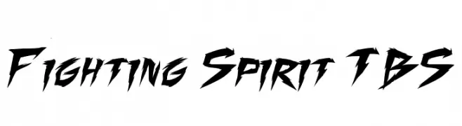
( Fonts by Press Gang Studios - Andeh Pinkard - www.pressgang-studios.com )
A bold, dynamic font with sharp, jagged edges and an energetic style.
 Herunterladen 3577 Downloads@WebFont
 -
![Ample Frei Schriftart Herunterladen]() Herunterladen 3576 Downloads@WebFont
Herunterladen 3576 Downloads@WebFont -
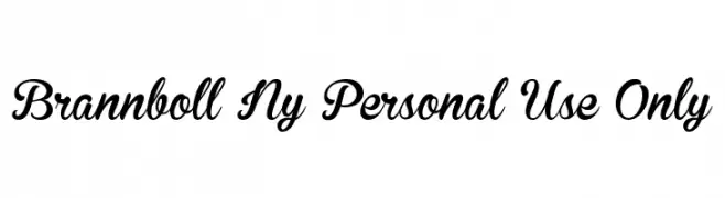
![Brannboll Ny Personal Use Only Frei Schriftart Herunterladen]() Herunterladen 3576 Downloads@WebFont
Herunterladen 3576 Downloads@WebFont -
( Fonts by a kmzero font foundry - www.zetafonts.com. Personal-use only. For commercial use please contact owner. )
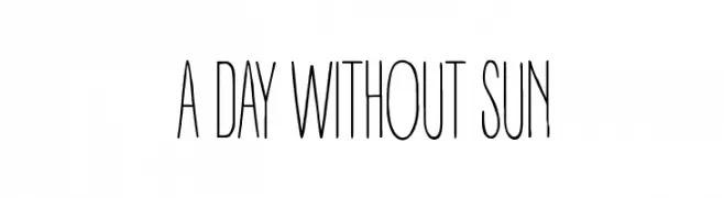
A tall, narrow font with consistent strokes and a modern, minimalistic design.
![A DAY WITHOUT SUN Frei Schriftart Herunterladen]() Herunterladen 3576 Downloads@WebFont
Herunterladen 3576 Downloads@WebFont -
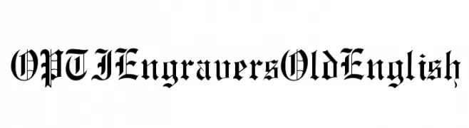
( Fonts by Castcraft Software - opti.netii.net - check the website before use )
An ornate and intricate Old English style font with bold, angular letterforms.
![OPTIEngraversOldEnglish Frei Schriftart Herunterladen]() Herunterladen 3575 Downloads@WebFont
Herunterladen 3575 Downloads@WebFont -
-
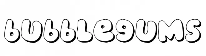
( Fonts by Jacob Fisher - www.pizzadude.dk )
A playful, bubble-like font with rounded, bold characters.
![bubblegums Frei Schriftart Herunterladen]() Herunterladen 3575 Downloads@WebFont
Herunterladen 3575 Downloads@WebFont -
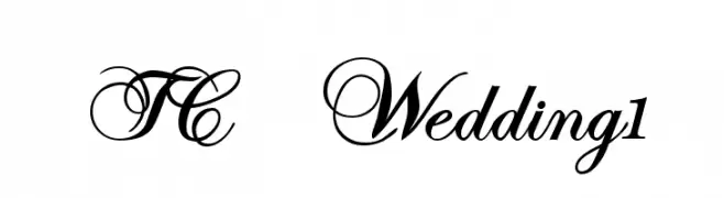
![TC _Wedding1 Frei Schriftart Herunterladen]() Herunterladen 3574 Downloads@WebFont
Herunterladen 3574 Downloads@WebFont -
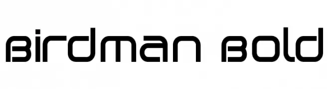
( Fonts by Utopiafonts )
A bold, geometric font with a modern and sleek design.
![Birdman Bold Frei Schriftart Herunterladen]() Herunterladen 3574 Downloads@WebFont
Herunterladen 3574 Downloads@WebFont -
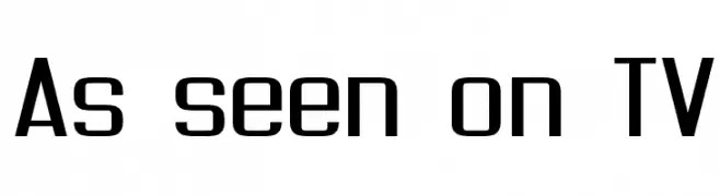
( Fonts by Jacob Fisher - www.pizzadude.dk )
A modern, geometric font with clean lines and bold uppercase letters.
![As seen on TV Frei Schriftart Herunterladen]() Herunterladen 3573 Downloads@WebFont
Herunterladen 3573 Downloads@WebFont -
![Milford Bold Italic Frei Schriftart Herunterladen]() Herunterladen 3572 Downloads
Herunterladen 3572 Downloads

Welche Schriften sind gerade am populärsten?
Poppins, Roboto, Montserrat, Open Sans und Lato sind wegen ihrer klaren Formen und breiten Einsetzbarkeit sehr gefragt – von Markenauftritt über Landingpages bis hin zu Postern.
Welche Fonts eignen sich für Logos?
Geometrische Sans‑Serifs (z. B. Poppins, Familien im Gotham‑Stil) sind ein häufiger Griff für sauberes, skalierbares Branding. Für eine persönlichere Note bleiben Scripts und Handschrift‑Stile beliebt. Kombinieren Sie einen prägnanten Headline‑Font mit einer neutralen Brotschrift für Wiedererkennung und Harmonie.
Wie oft wird die Top‑Liste aktualisiert?
Regelmäßig – basierend auf realen Downloads und Interaktionen. Schauen Sie öfter vorbei, um aufstrebende Favoriten früh zu entdecken.
💡 Tipp: Seite bookmarken – Trends wechseln schnell, und heutige Top‑Schriften inspirieren morgen vielleicht das Rebranding.