Willkommen bei den Top‑Schriften – hier treffen Beliebtheit und Qualität aufeinander. Das sind die in diesem Jahr am häufigsten heruntergeladenen und genutzten Fonts. Wenn Sie sichere Optionen für Logo, Web oder Social suchen, starten Sie hier.
Jeder Top‑Font überzeugt durch Balance, Lesbarkeit und Vielseitigkeit. Sie finden moderne Sans‑Serifs, elegante Scripts, Vintage‑Serifs und minimalistische Displays.
-
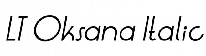
( Free for Personal Use. To use commercially please visit the http://www.nymFont.com )
A modern italic font with clean lines and a dynamic slant.
 Herunterladen 251 Downloads@WebFont
 -
( Fontomen - www.algonet.se/~j-j/ )
A playful, hand-drawn font with quirky, irregular letterforms.
![Tigger Frei Schriftart Herunterladen]() Herunterladen 251 Downloads@WebFont
Herunterladen 251 Downloads@WebFont -
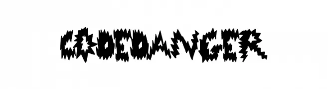
( Fonts by a Max Infeld - XEROGRAPHER FONTS - xerographer.blogspot.com . Personal-use only. For commercial use please contact owner. )
A jagged, electrifying font with dynamic, sharp edges.
![CodeDanger Frei Schriftart Herunterladen]() Herunterladen 251 Downloads@WebFont
Herunterladen 251 Downloads@WebFont -
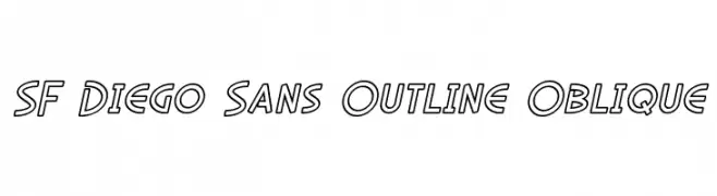
![SF Diego Sans Outline Oblique Frei Schriftart Herunterladen]() Herunterladen 251 Downloads@WebFont
Herunterladen 251 Downloads@WebFont -
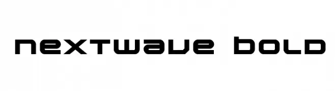
( Fonts by Daniel Zadorozny - www.iconian.com - Free for personal use )
A bold, futuristic font with geometric and angular shapes.
![Nextwave Bold Frei Schriftart Herunterladen]() Herunterladen 251 Downloads@WebFont
Herunterladen 251 Downloads@WebFont -
-
( Fonts by Jacob Fisher - www.pizzadude.dk )
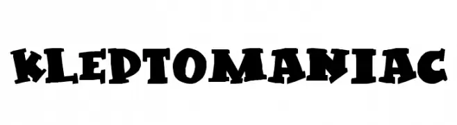
A bold, playful font with exaggerated serifs and a whimsical style.
![Kleptomaniac Frei Schriftart Herunterladen]() Herunterladen 251 Downloads@WebFont
Herunterladen 251 Downloads@WebFont -
( Iconian Fonts - Daniel Zadorozny - www.iconian.com )
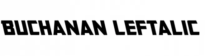
A bold, angular font with a dynamic, slanted design.
![Buchanan Leftalic Frei Schriftart Herunterladen]() Herunterladen 251 Downloads@WebFont
Herunterladen 251 Downloads@WebFont -
( Fonts by a Max Infeld - XEROGRAPHER FONTS - xerographer.blogspot.com . Personal-use only. For commercial use please contact owner. )
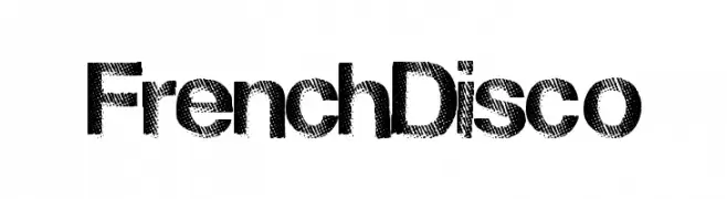
A bold, halftone-patterned font with a retro, disco-inspired style.
![FrenchDisco Frei Schriftart Herunterladen]() Herunterladen 251 Downloads@WebFont
Herunterladen 251 Downloads@WebFont -
( Chequered Ink - chequered.ink/ )
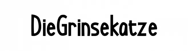
A playful, hand-drawn font with bold, irregular letterforms.
![DieGrinsekatze Frei Schriftart Herunterladen]() Herunterladen 251 Downloads@WebFont
Herunterladen 251 Downloads@WebFont -
Schriftart von JuanCasco. For commercial use please contact the owner.
( Fonts by Juan Casco - www.juancasco.net )
A playful, casual handwritten font with dynamic strokes and a lively feel.
![Chave Frei Schriftart Herunterladen]() Herunterladen 251 Downloads@WebFont
Herunterladen 251 Downloads@WebFont


Welche Schriften sind gerade am populärsten?
Poppins, Roboto, Montserrat, Open Sans und Lato sind wegen ihrer klaren Formen und breiten Einsetzbarkeit sehr gefragt – von Markenauftritt über Landingpages bis hin zu Postern.
Welche Fonts eignen sich für Logos?
Geometrische Sans‑Serifs (z. B. Poppins, Familien im Gotham‑Stil) sind ein häufiger Griff für sauberes, skalierbares Branding. Für eine persönlichere Note bleiben Scripts und Handschrift‑Stile beliebt. Kombinieren Sie einen prägnanten Headline‑Font mit einer neutralen Brotschrift für Wiedererkennung und Harmonie.
Wie oft wird die Top‑Liste aktualisiert?
Regelmäßig – basierend auf realen Downloads und Interaktionen. Schauen Sie öfter vorbei, um aufstrebende Favoriten früh zu entdecken.
💡 Tipp: Seite bookmarken – Trends wechseln schnell, und heutige Top‑Schriften inspirieren morgen vielleicht das Rebranding.