Willkommen bei den Top‑Schriften – hier treffen Beliebtheit und Qualität aufeinander. Das sind die in diesem Jahr am häufigsten heruntergeladenen und genutzten Fonts. Wenn Sie sichere Optionen für Logo, Web oder Social suchen, starten Sie hier.
Jeder Top‑Font überzeugt durch Balance, Lesbarkeit und Vielseitigkeit. Sie finden moderne Sans‑Serifs, elegante Scripts, Vintage‑Serifs und minimalistische Displays.
-
 Herunterladen 250 Downloads@WebFont
 -
( Fonts by Graham Meade - GemFonts )
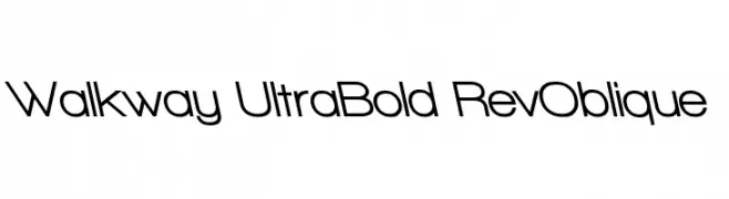
A bold, ultra-modern oblique font with clean, geometric lines.
![Walkway UltraBold RevOblique Frei Schriftart Herunterladen]() Herunterladen 250 Downloads@WebFont
Herunterladen 250 Downloads@WebFont -
![Derrida Frei Schriftart Herunterladen]() Herunterladen 250 Downloads@WebFont
Herunterladen 250 Downloads@WebFont -
( Akkades )
A modern, geometric sans-serif font with clean lines and balanced proportions.
![CRU-Akkades Frei Schriftart Herunterladen]() Herunterladen 250 Downloads@WebFont
Herunterladen 250 Downloads@WebFont -
![Sam Brown is My Hero Frei Schriftart Herunterladen]() Herunterladen 250 Downloads@WebFont
Herunterladen 250 Downloads@WebFont -
-
( Fonts by Grafito Design - dibujosenlinea.ideasintegrales.net )
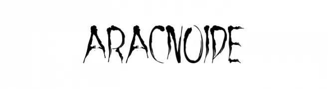
A decorative, horror-themed font with sharp, dripping strokes.
![aracnoide Frei Schriftart Herunterladen]() Herunterladen 250 Downloads@WebFont
Herunterladen 250 Downloads@WebFont -
( Fonts by www.legacyofdefeat.com )
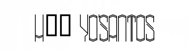
A geometric, angular font with a three-dimensional, modern design.
![H74 Yo'Santos Frei Schriftart Herunterladen]() Herunterladen 250 Downloads@WebFont
Herunterladen 250 Downloads@WebFont -
( Fonts by Sam Wang )
A decorative serif font with sharp, angular serifs and a modern vintage style.
![Gismonda [Plain]:001.001 Frei Schriftart Herunterladen]() Herunterladen 250 Downloads@WebFont
Herunterladen 250 Downloads@WebFont -
( Fonts by Dieter Schumacher )
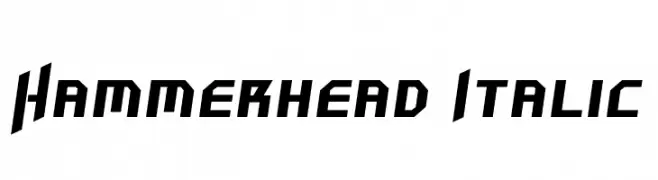
A bold, angular, and italicized font with a futuristic and dynamic style.
![Hammerhead Italic Frei Schriftart Herunterladen]() Herunterladen 250 Downloads@WebFont
Herunterladen 250 Downloads@WebFont -
( Fonts by Ketapel Creative - Personal-use only. For commercial use please contact owner. )
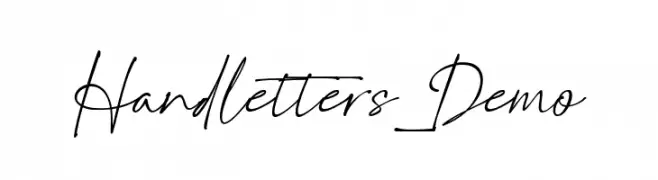
A dynamic, fluid handwritten font with elegant, flowing letterforms.
![Handletters_Demo Frei Schriftart Herunterladen]() Herunterladen 250 Downloads@WebFont
Herunterladen 250 Downloads@WebFont


![Gismonda [Plain]:001.001 Frei Schriftart Herunterladen](https://d144mzi0q5mijx.cloudfront.net/img/G/I/Gismonda-Plain-001001.webp)
Welche Schriften sind gerade am populärsten?
Poppins, Roboto, Montserrat, Open Sans und Lato sind wegen ihrer klaren Formen und breiten Einsetzbarkeit sehr gefragt – von Markenauftritt über Landingpages bis hin zu Postern.
Welche Fonts eignen sich für Logos?
Geometrische Sans‑Serifs (z. B. Poppins, Familien im Gotham‑Stil) sind ein häufiger Griff für sauberes, skalierbares Branding. Für eine persönlichere Note bleiben Scripts und Handschrift‑Stile beliebt. Kombinieren Sie einen prägnanten Headline‑Font mit einer neutralen Brotschrift für Wiedererkennung und Harmonie.
Wie oft wird die Top‑Liste aktualisiert?
Regelmäßig – basierend auf realen Downloads und Interaktionen. Schauen Sie öfter vorbei, um aufstrebende Favoriten früh zu entdecken.
💡 Tipp: Seite bookmarken – Trends wechseln schnell, und heutige Top‑Schriften inspirieren morgen vielleicht das Rebranding.