Willkommen bei den Top‑Schriften – hier treffen Beliebtheit und Qualität aufeinander. Das sind die in diesem Jahr am häufigsten heruntergeladenen und genutzten Fonts. Wenn Sie sichere Optionen für Logo, Web oder Social suchen, starten Sie hier.
Jeder Top‑Font überzeugt durch Balance, Lesbarkeit und Vielseitigkeit. Sie finden moderne Sans‑Serifs, elegante Scripts, Vintage‑Serifs und minimalistische Displays.
-
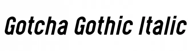
( Levi Szekeres - www.loremipsum.ro )
A bold, italic, and dynamic font with a modern, assertive style.
 Herunterladen 249 Downloads@WebFont
 -
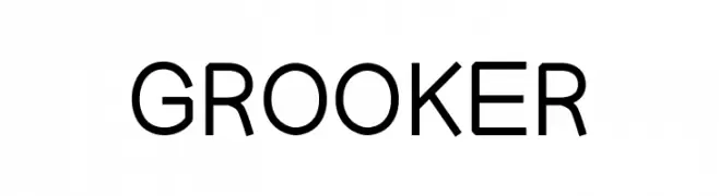
( Fonts by zanfonts - ari budi setiawan - Personal-use only. For commercial use please contact owner. )
A modern, clean sans-serif font with uniform stroke width and excellent readability.
![GROOKER Frei Schriftart Herunterladen]() Herunterladen 249 Downloads@WebFont
Herunterladen 249 Downloads@WebFont -
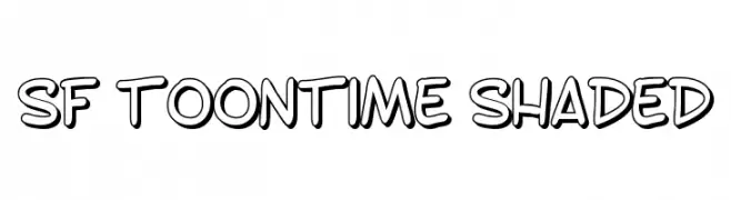
( Fonts by ShyFonts )
A playful, cartoonish font with a bold, shaded style.
![SF Toontime Shaded Frei Schriftart Herunterladen]() Herunterladen 249 Downloads@WebFont
Herunterladen 249 Downloads@WebFont -
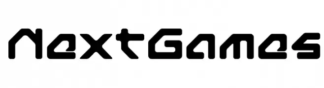
![NextGames Frei Schriftart Herunterladen]() Herunterladen 249 Downloads@WebFont
Herunterladen 249 Downloads@WebFont -
( Fonts by Apostrophic Lab )
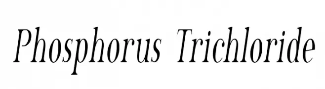
A classic, high-contrast serif font with elegant italics.
![Phosphorus Trichloride Frei Schriftart Herunterladen]() Herunterladen 249 Downloads@WebFont
Herunterladen 249 Downloads@WebFont -
-
( Debut Studio - Ari Fadli - creativemarket.com/debutstudio )
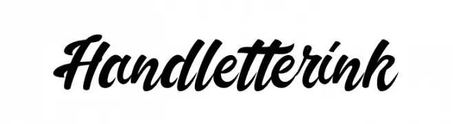
A bold, cursive font with fluid, interconnected strokes.
![Handletterink Frei Schriftart Herunterladen]() Herunterladen 249 Downloads@WebFont
Herunterladen 249 Downloads@WebFont -
( Fonts by Iconian Fonts )
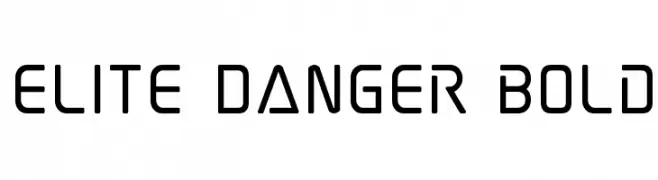
A futuristic, geometric font with clean lines and a bold presence.
![Elite Danger Bold Frei Schriftart Herunterladen]() Herunterladen 249 Downloads@WebFont
Herunterladen 249 Downloads@WebFont -
( Fonts by TypeOff )
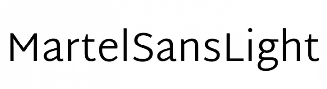
A clean, modern sans-serif font with a light weight and excellent legibility.
![Martel Sans Light Frei Schriftart Herunterladen]() Herunterladen 249 Downloads@WebFont
Herunterladen 249 Downloads@WebFont -
![GREEN TEA Frei Schriftart Herunterladen]() Herunterladen 249 Downloads@WebFont
Herunterladen 249 Downloads@WebFont -
![Alien Tongue Normal Frei Schriftart Herunterladen]() Herunterladen 249 Downloads
Herunterladen 249 Downloads
Welche Schriften sind gerade am populärsten?
Poppins, Roboto, Montserrat, Open Sans und Lato sind wegen ihrer klaren Formen und breiten Einsetzbarkeit sehr gefragt – von Markenauftritt über Landingpages bis hin zu Postern.
Welche Fonts eignen sich für Logos?
Geometrische Sans‑Serifs (z. B. Poppins, Familien im Gotham‑Stil) sind ein häufiger Griff für sauberes, skalierbares Branding. Für eine persönlichere Note bleiben Scripts und Handschrift‑Stile beliebt. Kombinieren Sie einen prägnanten Headline‑Font mit einer neutralen Brotschrift für Wiedererkennung und Harmonie.
Wie oft wird die Top‑Liste aktualisiert?
Regelmäßig – basierend auf realen Downloads und Interaktionen. Schauen Sie öfter vorbei, um aufstrebende Favoriten früh zu entdecken.
💡 Tipp: Seite bookmarken – Trends wechseln schnell, und heutige Top‑Schriften inspirieren morgen vielleicht das Rebranding.