Willkommen bei den Top‑Schriften – hier treffen Beliebtheit und Qualität aufeinander. Das sind die in diesem Jahr am häufigsten heruntergeladenen und genutzten Fonts. Wenn Sie sichere Optionen für Logo, Web oder Social suchen, starten Sie hier.
Jeder Top‑Font überzeugt durch Balance, Lesbarkeit und Vielseitigkeit. Sie finden moderne Sans‑Serifs, elegante Scripts, Vintage‑Serifs und minimalistische Displays.
-
 Herunterladen 247 Downloads@WebFont
 -
( Fonts by Dan P. Lyons - Personal-use only. For commercial use please contact owner. )
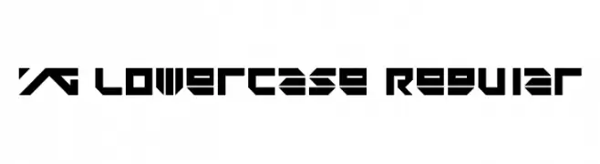
A bold, geometric font with a futuristic and angular design.
![YG Lowercase Regular Frei Schriftart Herunterladen]() Herunterladen 247 Downloads@WebFont
Herunterladen 247 Downloads@WebFont -
( Fonts by Manfred Klein. Free for private and charity use. Free for commercial with donation to organizations )
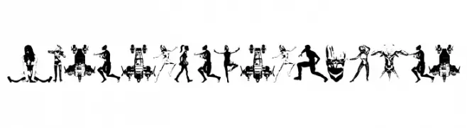
Abstract, fragmented silhouettes form each character in a bold, decorative style.
![AbstractFragments Frei Schriftart Herunterladen]() Herunterladen 247 Downloads@WebFont
Herunterladen 247 Downloads@WebFont -
( Fonts by Daniel Zadorozny - www.iconian.com )
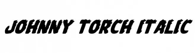
A bold, italic font with a dynamic and rugged style.
![Johnny Torch Italic Frei Schriftart Herunterladen]() Herunterladen 247 Downloads@WebFont
Herunterladen 247 Downloads@WebFont -
( Fonts by Graham Meade - GemFonts )
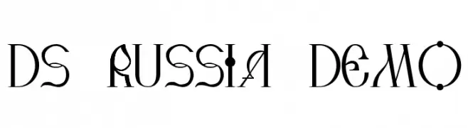
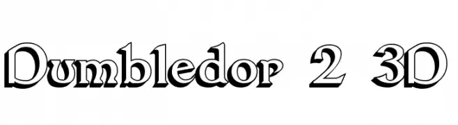
A bold, 3D serif font with dramatic, angular serifs and a vintage flair.
![Dumbledor 2 3D Frei Schriftart Herunterladen]() Herunterladen 247 Downloads@WebFont
Herunterladen 247 Downloads@WebFont -
-
![mine Frei Schriftart Herunterladen]() Herunterladen 247 Downloads@WebFont
Herunterladen 247 Downloads@WebFont -
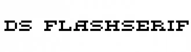
![DS FlashSerif Frei Schriftart Herunterladen]() Herunterladen 247 Downloads@WebFont
Herunterladen 247 Downloads@WebFont -
![Vergennes Demo Frei Schriftart Herunterladen]() Herunterladen 247 Downloads@WebFont
Herunterladen 247 Downloads@WebFont -
( Fonts by Daniel Zadorozny - www.iconian.com - Free for personal use )
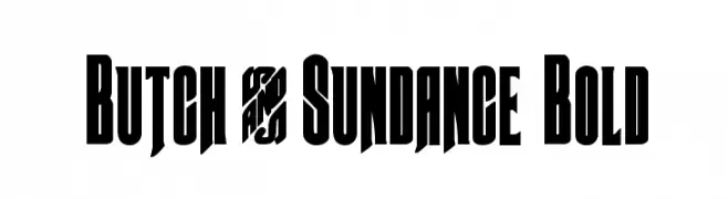
A bold, dramatic font with tall, narrow characters and sharp angles.
![Butch & Sundance Bold Frei Schriftart Herunterladen]() Herunterladen 247 Downloads@WebFont
Herunterladen 247 Downloads@WebFont -
( Fonts by Daniel Zadorozny - www.iconian.com )
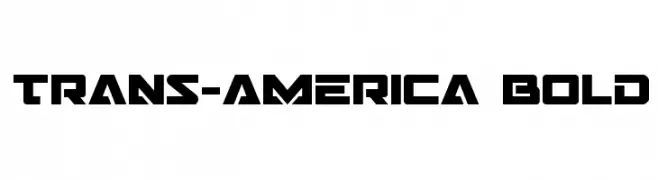
A bold, geometric font with a futuristic and industrial style.
![Trans-America Bold Frei Schriftart Herunterladen]() Herunterladen 247 Downloads@WebFont
Herunterladen 247 Downloads@WebFont


Welche Schriften sind gerade am populärsten?
Poppins, Roboto, Montserrat, Open Sans und Lato sind wegen ihrer klaren Formen und breiten Einsetzbarkeit sehr gefragt – von Markenauftritt über Landingpages bis hin zu Postern.
Welche Fonts eignen sich für Logos?
Geometrische Sans‑Serifs (z. B. Poppins, Familien im Gotham‑Stil) sind ein häufiger Griff für sauberes, skalierbares Branding. Für eine persönlichere Note bleiben Scripts und Handschrift‑Stile beliebt. Kombinieren Sie einen prägnanten Headline‑Font mit einer neutralen Brotschrift für Wiedererkennung und Harmonie.
Wie oft wird die Top‑Liste aktualisiert?
Regelmäßig – basierend auf realen Downloads und Interaktionen. Schauen Sie öfter vorbei, um aufstrebende Favoriten früh zu entdecken.
💡 Tipp: Seite bookmarken – Trends wechseln schnell, und heutige Top‑Schriften inspirieren morgen vielleicht das Rebranding.