Willkommen bei den Top‑Schriften – hier treffen Beliebtheit und Qualität aufeinander. Das sind die in diesem Jahr am häufigsten heruntergeladenen und genutzten Fonts. Wenn Sie sichere Optionen für Logo, Web oder Social suchen, starten Sie hier.
Jeder Top‑Font überzeugt durch Balance, Lesbarkeit und Vielseitigkeit. Sie finden moderne Sans‑Serifs, elegante Scripts, Vintage‑Serifs und minimalistische Displays.
-
( www.porcelainpaperandpie.com )
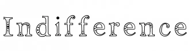
A decorative font with dotted outlines and playful, whimsical characters.
 Herunterladen 245 Downloads@WebFont
 -
![Rudolfo Frei Schriftart Herunterladen]() Herunterladen 245 Downloads@WebFont
Herunterladen 245 Downloads@WebFont -
![Funiko Frei Schriftart Herunterladen]() Herunterladen 245 Downloads@WebFont
Herunterladen 245 Downloads@WebFont -
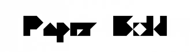
![Paper Bold Frei Schriftart Herunterladen]() Herunterladen 245 Downloads@WebFont
Herunterladen 245 Downloads@WebFont -
( Fonts by joeBob graff-X )
A bold, angular font with a modern, geometric style.
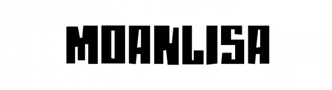
![moanLisa Frei Schriftart Herunterladen]() Herunterladen 245 Downloads@WebFont
Herunterladen 245 Downloads@WebFont -
-
( Fonts by Kat`s Fun Fonts - Personal-use only. For commercial use please contact owner. )
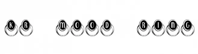
A playful, decorative font with characters encased in ring-like designs, reminiscent of vintage typewriter keys.
![KR Mood Ring Frei Schriftart Herunterladen]() Herunterladen 245 Downloads@WebFont
Herunterladen 245 Downloads@WebFont -
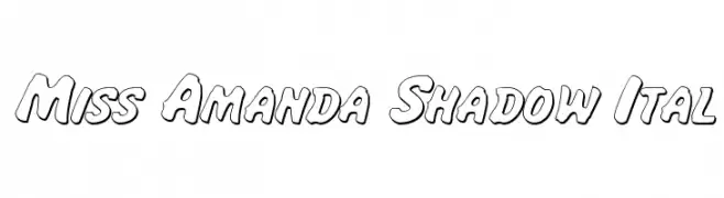
( Fonts by Daniel Zadorozny - www.iconian.com - Free for personal use )
A bold, shadowed font with rounded, italicized characters for a playful look.
![Miss Amanda Shadow Ital Frei Schriftart Herunterladen]() Herunterladen 245 Downloads@WebFont
Herunterladen 245 Downloads@WebFont -
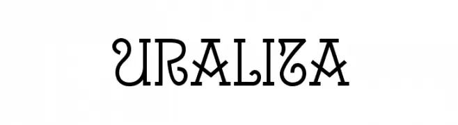
( Fonts by Ipanema Gráfica - Personal-use only. For commercial use please contact owner. )
A decorative font with classic elements and intricate detailing.
![Uralita Frei Schriftart Herunterladen]() Herunterladen 245 Downloads@WebFont
Herunterladen 245 Downloads@WebFont -
( Fonts by Letterena Studios )
A bold, playful handwritten font with a casual and dynamic style.
![Mattew Frei Schriftart Herunterladen]() Herunterladen 245 Downloads@WebFont
Herunterladen 245 Downloads@WebFont -
![Jakob's Handwriting Frei Schriftart Herunterladen]() Herunterladen 245 Downloads@WebFont
Herunterladen 245 Downloads@WebFont


Welche Schriften sind gerade am populärsten?
Poppins, Roboto, Montserrat, Open Sans und Lato sind wegen ihrer klaren Formen und breiten Einsetzbarkeit sehr gefragt – von Markenauftritt über Landingpages bis hin zu Postern.
Welche Fonts eignen sich für Logos?
Geometrische Sans‑Serifs (z. B. Poppins, Familien im Gotham‑Stil) sind ein häufiger Griff für sauberes, skalierbares Branding. Für eine persönlichere Note bleiben Scripts und Handschrift‑Stile beliebt. Kombinieren Sie einen prägnanten Headline‑Font mit einer neutralen Brotschrift für Wiedererkennung und Harmonie.
Wie oft wird die Top‑Liste aktualisiert?
Regelmäßig – basierend auf realen Downloads und Interaktionen. Schauen Sie öfter vorbei, um aufstrebende Favoriten früh zu entdecken.
💡 Tipp: Seite bookmarken – Trends wechseln schnell, und heutige Top‑Schriften inspirieren morgen vielleicht das Rebranding.