Willkommen bei den Top‑Schriften – hier treffen Beliebtheit und Qualität aufeinander. Das sind die in diesem Jahr am häufigsten heruntergeladenen und genutzten Fonts. Wenn Sie sichere Optionen für Logo, Web oder Social suchen, starten Sie hier.
Jeder Top‑Font überzeugt durch Balance, Lesbarkeit und Vielseitigkeit. Sie finden moderne Sans‑Serifs, elegante Scripts, Vintage‑Serifs und minimalistische Displays.
-
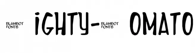
( Fonts by Nate Piekos - www.blambot.com )
A playful, bold font with exaggerated curves and a hand-drawn feel.
 Herunterladen 243 Downloads@WebFont
 -
( Fonts by Zea Fonts - Personal-use only. For commercial use please contact owner. )
A bold, high-contrast font with wide, block-like characters ideal for impactful headlines.
![Bogam Frei Schriftart Herunterladen]() Herunterladen 243 Downloads@WebFont
Herunterladen 243 Downloads@WebFont -
( Fonts by Skiiller Studio )
A playful, handwritten-style font with a whimsical and casual vibe.
![Chanelle Frei Schriftart Herunterladen]() Herunterladen 243 Downloads@WebFont
Herunterladen 243 Downloads@WebFont -
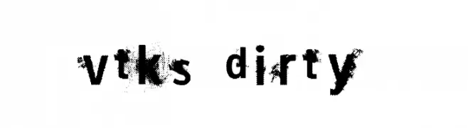
( Fonts by Douglas Vitkauskas - www.vtksdesign.com. Personal-use only. For commercial use please contact owner. )
A distressed, grungy font with a textured, worn appearance.
![vtks dirty 2 Frei Schriftart Herunterladen]() Herunterladen 243 Downloads@WebFont
Herunterladen 243 Downloads@WebFont -
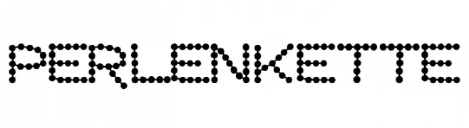
( Fonts by Dieter Schumacher )
A dotted, decorative font with a playful and modern aesthetic.
![Perlenkette Frei Schriftart Herunterladen]() Herunterladen 243 Downloads@WebFont
Herunterladen 243 Downloads@WebFont -
-
( Vladimir Nikolic - www.coroflot.com/vladimirnikolic )
A bold, textured font with a vintage, industrial style.
![Industrial Revolution Regular Frei Schriftart Herunterladen]() Herunterladen 243 Downloads@WebFont
Herunterladen 243 Downloads@WebFont -
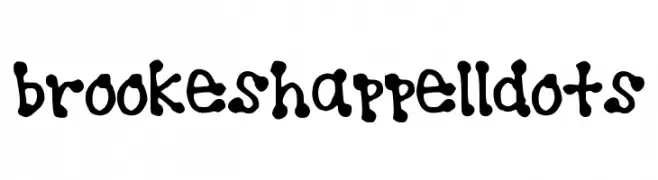
![brookeshappelldots Frei Schriftart Herunterladen]() Herunterladen 243 Downloads@WebFont
Herunterladen 243 Downloads@WebFont -
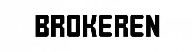
( Fonts by a Situjuh Nazara - c7n1.wordpress.com. Personal-use only. For commercial use please contact owner. )
A bold, geometric font with rounded corners and a modern style.
![BROKEREN Frei Schriftart Herunterladen]() Herunterladen 243 Downloads@WebFont
Herunterladen 243 Downloads@WebFont -
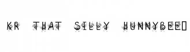
![KR That Silly Hunnybee! Frei Schriftart Herunterladen]() Herunterladen 243 Downloads@WebFont
Herunterladen 243 Downloads@WebFont -
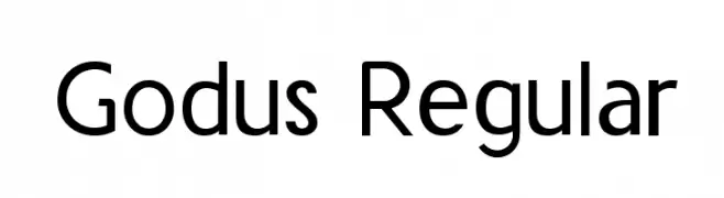
( Fonts by www.asleycruz.com - Asley Cruz - Personal-use only. For commercial use please contact owner. )
A modern sans-serif font with geometric shapes and uniform strokes.
![Godus Regular Frei Schriftart Herunterladen]() Herunterladen 243 Downloads@WebFont
Herunterladen 243 Downloads@WebFont


Welche Schriften sind gerade am populärsten?
Poppins, Roboto, Montserrat, Open Sans und Lato sind wegen ihrer klaren Formen und breiten Einsetzbarkeit sehr gefragt – von Markenauftritt über Landingpages bis hin zu Postern.
Welche Fonts eignen sich für Logos?
Geometrische Sans‑Serifs (z. B. Poppins, Familien im Gotham‑Stil) sind ein häufiger Griff für sauberes, skalierbares Branding. Für eine persönlichere Note bleiben Scripts und Handschrift‑Stile beliebt. Kombinieren Sie einen prägnanten Headline‑Font mit einer neutralen Brotschrift für Wiedererkennung und Harmonie.
Wie oft wird die Top‑Liste aktualisiert?
Regelmäßig – basierend auf realen Downloads und Interaktionen. Schauen Sie öfter vorbei, um aufstrebende Favoriten früh zu entdecken.
💡 Tipp: Seite bookmarken – Trends wechseln schnell, und heutige Top‑Schriften inspirieren morgen vielleicht das Rebranding.