Willkommen bei den Top‑Schriften – hier treffen Beliebtheit und Qualität aufeinander. Das sind die in diesem Jahr am häufigsten heruntergeladenen und genutzten Fonts. Wenn Sie sichere Optionen für Logo, Web oder Social suchen, starten Sie hier.
Jeder Top‑Font überzeugt durch Balance, Lesbarkeit und Vielseitigkeit. Sie finden moderne Sans‑Serifs, elegante Scripts, Vintage‑Serifs und minimalistische Displays.
-
( Fonts by Wino S Kadir - weknow - www.revolge.com/shop/weknow/ - Personal-use only. For commercial use please contact owner. )
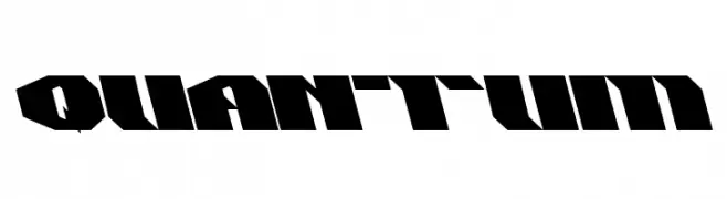
A bold, angular font with a futuristic and dynamic design.
 Herunterladen 243 Downloads@WebFont
 -
![1945 Regular Frei Schriftart Herunterladen]() Herunterladen 243 Downloads@WebFont
Herunterladen 243 Downloads@WebFont -
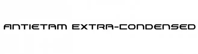
( Fonts by Daniel Zadorozny - www.iconian.com )
A modern, geometric, extra-condensed font with a futuristic style.
![Antietam Extra-Condensed Frei Schriftart Herunterladen]() Herunterladen 243 Downloads@WebFont
Herunterladen 243 Downloads@WebFont -
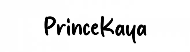
( Fonts by MJType - mjtype.com - Personal-use only. For commercial use please contact owner. )
A playful, handwritten font with smooth, rounded edges and a casual style.
![Prince Kaya Frei Schriftart Herunterladen]() Herunterladen 243 Downloads@WebFont
Herunterladen 243 Downloads@WebFont -
( Fonts by Daniel Zadorozny - www.iconian.com )
A bold, italicized font with a futuristic, double-layered design.
![4114 Blaster Academy Italic Frei Schriftart Herunterladen]() Herunterladen 243 Downloads@WebFont
Herunterladen 243 Downloads@WebFont -
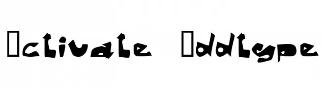
-
![Activate Oddtype Frei Schriftart Herunterladen]() Herunterladen 243 Downloads@WebFont
Herunterladen 243 Downloads@WebFont -
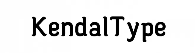
( Adha Azzaki - www.visitkabkendal.com )
A bold, rounded font with a modern and approachable style.
![Kendal Type Frei Schriftart Herunterladen]() Herunterladen 243 Downloads@WebFont
Herunterladen 243 Downloads@WebFont -
![Evelyn Italic Frei Schriftart Herunterladen]() Herunterladen 243 Downloads@WebFont
Herunterladen 243 Downloads@WebFont -
![Circoex / ANTIPIXEL.com.ar Frei Schriftart Herunterladen]() Herunterladen 243 Downloads@WebFont
Herunterladen 243 Downloads@WebFont -
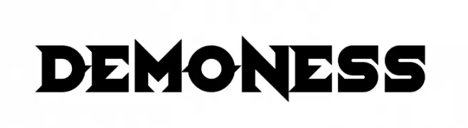
( Fonts by Chequered Ink - chequered.ink - Personal-use only. For commercial use please contact owner. )
A bold, angular font with sharp edges and a fierce, dynamic style.
![Demoness Frei Schriftart Herunterladen]() Herunterladen 243 Downloads@WebFont
Herunterladen 243 Downloads@WebFont


Welche Schriften sind gerade am populärsten?
Poppins, Roboto, Montserrat, Open Sans und Lato sind wegen ihrer klaren Formen und breiten Einsetzbarkeit sehr gefragt – von Markenauftritt über Landingpages bis hin zu Postern.
Welche Fonts eignen sich für Logos?
Geometrische Sans‑Serifs (z. B. Poppins, Familien im Gotham‑Stil) sind ein häufiger Griff für sauberes, skalierbares Branding. Für eine persönlichere Note bleiben Scripts und Handschrift‑Stile beliebt. Kombinieren Sie einen prägnanten Headline‑Font mit einer neutralen Brotschrift für Wiedererkennung und Harmonie.
Wie oft wird die Top‑Liste aktualisiert?
Regelmäßig – basierend auf realen Downloads und Interaktionen. Schauen Sie öfter vorbei, um aufstrebende Favoriten früh zu entdecken.
💡 Tipp: Seite bookmarken – Trends wechseln schnell, und heutige Top‑Schriften inspirieren morgen vielleicht das Rebranding.