Willkommen bei den Top‑Schriften – hier treffen Beliebtheit und Qualität aufeinander. Das sind die in diesem Jahr am häufigsten heruntergeladenen und genutzten Fonts. Wenn Sie sichere Optionen für Logo, Web oder Social suchen, starten Sie hier.
Jeder Top‑Font überzeugt durch Balance, Lesbarkeit und Vielseitigkeit. Sie finden moderne Sans‑Serifs, elegante Scripts, Vintage‑Serifs und minimalistische Displays.
-
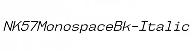
( Fonts by Typodermic Fonts )
A modern, monospaced italic font with uniform spacing and low contrast.
 Herunterladen 240 Downloads@WebFont
 -
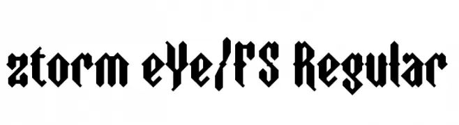
( fontstruct.com/fontstructors/elmoyenique )
A bold, angular Gothic-inspired font with a modern twist.
![ztorm eYe/FS Regular Frei Schriftart Herunterladen]() Herunterladen 240 Downloads@WebFont
Herunterladen 240 Downloads@WebFont -
( Fonts by Bud White. Personal-use only. For commercial use please contact owner. )
A sleek, modern font with thin, elongated letterforms and a minimalist design.
![Hinge Frei Schriftart Herunterladen]() Herunterladen 239 Downloads@WebFont
Herunterladen 239 Downloads@WebFont -
( Fonts by Cumberland Fontworks - http://www222.pair.com/sjohn/fonts.htm - S. John Ross )
A playful, bold, hand-drawn font with wavy, irregular edges.
![Invader Candy Frei Schriftart Herunterladen]() Herunterladen 239 Downloads@WebFont
Herunterladen 239 Downloads@WebFont -
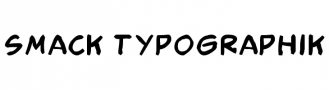
![Smack Typographik Frei Schriftart Herunterladen]() Herunterladen 239 Downloads@WebFont
Herunterladen 239 Downloads@WebFont -
-
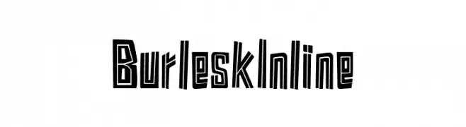
( Fonts by Kustomtype - Personal-use only. For commercial use please contact owner. )
A bold, decorative font with an inline style, perfect for standout designs.
![Burlesk Inline Frei Schriftart Herunterladen]() Herunterladen 239 Downloads@WebFont
Herunterladen 239 Downloads@WebFont -
![Lao Tangdaene Frei Schriftart Herunterladen]() Herunterladen 239 Downloads
Herunterladen 239 Downloads -
( Fonts by Darren Rigby - Personal-use only. For commercial use please contact owner. )
A bold, dynamic serif font with a modern yet classic appeal.
![Brasspounder Frei Schriftart Herunterladen]() Herunterladen 239 Downloads@WebFont
Herunterladen 239 Downloads@WebFont -
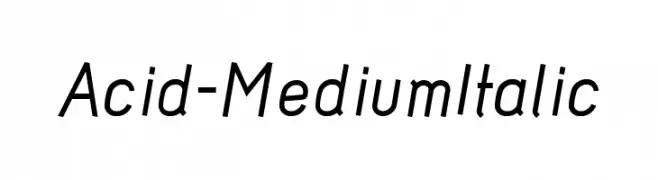
( Fonts by www.26plus-zeichen.de )
A modern, italicized sans-serif font with clean lines and a sleek design.
![Acid-MediumItalic Frei Schriftart Herunterladen]() Herunterladen 239 Downloads@WebFont
Herunterladen 239 Downloads@WebFont -
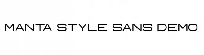
( Fonts by vilogsign - Nur Kholis - Personal-use only. For commercial use please contact owner. )
A modern, geometric sans-serif font with uniform stroke width and clean lines.
![Manta Style Sans DEMO Frei Schriftart Herunterladen]() Herunterladen 239 Downloads@WebFont
Herunterladen 239 Downloads@WebFont


Welche Schriften sind gerade am populärsten?
Poppins, Roboto, Montserrat, Open Sans und Lato sind wegen ihrer klaren Formen und breiten Einsetzbarkeit sehr gefragt – von Markenauftritt über Landingpages bis hin zu Postern.
Welche Fonts eignen sich für Logos?
Geometrische Sans‑Serifs (z. B. Poppins, Familien im Gotham‑Stil) sind ein häufiger Griff für sauberes, skalierbares Branding. Für eine persönlichere Note bleiben Scripts und Handschrift‑Stile beliebt. Kombinieren Sie einen prägnanten Headline‑Font mit einer neutralen Brotschrift für Wiedererkennung und Harmonie.
Wie oft wird die Top‑Liste aktualisiert?
Regelmäßig – basierend auf realen Downloads und Interaktionen. Schauen Sie öfter vorbei, um aufstrebende Favoriten früh zu entdecken.
💡 Tipp: Seite bookmarken – Trends wechseln schnell, und heutige Top‑Schriften inspirieren morgen vielleicht das Rebranding.