Willkommen bei den Top‑Schriften – hier treffen Beliebtheit und Qualität aufeinander. Das sind die in diesem Jahr am häufigsten heruntergeladenen und genutzten Fonts. Wenn Sie sichere Optionen für Logo, Web oder Social suchen, starten Sie hier.
Jeder Top‑Font überzeugt durch Balance, Lesbarkeit und Vielseitigkeit. Sie finden moderne Sans‑Serifs, elegante Scripts, Vintage‑Serifs und minimalistische Displays.
-
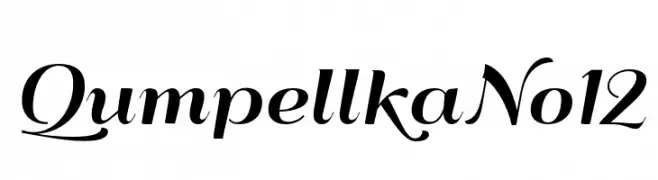
( Fonts by gluk - Grzegorz l - Personal-use only. For commercial use please contact owner. )
A modern, elegant script font with graceful curves and decorative flourishes.
 Herunterladen 238 Downloads@WebFont
 -
( Fonts by Figuree Studio )
A bold, decorative font with heart-shaped cutouts and playful, dynamic characters.
![Perfect Love Carved Frei Schriftart Herunterladen]() Herunterladen 238 Downloads@WebFont
Herunterladen 238 Downloads@WebFont -
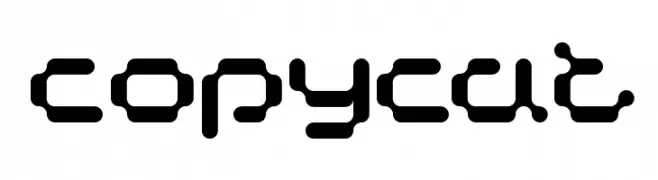
( Fonts by www.koenhachmang.com - Glitch )
A futuristic, geometric font with bold, rounded characters.
![Copycat Frei Schriftart Herunterladen]() Herunterladen 238 Downloads@WebFont
Herunterladen 238 Downloads@WebFont -
![kakukaku1 Frei Schriftart Herunterladen]() Herunterladen 238 Downloads@WebFont
Herunterladen 238 Downloads@WebFont -
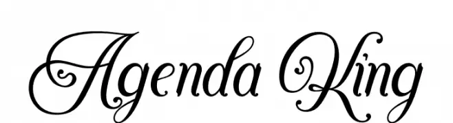
( Fonts by StringLabs - stringlabscreative.com - Personal-use only. For commercial use please contact owner. )
An elegant script font with ornate swirls and decorative flourishes.
![Agenda King Frei Schriftart Herunterladen]() Herunterladen 238 Downloads@WebFont
Herunterladen 238 Downloads@WebFont -
-
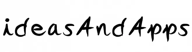
( Fonts by Ideas and Apps )
A dynamic handwritten font with fluid, expressive strokes and a playful character.
![ideasAndApps Frei Schriftart Herunterladen]() Herunterladen 238 Downloads@WebFont
Herunterladen 238 Downloads@WebFont -
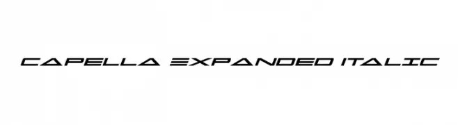
( Fonts by Daniel Zadorozny - www.iconian.com )
A sleek, futuristic italic font with expanded width and consistent stroke thickness.
![Capella Expanded Italic Frei Schriftart Herunterladen]() Herunterladen 238 Downloads@WebFont
Herunterladen 238 Downloads@WebFont -
![Facet [WLM] Regular Frei Schriftart Herunterladen]() Herunterladen 238 Downloads@WebFont
Herunterladen 238 Downloads@WebFont -
( Fonts by a Max Infeld - XEROGRAPHER FONTS - xerographer.blogspot.com . Personal-use only. For commercial use please contact owner. )
A bold, pixelated decorative font with a digital retro style.
![PixelHour Frei Schriftart Herunterladen]() Herunterladen 238 Downloads@WebFont
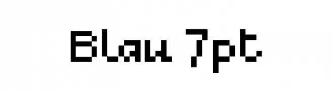
Herunterladen 238 Downloads@WebFont -
![Blau 7pt Frei Schriftart Herunterladen]() Herunterladen 238 Downloads@WebFont
Herunterladen 238 Downloads@WebFont


![Facet [WLM] Regular Frei Schriftart Herunterladen](https://d144mzi0q5mijx.cloudfront.net/img/F/A/Facet-WLM-Regular.webp)
Welche Schriften sind gerade am populärsten?
Poppins, Roboto, Montserrat, Open Sans und Lato sind wegen ihrer klaren Formen und breiten Einsetzbarkeit sehr gefragt – von Markenauftritt über Landingpages bis hin zu Postern.
Welche Fonts eignen sich für Logos?
Geometrische Sans‑Serifs (z. B. Poppins, Familien im Gotham‑Stil) sind ein häufiger Griff für sauberes, skalierbares Branding. Für eine persönlichere Note bleiben Scripts und Handschrift‑Stile beliebt. Kombinieren Sie einen prägnanten Headline‑Font mit einer neutralen Brotschrift für Wiedererkennung und Harmonie.
Wie oft wird die Top‑Liste aktualisiert?
Regelmäßig – basierend auf realen Downloads und Interaktionen. Schauen Sie öfter vorbei, um aufstrebende Favoriten früh zu entdecken.
💡 Tipp: Seite bookmarken – Trends wechseln schnell, und heutige Top‑Schriften inspirieren morgen vielleicht das Rebranding.