Willkommen bei den Top‑Schriften – hier treffen Beliebtheit und Qualität aufeinander. Das sind die in diesem Jahr am häufigsten heruntergeladenen und genutzten Fonts. Wenn Sie sichere Optionen für Logo, Web oder Social suchen, starten Sie hier.
Jeder Top‑Font überzeugt durch Balance, Lesbarkeit und Vielseitigkeit. Sie finden moderne Sans‑Serifs, elegante Scripts, Vintage‑Serifs und minimalistische Displays.
-
( Fonts by Inermedia Studio )
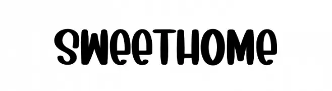
A playful, bold font with rounded edges and a hand-drawn look.
 Herunterladen 965 Downloads@WebFont
 -
( Fonts by Edric Studio www.creativefabrica.com/designer/edricstudio/ - Personal-use only. For commercial use please contact owner. )
A modern, geometric font with a sleek, futuristic design.
![GRACETIANS Cutting Frei Schriftart Herunterladen]() Herunterladen 965 Downloads@WebFont
Herunterladen 965 Downloads@WebFont -
( Fonts by Hanken Design Co. - Personal-use only. For commercial use please contact owner. )
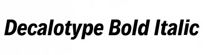
A bold, italicized font with a modern and dynamic style.
![Decalotype Bold Italic Frei Schriftart Herunterladen]() Herunterladen 965 Downloads@WebFont
Herunterladen 965 Downloads@WebFont -
( Måns Grebäck - www.mansgreback.com )
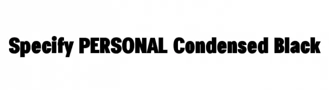
A bold, condensed font with a strong, modern style.
![Specify PERSONAL Condensed Black Frei Schriftart Herunterladen]() Herunterladen 965 Downloads@WebFont
Herunterladen 965 Downloads@WebFont -
( Free for personal use - https://www.behance.net/refineedge )
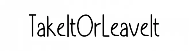
A playful, whimsical font with tall, narrow letters and rounded edges.
![TakeItOrLeaveIt Frei Schriftart Herunterladen]() Herunterladen 965 Downloads@WebFont
Herunterladen 965 Downloads@WebFont -
( Font by Jayvee D. Enaguas - grandchaos9000.deviantart.com )
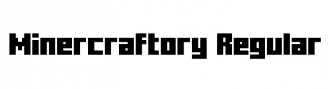
A bold, pixelated font with a retro, digital style.
![Minercraftory Regular Frei Schriftart Herunterladen]() Herunterladen 965 Downloads@WebFont
Herunterladen 965 Downloads@WebFont -
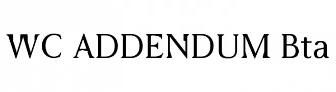
( Fonts by Christophe Feray - www.wcfonts.com )
A classic serif font with elegant strokes and sharp serifs, ideal for professional use.
![WC ADDENDUM Bta Frei Schriftart Herunterladen]() Herunterladen 965 Downloads@WebFont
Herunterladen 965 Downloads@WebFont -
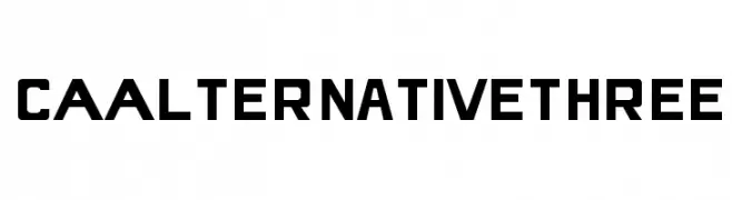
( Free for non-commercial use. For commercial use please buy a license. http://www.cape-arcona.com )
A bold, geometric font with a modern, industrial style.
![CAAlternativeThree Frei Schriftart Herunterladen]() Herunterladen 965 Downloads@WebFont
Herunterladen 965 Downloads@WebFont -
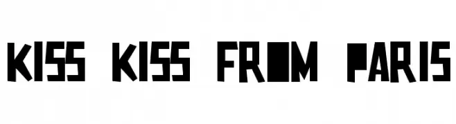
![Kiss Kiss From Paris Frei Schriftart Herunterladen]() Herunterladen 965 Downloads@WebFont
Herunterladen 965 Downloads@WebFont -
![SPTiberian Frei Schriftart Herunterladen]() Herunterladen 965 Downloads@WebFont
Herunterladen 965 Downloads@WebFont -
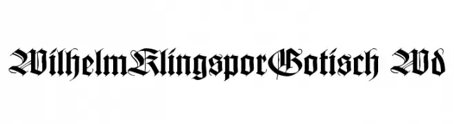
![WilhelmKlingsporGotisch Wd Frei Schriftart Herunterladen]() Herunterladen 965 Downloads@WebFont
Herunterladen 965 Downloads@WebFont -
( Fonts by Manfred Klein - manfred-klein.ina-mar.com )
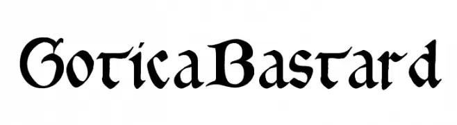
A bold, Gothic-inspired blackletter font with intricate details and a medieval aesthetic.
![GoticaBastard Frei Schriftart Herunterladen]() Herunterladen 965 Downloads@WebFont
Herunterladen 965 Downloads@WebFont -
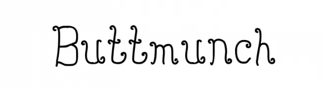
![Buttmunch Frei Schriftart Herunterladen]() Herunterladen 965 Downloads@WebFont
Herunterladen 965 Downloads@WebFont -
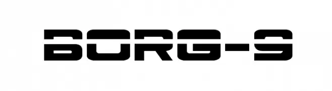
![Borg-9 Frei Schriftart Herunterladen]() Herunterladen 965 Downloads@WebFont
Herunterladen 965 Downloads@WebFont -
( Fonts by Khurasan )
A playful, bold font with a hand-drawn, whimsical style.
![Masala Puri Frei Schriftart Herunterladen]() Herunterladen 964 Downloads@WebFont
Herunterladen 964 Downloads@WebFont -
( Personal-use only. For commercial use please contact owner. )
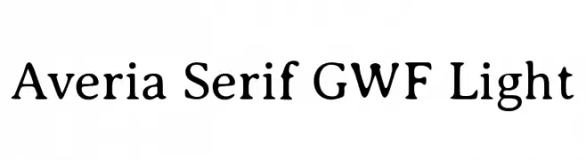
A modern serif font with rounded edges and a light weight, offering elegance and readability.
![Averia Serif GWF Light Frei Schriftart Herunterladen]() Herunterladen 964 Downloads@WebFont
Herunterladen 964 Downloads@WebFont -
( Fonts by Vladislav V. Dorosh, Yuri A.W. Shardt, Nikita Simmons, Aleksandr Andreev - Personal-use only. For commercial use please contact owner. )
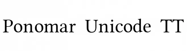
A classic serif font with elegant strokes and medium contrast, suitable for versatile applications.
![Ponomar Unicode TT Frei Schriftart Herunterladen]() Herunterladen 964 Downloads@WebFont
Herunterladen 964 Downloads@WebFont -
( Krafti Lab - Onur Cem TAN - www.kraftilab.com )
A geometric, segmented font inspired by digital displays.
![Seven Segment Regular Frei Schriftart Herunterladen]() Herunterladen 964 Downloads@WebFont
Herunterladen 964 Downloads@WebFont -
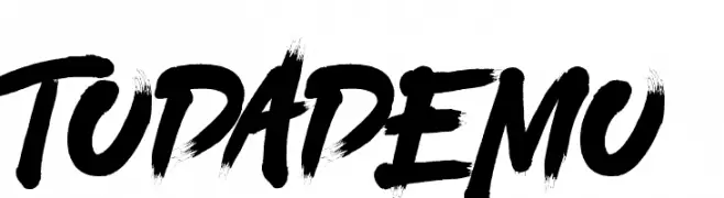
![TODA DEMO Frei Schriftart Herunterladen]() Herunterladen 964 Downloads@WebFont
Herunterladen 964 Downloads@WebFont -
( Fonts by a Neale Davidson - www.pixelsagas.com. Personal-use only. For commercial use please contact owner. )
A bold, modern font with thick, block-like characters and high contrast.
![Clark Bold Frei Schriftart Herunterladen]() Herunterladen 964 Downloads@WebFont
Herunterladen 964 Downloads@WebFont -
( Fonts by Bagus Budiyanto )
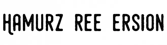
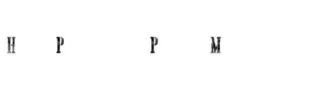
A bold, distressed font with a vintage, rustic appearance.
![Hamurz Free Version Frei Schriftart Herunterladen]() Herunterladen 964 Downloads@WebFont
Herunterladen 964 Downloads@WebFont -
![Hand Printing Press Meshed_demo Frei Schriftart Herunterladen]() Herunterladen 964 Downloads@WebFont
Herunterladen 964 Downloads@WebFont -
( Fonts by www.typodermicfonts.com - Ray Larabie )
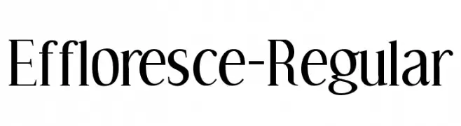
An elegant serif font with high contrast and sharp serifs, perfect for classic and refined designs.
![Effloresce-Regular Frei Schriftart Herunterladen]() Herunterladen 964 Downloads@WebFont
Herunterladen 964 Downloads@WebFont -
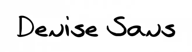
![Denise Sans Frei Schriftart Herunterladen]() Herunterladen 964 Downloads@WebFont
Herunterladen 964 Downloads@WebFont -
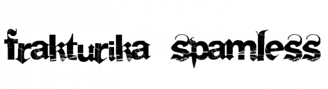
( Fonts by a Clement Nicolle - www.stereo-type.fr . Personal-use only. For commercial use please contact owner. )
A bold, distressed font with a vintage, grunge aesthetic.
![Frakturika Spamless Frei Schriftart Herunterladen]() Herunterladen 964 Downloads@WebFont
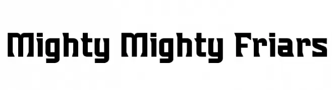
Herunterladen 964 Downloads@WebFont -
![Mighty Mighty Friars Frei Schriftart Herunterladen]() Herunterladen 964 Downloads@WebFont
Herunterladen 964 Downloads@WebFont -
( Fonts by Daniel Zadorozny - www.iconian.com - Free for personal use )
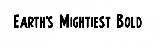
A bold, impactful font with thick lines and a strong presence, ideal for headlines.
![Earth's Mightiest Bold Frei Schriftart Herunterladen]() Herunterladen 964 Downloads@WebFont
Herunterladen 964 Downloads@WebFont -
![Beautiful Beasts Frei Schriftart Herunterladen]() Herunterladen 964 Downloads@WebFont
Herunterladen 964 Downloads@WebFont -
( Fonts by Matthew Welch - www.squaregear.net/fonts/ )
A modern, geometric sans-serif font with uniform stroke widths.
![Fudd Frei Schriftart Herunterladen]() Herunterladen 964 Downloads
Herunterladen 964 Downloads -
( Fonts by Mr Fisk - Mike Larsson - fontorama.net )
A bold, distressed font with a rugged, vintage appearance.
![Dr.Enoksen Frei Schriftart Herunterladen]() Herunterladen 964 Downloads@WebFont
Herunterladen 964 Downloads@WebFont -
( Fonts by Mr.Soon Design )
A playful, bold font with a rounded, hand-drawn style.
![Twin Bee Frei Schriftart Herunterladen]() Herunterladen 963 Downloads@WebFont
Herunterladen 963 Downloads@WebFont -
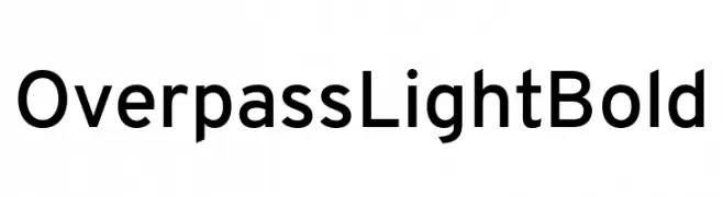
( Fonts by Red Hat )
A modern, geometric sans-serif font with uniform strokes and clear characters.
![Overpass Light Bold Frei Schriftart Herunterladen]() Herunterladen 963 Downloads@WebFont
Herunterladen 963 Downloads@WebFont -
( Fonts by ndiscovered - Personal-use only. For commercial use please contact owner. )
A modern, geometric font with clean lines and balanced proportions.
![Exo 2.0 Frei Schriftart Herunterladen]() Herunterladen 963 Downloads@WebFont
Herunterladen 963 Downloads@WebFont -
( Anke-Art - www.anke-art.de/ )
A bold, hand-drawn font with a brush-like texture and dynamic style.
![Paco Frei Schriftart Herunterladen]() Herunterladen 963 Downloads@WebFont
Herunterladen 963 Downloads@WebFont -
Schriftart von HammerBro101. For commercial use please contact the owner.
![New Super Koopa Bros Wii Regular Frei Schriftart Herunterladen]() Herunterladen 963 Downloads@WebFont
Herunterladen 963 Downloads@WebFont


Welche Schriften sind gerade am populärsten?
Poppins, Roboto, Montserrat, Open Sans und Lato sind wegen ihrer klaren Formen und breiten Einsetzbarkeit sehr gefragt – von Markenauftritt über Landingpages bis hin zu Postern.
Welche Fonts eignen sich für Logos?
Geometrische Sans‑Serifs (z. B. Poppins, Familien im Gotham‑Stil) sind ein häufiger Griff für sauberes, skalierbares Branding. Für eine persönlichere Note bleiben Scripts und Handschrift‑Stile beliebt. Kombinieren Sie einen prägnanten Headline‑Font mit einer neutralen Brotschrift für Wiedererkennung und Harmonie.
Wie oft wird die Top‑Liste aktualisiert?
Regelmäßig – basierend auf realen Downloads und Interaktionen. Schauen Sie öfter vorbei, um aufstrebende Favoriten früh zu entdecken.
💡 Tipp: Seite bookmarken – Trends wechseln schnell, und heutige Top‑Schriften inspirieren morgen vielleicht das Rebranding.