Willkommen bei den Top‑Schriften – hier treffen Beliebtheit und Qualität aufeinander. Das sind die in diesem Jahr am häufigsten heruntergeladenen und genutzten Fonts. Wenn Sie sichere Optionen für Logo, Web oder Social suchen, starten Sie hier.
Jeder Top‑Font überzeugt durch Balance, Lesbarkeit und Vielseitigkeit. Sie finden moderne Sans‑Serifs, elegante Scripts, Vintage‑Serifs und minimalistische Displays.
-
( Fonts by Kong Font - https://fontkong.com/ - Personal-use only. For commercial use please contact owner. )
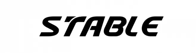
A bold, italicized font with a dynamic and modern style.
 Herunterladen 231 Downloads@WebFont
 -
( Fonts by Cadson Demak )
A bold, modern sans-serif font with clean lines and strong presence.
![Kanit-Bold Frei Schriftart Herunterladen]() Herunterladen 231 Downloads@WebFont
Herunterladen 231 Downloads@WebFont -
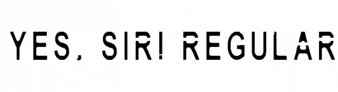
![Yes, Sir! Regular Frei Schriftart Herunterladen]() Herunterladen 231 Downloads@WebFont
Herunterladen 231 Downloads@WebFont -
( Dismantle Destroy - Matthew Tyndall - creativemarket.com/Dismantle )
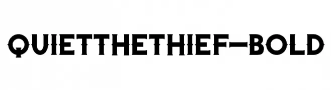
A bold, decorative font with unique embellishments and strong serifs.
![QuiettheThief-Bold Frei Schriftart Herunterladen]() Herunterladen 231 Downloads@WebFont
Herunterladen 231 Downloads@WebFont -
![ODINS SPEAR Frei Schriftart Herunterladen]() Herunterladen 231 Downloads@WebFont
Herunterladen 231 Downloads@WebFont -
-
( Fonts by Daniel Zadorozny - www.iconian.com )
An elegant, flowing script font with a classic calligraphic style.
![Rhalina Italic Frei Schriftart Herunterladen]() Herunterladen 231 Downloads@WebFont
Herunterladen 231 Downloads@WebFont -
( Free for a personal use. For a commercial use please visit www.kevinandamanda.com )
A whimsical handwritten font with lively, irregular strokes.
![Pea Snoflake Frei Schriftart Herunterladen]() Herunterladen 231 Downloads@WebFont
Herunterladen 231 Downloads@WebFont -
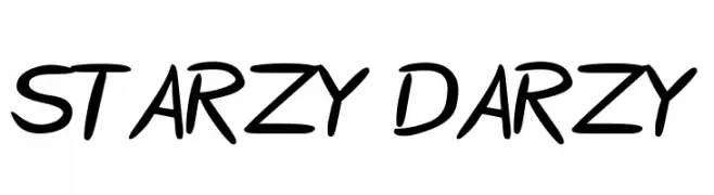
![Starzy Darzy Frei Schriftart Herunterladen]() Herunterladen 231 Downloads@WebFont
Herunterladen 231 Downloads@WebFont -
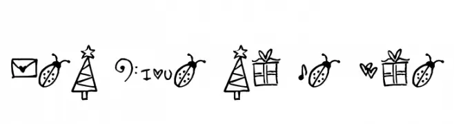
( Free for a personal use. For a commercial use please visit www.kevinandamanda.com )
A playful set of hand-drawn doodles with a whimsical and casual style.
![Pea Mumble and Jen Doodles Frei Schriftart Herunterladen]() Herunterladen 231 Downloads@WebFont
Herunterladen 231 Downloads@WebFont -
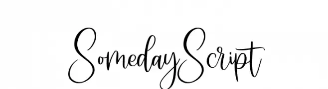
( Fonts by Type Factory )
Elegant handwritten script font.
![SomedayScript Frei Schriftart Herunterladen]() Herunterladen 231 Downloads@WebFont
Herunterladen 231 Downloads@WebFont


Welche Schriften sind gerade am populärsten?
Poppins, Roboto, Montserrat, Open Sans und Lato sind wegen ihrer klaren Formen und breiten Einsetzbarkeit sehr gefragt – von Markenauftritt über Landingpages bis hin zu Postern.
Welche Fonts eignen sich für Logos?
Geometrische Sans‑Serifs (z. B. Poppins, Familien im Gotham‑Stil) sind ein häufiger Griff für sauberes, skalierbares Branding. Für eine persönlichere Note bleiben Scripts und Handschrift‑Stile beliebt. Kombinieren Sie einen prägnanten Headline‑Font mit einer neutralen Brotschrift für Wiedererkennung und Harmonie.
Wie oft wird die Top‑Liste aktualisiert?
Regelmäßig – basierend auf realen Downloads und Interaktionen. Schauen Sie öfter vorbei, um aufstrebende Favoriten früh zu entdecken.
💡 Tipp: Seite bookmarken – Trends wechseln schnell, und heutige Top‑Schriften inspirieren morgen vielleicht das Rebranding.