Willkommen bei den Top‑Schriften – hier treffen Beliebtheit und Qualität aufeinander. Das sind die in diesem Jahr am häufigsten heruntergeladenen und genutzten Fonts. Wenn Sie sichere Optionen für Logo, Web oder Social suchen, starten Sie hier.
Jeder Top‑Font überzeugt durch Balance, Lesbarkeit und Vielseitigkeit. Sie finden moderne Sans‑Serifs, elegante Scripts, Vintage‑Serifs und minimalistische Displays.
-
( Noto is a trademark of Google Inc. Noto fonts are open source. All Noto fonts are published under the SIL Open Font License, Version 1.1 )
A modern, geometric sans-serif font with clear, legible shapes.
 Herunterladen 231 Downloads@WebFont
 -
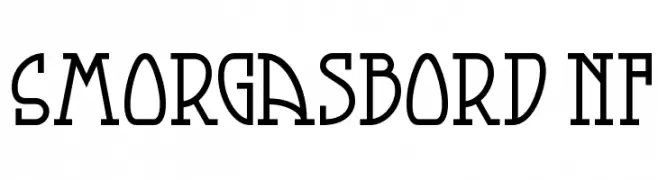
( Fonts by Nick Curtis - www.nicksfonts.com )
A bold, angular font with geometric and decorative elements, suitable for modern and vintage designs.
![Smorgasbord NF Frei Schriftart Herunterladen]() Herunterladen 231 Downloads@WebFont
Herunterladen 231 Downloads@WebFont -
( Fonts by Docallisme HAS )
A playful, hand-drawn style font with bold, energetic strokes.
![DILOVE Frei Schriftart Herunterladen]() Herunterladen 231 Downloads@WebFont
Herunterladen 231 Downloads@WebFont -
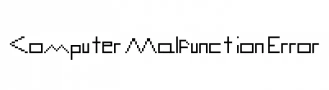
![Computer Malfunction Error Frei Schriftart Herunterladen]() Herunterladen 231 Downloads@WebFont
Herunterladen 231 Downloads@WebFont -
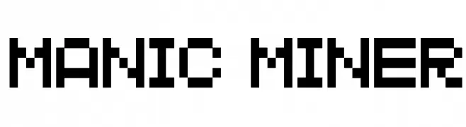
Schriftart von KiddieFonts. For commercial use please contact the owner.
![MANIC MINER Frei Schriftart Herunterladen]() Herunterladen 231 Downloads@WebFont
Herunterladen 231 Downloads@WebFont -
-
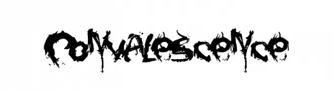
![Convalescence Frei Schriftart Herunterladen]() Herunterladen 231 Downloads@WebFont
Herunterladen 231 Downloads@WebFont -
( Fonts by Ahmad Syarif Afandi - https://delapan.studio - Personal-use only. For commercial use please contact owner. )
A playful, handwritten cursive font with a casual and energetic style.
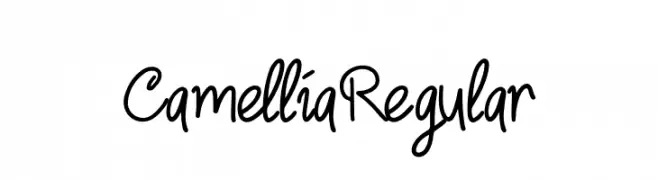
![CamelliaRegular Frei Schriftart Herunterladen]() Herunterladen 231 Downloads@WebFont
Herunterladen 231 Downloads@WebFont -
![Guede Demo Frei Schriftart Herunterladen]() Herunterladen 231 Downloads@WebFont
Herunterladen 231 Downloads@WebFont -
( Haris Prawoto - graphicriver.net/user/selawe/portfolio )
A stylish cursive font with flowing, interconnected letterforms.
![Harris Frei Schriftart Herunterladen]() Herunterladen 230 Downloads@WebFont
Herunterladen 230 Downloads@WebFont -
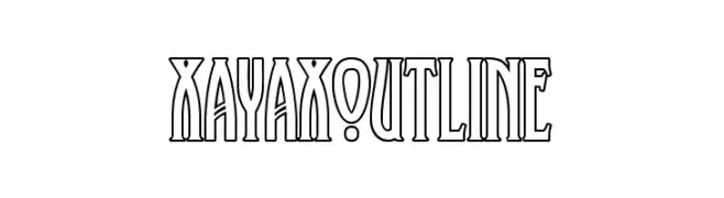
( Fonts by Peter Wiegel - www.peter-wiegel.de )
An elegant, outlined font with tall, narrow characters and a modern aesthetic.
![XAyaxOutline Frei Schriftart Herunterladen]() Herunterladen 230 Downloads@WebFont
Herunterladen 230 Downloads@WebFont


Welche Schriften sind gerade am populärsten?
Poppins, Roboto, Montserrat, Open Sans und Lato sind wegen ihrer klaren Formen und breiten Einsetzbarkeit sehr gefragt – von Markenauftritt über Landingpages bis hin zu Postern.
Welche Fonts eignen sich für Logos?
Geometrische Sans‑Serifs (z. B. Poppins, Familien im Gotham‑Stil) sind ein häufiger Griff für sauberes, skalierbares Branding. Für eine persönlichere Note bleiben Scripts und Handschrift‑Stile beliebt. Kombinieren Sie einen prägnanten Headline‑Font mit einer neutralen Brotschrift für Wiedererkennung und Harmonie.
Wie oft wird die Top‑Liste aktualisiert?
Regelmäßig – basierend auf realen Downloads und Interaktionen. Schauen Sie öfter vorbei, um aufstrebende Favoriten früh zu entdecken.
💡 Tipp: Seite bookmarken – Trends wechseln schnell, und heutige Top‑Schriften inspirieren morgen vielleicht das Rebranding.