Willkommen bei den Top‑Schriften – hier treffen Beliebtheit und Qualität aufeinander. Das sind die in diesem Jahr am häufigsten heruntergeladenen und genutzten Fonts. Wenn Sie sichere Optionen für Logo, Web oder Social suchen, starten Sie hier.
Jeder Top‑Font überzeugt durch Balance, Lesbarkeit und Vielseitigkeit. Sie finden moderne Sans‑Serifs, elegante Scripts, Vintage‑Serifs und minimalistische Displays.
-
 Herunterladen 230 Downloads@WebFont
 -
( Omen Type - Frederik Jackson )
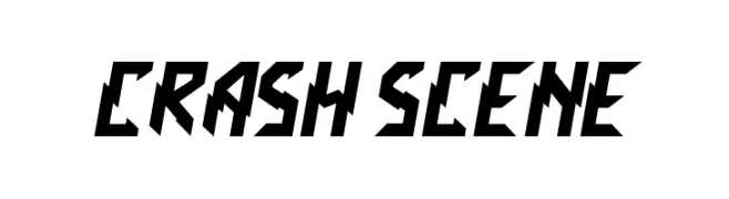
A bold, angular font with a dynamic and aggressive style.
![Crash Scene Frei Schriftart Herunterladen]() Herunterladen 230 Downloads@WebFont
Herunterladen 230 Downloads@WebFont -
( Fonts by Galdino Otten Fonts - www.galdinootten.com - Personal-use only. For commercial use please contact owner. )
A tall, slender, and modern font with a minimalist aesthetic.
![Thin Design Frei Schriftart Herunterladen]() Herunterladen 230 Downloads@WebFont
Herunterladen 230 Downloads@WebFont -
![SKLostUpstate Frei Schriftart Herunterladen]() Herunterladen 230 Downloads@WebFont
Herunterladen 230 Downloads@WebFont -
( Fonts by SDFonts - Ritzy )
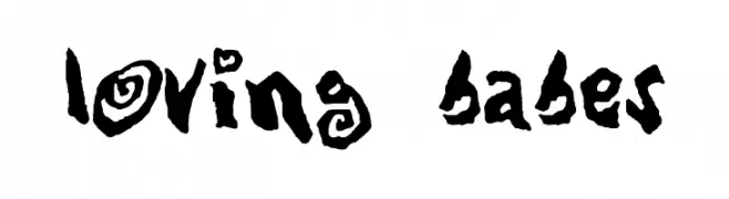
A bold, playful font with hand-drawn, whimsical characters and quirky embellishments.
![Loving Babes Frei Schriftart Herunterladen]() Herunterladen 230 Downloads@WebFont
Herunterladen 230 Downloads@WebFont -
-
( Fonts by Utopia - www.daleharris.com )
A bold, hand-drawn font with expressive strokes and a lively appearance.
![Pigae Frei Schriftart Herunterladen]() Herunterladen 230 Downloads@WebFont
Herunterladen 230 Downloads@WebFont -
( Fonts by Nick Curtis - www.nicksfonts.com )
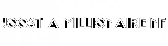
A bold, geometric font with a mix of solid and outlined elements, ideal for decorative use.
![Joost A Millionaire NF Frei Schriftart Herunterladen]() Herunterladen 230 Downloads@WebFont
Herunterladen 230 Downloads@WebFont -
( Fonts by weknow - Wino S Kadir )
A modern, geometric font with clean lines and a futuristic aesthetic.
![lifeforfun Frei Schriftart Herunterladen]() Herunterladen 230 Downloads@WebFont
Herunterladen 230 Downloads@WebFont -
( Fonts by Scratchones )
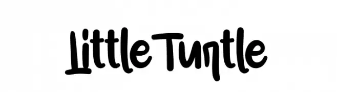
Playful handwritten font with rounded edges.
![Little Turtle Frei Schriftart Herunterladen]() Herunterladen 230 Downloads@WebFont
Herunterladen 230 Downloads@WebFont -
( Fonts by Roland Huse - rolandhuse.com )
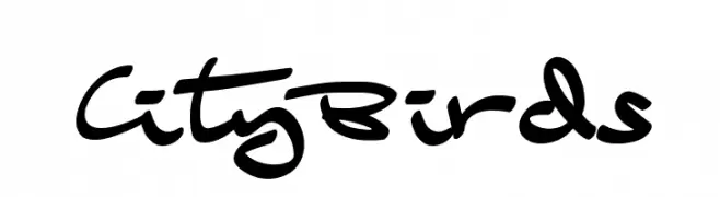
A playful, dynamic handwritten font with fluid strokes and lively character.
![CityBirds Frei Schriftart Herunterladen]() Herunterladen 230 Downloads@WebFont
Herunterladen 230 Downloads@WebFont


Welche Schriften sind gerade am populärsten?
Poppins, Roboto, Montserrat, Open Sans und Lato sind wegen ihrer klaren Formen und breiten Einsetzbarkeit sehr gefragt – von Markenauftritt über Landingpages bis hin zu Postern.
Welche Fonts eignen sich für Logos?
Geometrische Sans‑Serifs (z. B. Poppins, Familien im Gotham‑Stil) sind ein häufiger Griff für sauberes, skalierbares Branding. Für eine persönlichere Note bleiben Scripts und Handschrift‑Stile beliebt. Kombinieren Sie einen prägnanten Headline‑Font mit einer neutralen Brotschrift für Wiedererkennung und Harmonie.
Wie oft wird die Top‑Liste aktualisiert?
Regelmäßig – basierend auf realen Downloads und Interaktionen. Schauen Sie öfter vorbei, um aufstrebende Favoriten früh zu entdecken.
💡 Tipp: Seite bookmarken – Trends wechseln schnell, und heutige Top‑Schriften inspirieren morgen vielleicht das Rebranding.