Willkommen bei den Top‑Schriften – hier treffen Beliebtheit und Qualität aufeinander. Das sind die in diesem Jahr am häufigsten heruntergeladenen und genutzten Fonts. Wenn Sie sichere Optionen für Logo, Web oder Social suchen, starten Sie hier.
Jeder Top‑Font überzeugt durch Balance, Lesbarkeit und Vielseitigkeit. Sie finden moderne Sans‑Serifs, elegante Scripts, Vintage‑Serifs und minimalistische Displays.
-
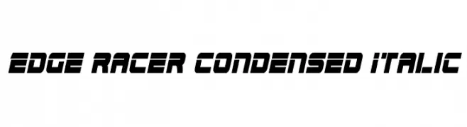
( Fonts by www.iconian.com - Personal-use only. For commercial use please contact owner. )
A bold, italicized, and condensed font with a futuristic and dynamic style.
 Herunterladen 229 Downloads@WebFont
 -
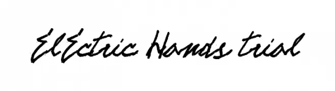
![ELECTRIC HANDS trial Frei Schriftart Herunterladen]() Herunterladen 229 Downloads@WebFont
Herunterladen 229 Downloads@WebFont -
( Fonts by Taylor Baybutt - ikon3.com - Free for personal use only )
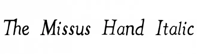
A charming handwritten italic font with a personal and informal style.
![The Missus Hand Italic Frei Schriftart Herunterladen]() Herunterladen 229 Downloads@WebFont
Herunterladen 229 Downloads@WebFont -
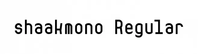
![shaakmono Regular Frei Schriftart Herunterladen]() Herunterladen 229 Downloads@WebFont
Herunterladen 229 Downloads@WebFont -
( Fonts by www.DigitalDreamDesign.net )
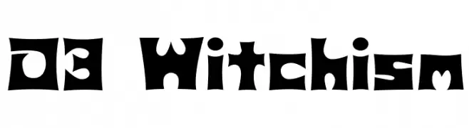
A bold, whimsical font with playful cut-out shapes and consistent width.
![D3 Witchism Frei Schriftart Herunterladen]() Herunterladen 229 Downloads@WebFont
Herunterladen 229 Downloads@WebFont -
-
( Fonts by ingoFonts - Ingo Zimmermann - Personal-use only. For commercial use please contact owner. )
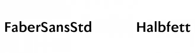
A bold, modern sans-serif font with a clean and balanced design.
![FaberSansStd-75Halbfett Frei Schriftart Herunterladen]() Herunterladen 229 Downloads@WebFont
Herunterladen 229 Downloads@WebFont -
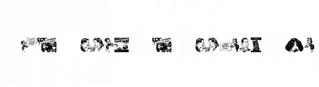
![Old Time Ad Dings Two Frei Schriftart Herunterladen]() Herunterladen 229 Downloads@WebFont
Herunterladen 229 Downloads@WebFont -
![Bit Line15 [sRB] Frei Schriftart Herunterladen]() Herunterladen 229 Downloads@WebFont
Herunterladen 229 Downloads@WebFont -
( Fonts by Wahyu Eka Prasetya - wepfont.com - Personal-use only. For commercial use please contact owner. )
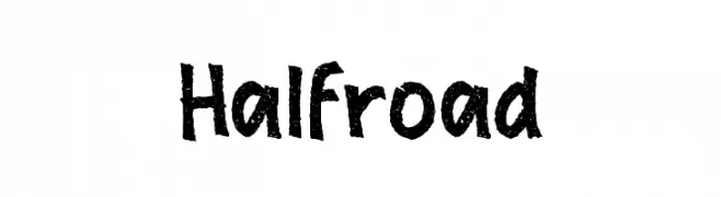
A bold, textured, hand-drawn font with a playful and casual style.
![Halfroad Frei Schriftart Herunterladen]() Herunterladen 229 Downloads@WebFont
Herunterladen 229 Downloads@WebFont -
( Fonts by Ahmad Syarif Afandi - https://delapan.studio - Personal-use only. For commercial use please contact owner. )
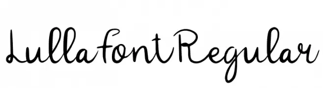
A playful handwritten font with fluid, organic letterforms and a casual style.
![LullaFontRegular Frei Schriftart Herunterladen]() Herunterladen 229 Downloads@WebFont
Herunterladen 229 Downloads@WebFont
![Bit Line15 [sRB] Frei Schriftart Herunterladen](https://d144mzi0q5mijx.cloudfront.net/img/B/I/Bit-Line15-sRB.webp)
Welche Schriften sind gerade am populärsten?
Poppins, Roboto, Montserrat, Open Sans und Lato sind wegen ihrer klaren Formen und breiten Einsetzbarkeit sehr gefragt – von Markenauftritt über Landingpages bis hin zu Postern.
Welche Fonts eignen sich für Logos?
Geometrische Sans‑Serifs (z. B. Poppins, Familien im Gotham‑Stil) sind ein häufiger Griff für sauberes, skalierbares Branding. Für eine persönlichere Note bleiben Scripts und Handschrift‑Stile beliebt. Kombinieren Sie einen prägnanten Headline‑Font mit einer neutralen Brotschrift für Wiedererkennung und Harmonie.
Wie oft wird die Top‑Liste aktualisiert?
Regelmäßig – basierend auf realen Downloads und Interaktionen. Schauen Sie öfter vorbei, um aufstrebende Favoriten früh zu entdecken.
💡 Tipp: Seite bookmarken – Trends wechseln schnell, und heutige Top‑Schriften inspirieren morgen vielleicht das Rebranding.