Willkommen bei den Top‑Schriften – hier treffen Beliebtheit und Qualität aufeinander. Das sind die in diesem Jahr am häufigsten heruntergeladenen und genutzten Fonts. Wenn Sie sichere Optionen für Logo, Web oder Social suchen, starten Sie hier.
Jeder Top‑Font überzeugt durch Balance, Lesbarkeit und Vielseitigkeit. Sie finden moderne Sans‑Serifs, elegante Scripts, Vintage‑Serifs und minimalistische Displays.
-
Schriftart von NicholasJudy456. For commercial use please contact the owner.
( Here's More of the House Fonts )
A bold, distressed font with a grunge, hand-painted style.
 Herunterladen 228 Downloads@WebFont
 -
( Fonts by uatype.faithweb.com - UnAuthorized Type )
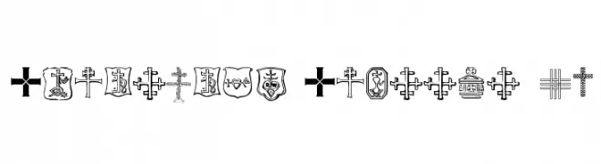
A symbol font with diverse Christian cross designs and religious motifs.
![Christian Crosses IV Frei Schriftart Herunterladen]() Herunterladen 228 Downloads@WebFont
Herunterladen 228 Downloads@WebFont -
( Fonts by Chank Co. - www.chank.com )
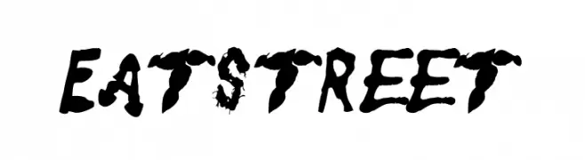
A bold, grunge-style font with a distressed, brush-painted appearance.
![Eatstreet Frei Schriftart Herunterladen]() Herunterladen 228 Downloads@WebFont
Herunterladen 228 Downloads@WebFont -
Schriftart von spideraysfonts. For commercial use please contact the owner.
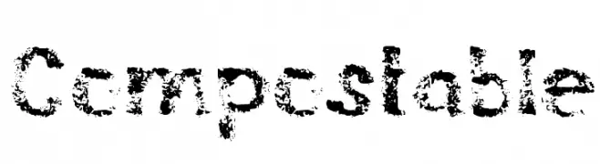
![Compostable Frei Schriftart Herunterladen]() Herunterladen 228 Downloads@WebFont
Herunterladen 228 Downloads@WebFont -
Schriftart von typotopia. For commercial use please contact the owner.
( Fonts bt Typotopia - Typotopia.co - Personal Use Only, for Commercial Use, please contact us )
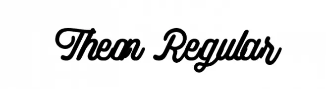
A flowing, cursive font with elegant interconnected characters.
![Theon Regular Frei Schriftart Herunterladen]() Herunterladen 228 Downloads@WebFont
Herunterladen 228 Downloads@WebFont -
-
( Fonts by a Neale Davidson - www.pixelsagas.com. Personal-use only. For commercial use please contact owner. )
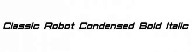
A futuristic, bold, and italicized font with a condensed, modern design.
![Classic Robot Condensed Bold Italic Frei Schriftart Herunterladen]() Herunterladen 228 Downloads@WebFont
Herunterladen 228 Downloads@WebFont -
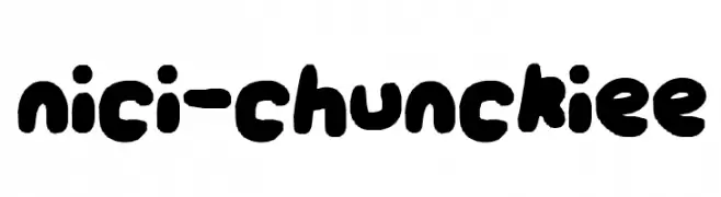
![nici-chunckiee Frei Schriftart Herunterladen]() Herunterladen 228 Downloads@WebFont
Herunterladen 228 Downloads@WebFont -
( Fonts by Eknoji Studio - www.eknojistudio.com - Personal-use only. For commercial use please contact owner. )
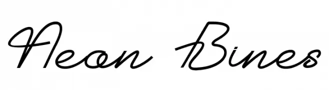
A modern cursive font with elegant, flowing lines and a handwritten style.
![Neon Bines Frei Schriftart Herunterladen]() Herunterladen 228 Downloads@WebFont
Herunterladen 228 Downloads@WebFont -
( Fonts by Font People - Personal-use only. For commercial use please contact owner. )
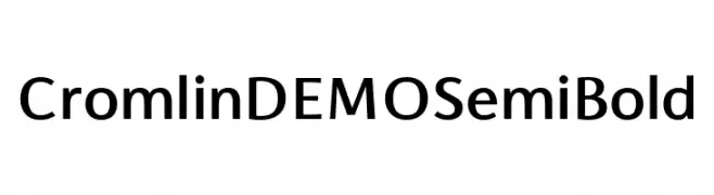
A modern, semi-bold sans-serif font with excellent readability and balanced proportions.
![Cromlin DEMO SemiBold Frei Schriftart Herunterladen]() Herunterladen 228 Downloads@WebFont
Herunterladen 228 Downloads@WebFont -
( Free for a personal use. For a commercial use please visit www.kevinandamanda.com )
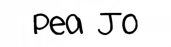
A playful, handwritten font with a casual and friendly style.
![Pea Jo Frei Schriftart Herunterladen]() Herunterladen 228 Downloads@WebFont
Herunterladen 228 Downloads@WebFont
Welche Schriften sind gerade am populärsten?
Poppins, Roboto, Montserrat, Open Sans und Lato sind wegen ihrer klaren Formen und breiten Einsetzbarkeit sehr gefragt – von Markenauftritt über Landingpages bis hin zu Postern.
Welche Fonts eignen sich für Logos?
Geometrische Sans‑Serifs (z. B. Poppins, Familien im Gotham‑Stil) sind ein häufiger Griff für sauberes, skalierbares Branding. Für eine persönlichere Note bleiben Scripts und Handschrift‑Stile beliebt. Kombinieren Sie einen prägnanten Headline‑Font mit einer neutralen Brotschrift für Wiedererkennung und Harmonie.
Wie oft wird die Top‑Liste aktualisiert?
Regelmäßig – basierend auf realen Downloads und Interaktionen. Schauen Sie öfter vorbei, um aufstrebende Favoriten früh zu entdecken.
💡 Tipp: Seite bookmarken – Trends wechseln schnell, und heutige Top‑Schriften inspirieren morgen vielleicht das Rebranding.