Willkommen bei den Top‑Schriften – hier treffen Beliebtheit und Qualität aufeinander. Das sind die in diesem Jahr am häufigsten heruntergeladenen und genutzten Fonts. Wenn Sie sichere Optionen für Logo, Web oder Social suchen, starten Sie hier.
Jeder Top‑Font überzeugt durch Balance, Lesbarkeit und Vielseitigkeit. Sie finden moderne Sans‑Serifs, elegante Scripts, Vintage‑Serifs und minimalistische Displays.
-
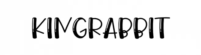
( Fonts by Airotype Studio )
A playful, hand-drawn font with decorative elements and a bold, friendly style.
 Herunterladen 228 Downloads@WebFont
 -
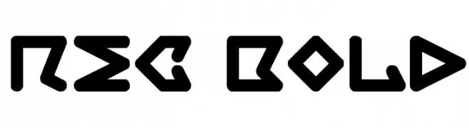
( Fonts by Niels Bonnevie )
A bold, geometric font with a futuristic and angular design.
![rec Bold Frei Schriftart Herunterladen]() Herunterladen 228 Downloads@WebFont
Herunterladen 228 Downloads@WebFont -
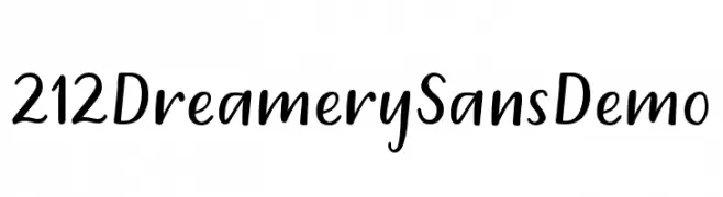
( Fonts by 212 fonts - Elizabeth - Personal-use only. For commercial use please contact owner. )
A playful, handwritten-style font with smooth, rounded strokes.
![212 Dreamery Sans Demo Frei Schriftart Herunterladen]() Herunterladen 228 Downloads@WebFont
Herunterladen 228 Downloads@WebFont -
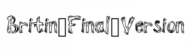
( Fonts by Brittany Shemmeld )
A bold, hand-drawn font with a playful and dynamic style.
![Britin_Final_Version Frei Schriftart Herunterladen]() Herunterladen 228 Downloads@WebFont
Herunterladen 228 Downloads@WebFont -
![Bigntall Frei Schriftart Herunterladen]() Herunterladen 228 Downloads@WebFont
Herunterladen 228 Downloads@WebFont -
-
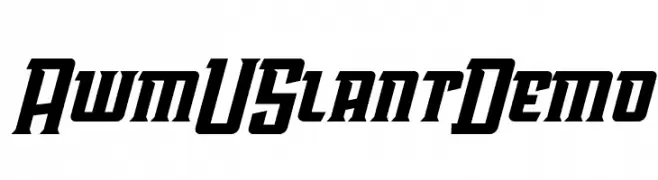
( Fonts by Toko Laris Djaja - Dicky Syafaat - Personal-use only. For commercial use please contact owner. )
A bold, slanted font with sharp angles and a dynamic presence.
![AwmU Slant Demo Frei Schriftart Herunterladen]() Herunterladen 228 Downloads@WebFont
Herunterladen 228 Downloads@WebFont -
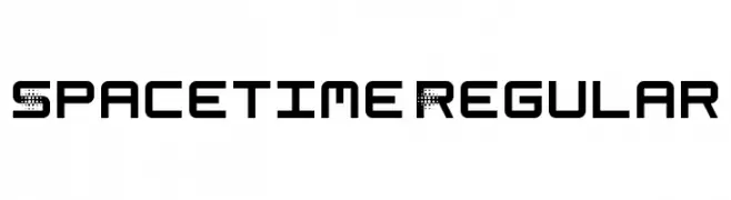
( Aquaflame Fonts - Aqua Flame - aquaflameweb.weebly.com )
A futuristic, geometric font with a pixelated effect on select characters.
![Spacetime Regular Frei Schriftart Herunterladen]() Herunterladen 228 Downloads@WebFont
Herunterladen 228 Downloads@WebFont -
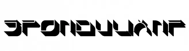
( Fonts by Nick Curtis - www.nicksfonts.com )
A bold, geometric font with a futuristic and angular design.
![SpondulixNF Frei Schriftart Herunterladen]() Herunterladen 228 Downloads@WebFont
Herunterladen 228 Downloads@WebFont -
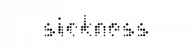
( Derik Revenge )
A playful, modern font made from small, evenly spaced dots.
![--sickness-- Frei Schriftart Herunterladen]() Herunterladen 228 Downloads@WebFont
Herunterladen 228 Downloads@WebFont -
( Free for personal use - byjanam.blogspot.com )
![Paper Banner Black Frei Schriftart Herunterladen]() Herunterladen 228 Downloads@WebFont
Herunterladen 228 Downloads@WebFont

Welche Schriften sind gerade am populärsten?
Poppins, Roboto, Montserrat, Open Sans und Lato sind wegen ihrer klaren Formen und breiten Einsetzbarkeit sehr gefragt – von Markenauftritt über Landingpages bis hin zu Postern.
Welche Fonts eignen sich für Logos?
Geometrische Sans‑Serifs (z. B. Poppins, Familien im Gotham‑Stil) sind ein häufiger Griff für sauberes, skalierbares Branding. Für eine persönlichere Note bleiben Scripts und Handschrift‑Stile beliebt. Kombinieren Sie einen prägnanten Headline‑Font mit einer neutralen Brotschrift für Wiedererkennung und Harmonie.
Wie oft wird die Top‑Liste aktualisiert?
Regelmäßig – basierend auf realen Downloads und Interaktionen. Schauen Sie öfter vorbei, um aufstrebende Favoriten früh zu entdecken.
💡 Tipp: Seite bookmarken – Trends wechseln schnell, und heutige Top‑Schriften inspirieren morgen vielleicht das Rebranding.