Willkommen bei den Top‑Schriften – hier treffen Beliebtheit und Qualität aufeinander. Das sind die in diesem Jahr am häufigsten heruntergeladenen und genutzten Fonts. Wenn Sie sichere Optionen für Logo, Web oder Social suchen, starten Sie hier.
Jeder Top‑Font überzeugt durch Balance, Lesbarkeit und Vielseitigkeit. Sie finden moderne Sans‑Serifs, elegante Scripts, Vintage‑Serifs und minimalistische Displays.
-
( Fonts by Font People - Personal-use only. For commercial use please contact owner. )
A bold, italic font with a dynamic and modern style.
 Herunterladen 227 Downloads@WebFont
 -
![VTC ScreamItLoud Regular Frei Schriftart Herunterladen]() Herunterladen 227 Downloads@WebFont
Herunterladen 227 Downloads@WebFont -
![Factory LJDS Frei Schriftart Herunterladen]() Herunterladen 227 Downloads@WebFont
Herunterladen 227 Downloads@WebFont -
![JD Stripex Frei Schriftart Herunterladen]() Herunterladen 227 Downloads@WebFont
Herunterladen 227 Downloads@WebFont -
![Dont Click Me DEMO Regular Frei Schriftart Herunterladen]() Herunterladen 227 Downloads@WebFont
Herunterladen 227 Downloads@WebFont -
-
( Fonts by Manfred Klein. Free for private and charity use. Free for commercial with donation to organizations )
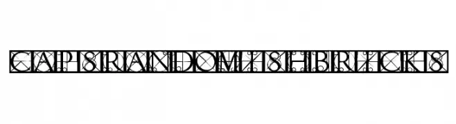
An ornate, geometric font with intricate patterns and uppercase letters.
![CapsRandomishBricks Frei Schriftart Herunterladen]() Herunterladen 227 Downloads@WebFont
Herunterladen 227 Downloads@WebFont -
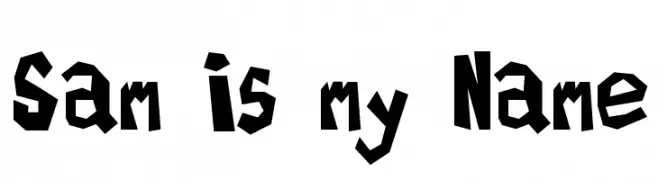
![Sam is my Name Frei Schriftart Herunterladen]() Herunterladen 227 Downloads@WebFont
Herunterladen 227 Downloads@WebFont -
( Fonts by www.stimuleyefonts.com )
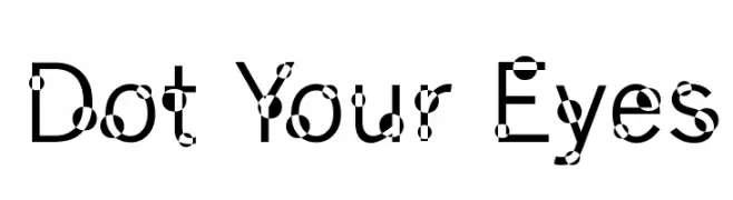
A playful sans-serif font with decorative dots on each character.
![Dot Your Eyes Frei Schriftart Herunterladen]() Herunterladen 227 Downloads@WebFont
Herunterladen 227 Downloads@WebFont -
( Fonts by Iconian Fonts )
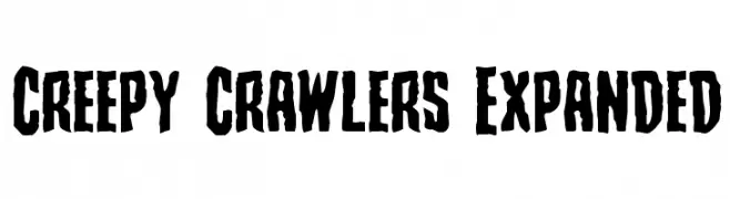
A bold, jagged font with an eerie, hand-carved appearance.
![Creepy Crawlers Expanded Frei Schriftart Herunterladen]() Herunterladen 227 Downloads@WebFont
Herunterladen 227 Downloads@WebFont -
( Fonts by Peter Stanton )
A distressed, textured font with a rugged, vintage aesthetic.
![Graveyard Shift Frei Schriftart Herunterladen]() Herunterladen 227 Downloads@WebFont
Herunterladen 227 Downloads@WebFont

Welche Schriften sind gerade am populärsten?
Poppins, Roboto, Montserrat, Open Sans und Lato sind wegen ihrer klaren Formen und breiten Einsetzbarkeit sehr gefragt – von Markenauftritt über Landingpages bis hin zu Postern.
Welche Fonts eignen sich für Logos?
Geometrische Sans‑Serifs (z. B. Poppins, Familien im Gotham‑Stil) sind ein häufiger Griff für sauberes, skalierbares Branding. Für eine persönlichere Note bleiben Scripts und Handschrift‑Stile beliebt. Kombinieren Sie einen prägnanten Headline‑Font mit einer neutralen Brotschrift für Wiedererkennung und Harmonie.
Wie oft wird die Top‑Liste aktualisiert?
Regelmäßig – basierend auf realen Downloads und Interaktionen. Schauen Sie öfter vorbei, um aufstrebende Favoriten früh zu entdecken.
💡 Tipp: Seite bookmarken – Trends wechseln schnell, und heutige Top‑Schriften inspirieren morgen vielleicht das Rebranding.