Willkommen bei den Top‑Schriften – hier treffen Beliebtheit und Qualität aufeinander. Das sind die in diesem Jahr am häufigsten heruntergeladenen und genutzten Fonts. Wenn Sie sichere Optionen für Logo, Web oder Social suchen, starten Sie hier.
Jeder Top‑Font überzeugt durch Balance, Lesbarkeit und Vielseitigkeit. Sie finden moderne Sans‑Serifs, elegante Scripts, Vintage‑Serifs und minimalistische Displays.
-
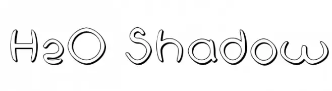
( Fonts by Fernando Haro - defharo.com )
A playful, shadowed font with rounded, bold characters.
 Herunterladen 226 Downloads@WebFont
 -
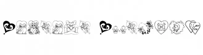
( Fonts by www.houseoflime.com )
Whimsical, love-themed decorative font with illustrated glyphs.
![Someone Special Frei Schriftart Herunterladen]() Herunterladen 226 Downloads@WebFont
Herunterladen 226 Downloads@WebFont -
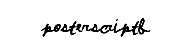
( Fonts by a Max Infeld - XEROGRAPHER FONTS - xerographer.blogspot.com . Personal-use only. For commercial use please contact owner. )
A bold, cursive handwritten font with a fluid and connected style.
![PosterScriptB Frei Schriftart Herunterladen]() Herunterladen 226 Downloads@WebFont
Herunterladen 226 Downloads@WebFont -
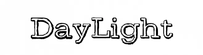
( Fonts by Luedecke Design Font Co. - ldfonts.weebly.com )
A bold, outlined font with a hand-drawn, artistic style.
![DayLight Frei Schriftart Herunterladen]() Herunterladen 226 Downloads@WebFont
Herunterladen 226 Downloads@WebFont -
( Fonts by Apostrophic Lab )
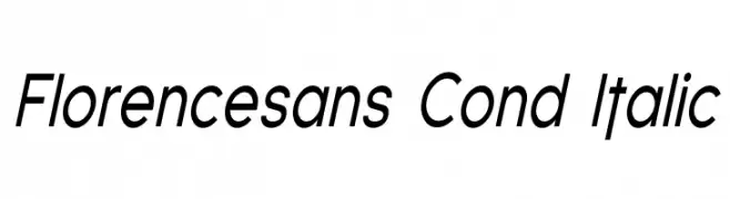
A modern, condensed, italic sans-serif font with clean lines and medium contrast.
![Florencesans Cond Italic Frei Schriftart Herunterladen]() Herunterladen 226 Downloads@WebFont
Herunterladen 226 Downloads@WebFont -
-
( Fonts by Peax Webdesign - www.peax-webdesign.com. Personal-use only. For commercial use please contact owner. )
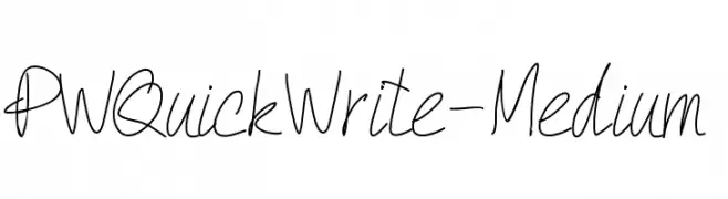
A casual, handwritten font with a fluid and spontaneous style.
![PWQuickWrite-Medium Frei Schriftart Herunterladen]() Herunterladen 226 Downloads@WebFont
Herunterladen 226 Downloads@WebFont -
( Fonts by Poemhaiku - Huong Le Thi Thu - www.behance.net/poemhaiku )
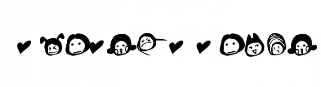
Hand-drawn, playful symbol font with hearts and cartoon faces.
![Simplesymbol Frei Schriftart Herunterladen]() Herunterladen 226 Downloads@WebFont
Herunterladen 226 Downloads@WebFont -
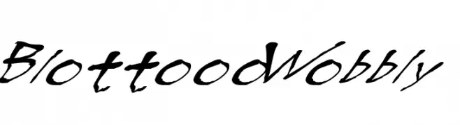
![BlottoooWobbly Frei Schriftart Herunterladen]() Herunterladen 226 Downloads@WebFont
Herunterladen 226 Downloads@WebFont -
( Fonts by Em Nazar )
A playful, bold font with rounded, hand-drawn strokes.
![Westau Frei Schriftart Herunterladen]() Herunterladen 226 Downloads@WebFont
Herunterladen 226 Downloads@WebFont -
( Fonts by Kong Font - https://fontkong.com/ - Personal-use only. For commercial use please contact owner. )
A bold, dynamic italic font with strong, slanted letterforms.
![Mutchin Italic Frei Schriftart Herunterladen]() Herunterladen 226 Downloads@WebFont
Herunterladen 226 Downloads@WebFont

Welche Schriften sind gerade am populärsten?
Poppins, Roboto, Montserrat, Open Sans und Lato sind wegen ihrer klaren Formen und breiten Einsetzbarkeit sehr gefragt – von Markenauftritt über Landingpages bis hin zu Postern.
Welche Fonts eignen sich für Logos?
Geometrische Sans‑Serifs (z. B. Poppins, Familien im Gotham‑Stil) sind ein häufiger Griff für sauberes, skalierbares Branding. Für eine persönlichere Note bleiben Scripts und Handschrift‑Stile beliebt. Kombinieren Sie einen prägnanten Headline‑Font mit einer neutralen Brotschrift für Wiedererkennung und Harmonie.
Wie oft wird die Top‑Liste aktualisiert?
Regelmäßig – basierend auf realen Downloads und Interaktionen. Schauen Sie öfter vorbei, um aufstrebende Favoriten früh zu entdecken.
💡 Tipp: Seite bookmarken – Trends wechseln schnell, und heutige Top‑Schriften inspirieren morgen vielleicht das Rebranding.