Willkommen bei den Top‑Schriften – hier treffen Beliebtheit und Qualität aufeinander. Das sind die in diesem Jahr am häufigsten heruntergeladenen und genutzten Fonts. Wenn Sie sichere Optionen für Logo, Web oder Social suchen, starten Sie hier.
Jeder Top‑Font überzeugt durch Balance, Lesbarkeit und Vielseitigkeit. Sie finden moderne Sans‑Serifs, elegante Scripts, Vintage‑Serifs und minimalistische Displays.
-
 Herunterladen 226 Downloads@WebFont
 -
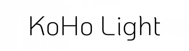
( Copyright 2018 The KoHo Project Authors (https://github.com/cadsondemak/Koho) )
A modern, light sans-serif font with clean lines and low contrast.
![KoHo Light Frei Schriftart Herunterladen]() Herunterladen 226 Downloads@WebFont
Herunterladen 226 Downloads@WebFont -
Schriftart von inGeniousGuru. For commercial use please contact the owner.
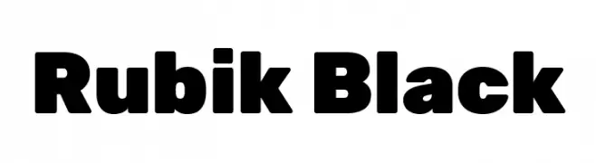
( Rubik font )
A bold, modern font with rounded edges and uniform weight.
![Rubik Black Frei Schriftart Herunterladen]() Herunterladen 226 Downloads@WebFont
Herunterladen 226 Downloads@WebFont -
( Fonts by Manfred Klein - manfred-klein.ina-mar.com )
A modern serif font with geometric shapes and high contrast.
![Fragmenta Frei Schriftart Herunterladen]() Herunterladen 226 Downloads@WebFont
Herunterladen 226 Downloads@WebFont -
![Rishangle Frei Schriftart Herunterladen]() Herunterladen 226 Downloads@WebFont
Herunterladen 226 Downloads@WebFont -
-
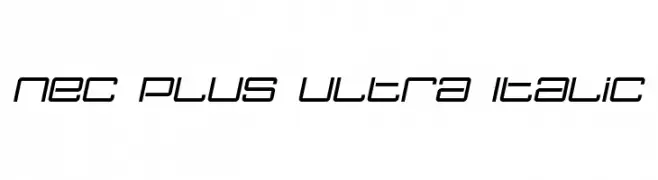
( Fonts by dustBUST - Andreas Nylin )
A futuristic, italicized font with geometric lines and a sleek, modern appearance.
![Nec plus ultra Italic Frei Schriftart Herunterladen]() Herunterladen 226 Downloads@WebFont
Herunterladen 226 Downloads@WebFont -
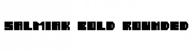
![Salmiak Bold Rounded Frei Schriftart Herunterladen]() Herunterladen 226 Downloads@WebFont
Herunterladen 226 Downloads@WebFont -
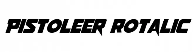
( Fonts by Daniel Zadorozny - www.iconian.com )
A bold, italicized font with sharp, angular edges and a dynamic, futuristic style.
![Pistoleer Rotalic Frei Schriftart Herunterladen]() Herunterladen 226 Downloads@WebFont
Herunterladen 226 Downloads@WebFont -
( Fonts by a Max Infeld - XEROGRAPHER FONTS - xerographer.blogspot.com . Personal-use only. For commercial use please contact owner. )
A playful, icy-themed font with bold, rounded letters adorned with icicle drips.
![FrostyHoliday Frei Schriftart Herunterladen]() Herunterladen 226 Downloads@WebFont
Herunterladen 226 Downloads@WebFont -
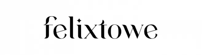
( Fonts by VampStudio - Personal-use only. For commercial use please contact owner. )
A high-contrast, elegant serif font with sharp serifs and refined curves.
![felixtowe Frei Schriftart Herunterladen]() Herunterladen 226 Downloads@WebFont
Herunterladen 226 Downloads@WebFont


Welche Schriften sind gerade am populärsten?
Poppins, Roboto, Montserrat, Open Sans und Lato sind wegen ihrer klaren Formen und breiten Einsetzbarkeit sehr gefragt – von Markenauftritt über Landingpages bis hin zu Postern.
Welche Fonts eignen sich für Logos?
Geometrische Sans‑Serifs (z. B. Poppins, Familien im Gotham‑Stil) sind ein häufiger Griff für sauberes, skalierbares Branding. Für eine persönlichere Note bleiben Scripts und Handschrift‑Stile beliebt. Kombinieren Sie einen prägnanten Headline‑Font mit einer neutralen Brotschrift für Wiedererkennung und Harmonie.
Wie oft wird die Top‑Liste aktualisiert?
Regelmäßig – basierend auf realen Downloads und Interaktionen. Schauen Sie öfter vorbei, um aufstrebende Favoriten früh zu entdecken.
💡 Tipp: Seite bookmarken – Trends wechseln schnell, und heutige Top‑Schriften inspirieren morgen vielleicht das Rebranding.