Willkommen bei den Top‑Schriften – hier treffen Beliebtheit und Qualität aufeinander. Das sind die in diesem Jahr am häufigsten heruntergeladenen und genutzten Fonts. Wenn Sie sichere Optionen für Logo, Web oder Social suchen, starten Sie hier.
Jeder Top‑Font überzeugt durch Balance, Lesbarkeit und Vielseitigkeit. Sie finden moderne Sans‑Serifs, elegante Scripts, Vintage‑Serifs und minimalistische Displays.
-
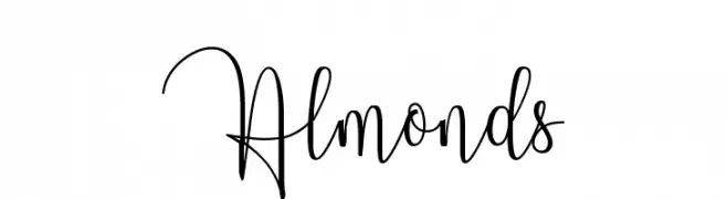
( Pollem Studio - Muhammad Nur - www.creativefabrica.com/designer/polem/ref/2050/ )
An elegant, flowing script font with graceful loops and cursive style.
 Herunterladen 226 Downloads@WebFont
 -
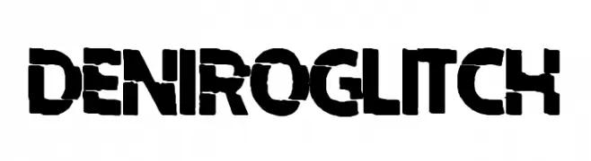
( Fonts by Woodcutter )
A bold, glitch-effect font with a modern, edgy style.
![Deniro Glitch Frei Schriftart Herunterladen]() Herunterladen 226 Downloads@WebFont
Herunterladen 226 Downloads@WebFont -
![The Miracle Frei Schriftart Herunterladen]() Herunterladen 225 Downloads@WebFont
Herunterladen 225 Downloads@WebFont -
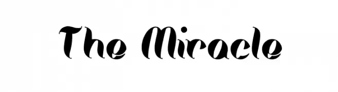
( Fonts by Geronimo Fonts - Personal-use only. For commercial use please contact owner. )
A bold, brush-like font with dynamic strokes and a playful, artistic style.
![i do not trust you Frei Schriftart Herunterladen]() Herunterladen 225 Downloads@WebFont
Herunterladen 225 Downloads@WebFont -
![Retardo Splat Frei Schriftart Herunterladen]() Herunterladen 225 Downloads@WebFont
Herunterladen 225 Downloads@WebFont -
-
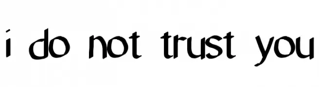
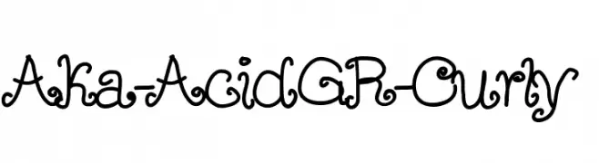
( Fonts by www.aka-acid.com )
A whimsical and decorative font with curly, ornate letterforms.
![Aka-AcidGR-Curly Frei Schriftart Herunterladen]() Herunterladen 225 Downloads@WebFont
Herunterladen 225 Downloads@WebFont -
( Fonts by www.fontdiner.com )
A bold, jagged font with sharp, angular edges for a dynamic look.
![Xerker Frei Schriftart Herunterladen]() Herunterladen 225 Downloads@WebFont
Herunterladen 225 Downloads@WebFont -
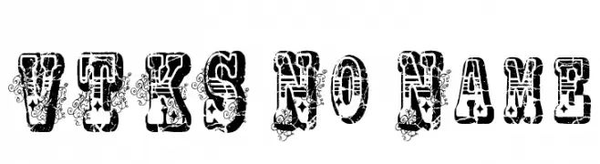
( Fonts by Douglas Vitkauskas - www.vtksdesign.com. Personal-use only. For commercial use please contact owner. )
A bold, decorative font with a distressed, grunge texture.
![VTKS No Name Frei Schriftart Herunterladen]() Herunterladen 225 Downloads@WebFont
Herunterladen 225 Downloads@WebFont -
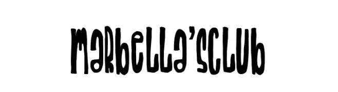
( Fonts by Woodcutter )
A bold, playful font with elongated, irregular letterforms and a whimsical, artistic style.
![Marbella's Club Frei Schriftart Herunterladen]() Herunterladen 225 Downloads@WebFont
Herunterladen 225 Downloads@WebFont -
( Fonts by Toko Laris Djaja )
A bold, decorative font with a unique dotted pattern, ideal for creative projects.
![Fish Demo Frei Schriftart Herunterladen]() Herunterladen 225 Downloads@WebFont
Herunterladen 225 Downloads@WebFont


Welche Schriften sind gerade am populärsten?
Poppins, Roboto, Montserrat, Open Sans und Lato sind wegen ihrer klaren Formen und breiten Einsetzbarkeit sehr gefragt – von Markenauftritt über Landingpages bis hin zu Postern.
Welche Fonts eignen sich für Logos?
Geometrische Sans‑Serifs (z. B. Poppins, Familien im Gotham‑Stil) sind ein häufiger Griff für sauberes, skalierbares Branding. Für eine persönlichere Note bleiben Scripts und Handschrift‑Stile beliebt. Kombinieren Sie einen prägnanten Headline‑Font mit einer neutralen Brotschrift für Wiedererkennung und Harmonie.
Wie oft wird die Top‑Liste aktualisiert?
Regelmäßig – basierend auf realen Downloads und Interaktionen. Schauen Sie öfter vorbei, um aufstrebende Favoriten früh zu entdecken.
💡 Tipp: Seite bookmarken – Trends wechseln schnell, und heutige Top‑Schriften inspirieren morgen vielleicht das Rebranding.