Willkommen bei den Top‑Schriften – hier treffen Beliebtheit und Qualität aufeinander. Das sind die in diesem Jahr am häufigsten heruntergeladenen und genutzten Fonts. Wenn Sie sichere Optionen für Logo, Web oder Social suchen, starten Sie hier.
Jeder Top‑Font überzeugt durch Balance, Lesbarkeit und Vielseitigkeit. Sie finden moderne Sans‑Serifs, elegante Scripts, Vintage‑Serifs und minimalistische Displays.
-
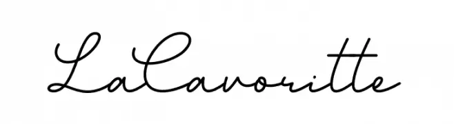
( Fonts by Alvaro Ariel - Personal-use only. For commercial use please contact owner. )
A flowing, cursive script font with a natural handwriting style.
 Herunterladen 225 Downloads@WebFont
 -
![Fat Brush Frei Schriftart Herunterladen]() Herunterladen 225 Downloads@WebFont
Herunterladen 225 Downloads@WebFont -
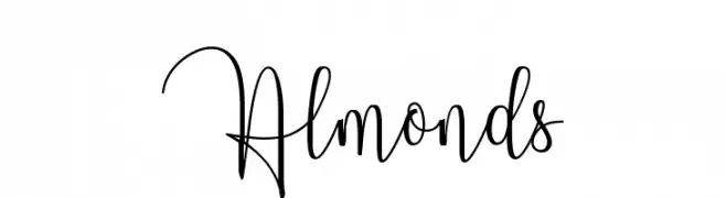
( Pollem Studio - Muhammad Nur - www.creativefabrica.com/designer/polem/ref/2050/ )
An elegant, flowing script font with graceful loops and cursive style.
![Almonds Frei Schriftart Herunterladen]() Herunterladen 225 Downloads@WebFont
Herunterladen 225 Downloads@WebFont -
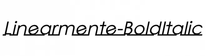
Schriftart von JamboFonts. For commercial use please contact the owner.
![Linearmente-BoldItalic Frei Schriftart Herunterladen]() Herunterladen 225 Downloads@WebFont
Herunterladen 225 Downloads@WebFont -
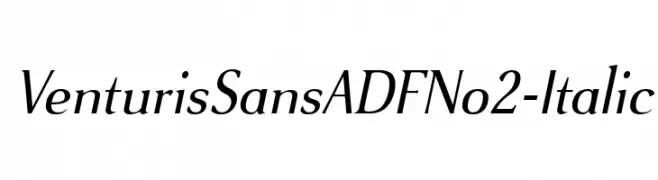
( Fonts by Arkandis Digital Foundry )
An elegant italic serif font with smooth curves and classic style.
![VenturisSansADFNo2-Italic Frei Schriftart Herunterladen]() Herunterladen 224 Downloads@WebFont
Herunterladen 224 Downloads@WebFont -
-
( Fonts by wepfont - Wahyu Eka Prasetya - Personal-use only. For commercial use please contact owner. )
A bold, playful handwritten font with a casual and dynamic style.
![Acakadut Frei Schriftart Herunterladen]() Herunterladen 224 Downloads@WebFont
Herunterladen 224 Downloads@WebFont -
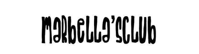
( Fonts by Woodcutter )
A bold, playful font with elongated, irregular letterforms and a whimsical, artistic style.
![Marbella's Club Frei Schriftart Herunterladen]() Herunterladen 224 Downloads@WebFont
Herunterladen 224 Downloads@WebFont -
( Fonts by Erik Studio - Personal-use only. For commercial use please contact owner. )
A cursive, handwritten font with elegant, flowing strokes.
![Tamara Frei Schriftart Herunterladen]() Herunterladen 224 Downloads@WebFont
Herunterladen 224 Downloads@WebFont -
![Octagen Roman Italic Frei Schriftart Herunterladen]() Herunterladen 224 Downloads@WebFont
Herunterladen 224 Downloads@WebFont -
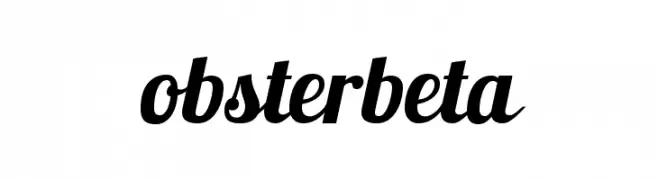
( Fonts by www.impallari.com )
A bold, flowing script font with a modern, handwritten style.
![Lobsterbeta11 Frei Schriftart Herunterladen]() Herunterladen 224 Downloads@WebFont
Herunterladen 224 Downloads@WebFont


Welche Schriften sind gerade am populärsten?
Poppins, Roboto, Montserrat, Open Sans und Lato sind wegen ihrer klaren Formen und breiten Einsetzbarkeit sehr gefragt – von Markenauftritt über Landingpages bis hin zu Postern.
Welche Fonts eignen sich für Logos?
Geometrische Sans‑Serifs (z. B. Poppins, Familien im Gotham‑Stil) sind ein häufiger Griff für sauberes, skalierbares Branding. Für eine persönlichere Note bleiben Scripts und Handschrift‑Stile beliebt. Kombinieren Sie einen prägnanten Headline‑Font mit einer neutralen Brotschrift für Wiedererkennung und Harmonie.
Wie oft wird die Top‑Liste aktualisiert?
Regelmäßig – basierend auf realen Downloads und Interaktionen. Schauen Sie öfter vorbei, um aufstrebende Favoriten früh zu entdecken.
💡 Tipp: Seite bookmarken – Trends wechseln schnell, und heutige Top‑Schriften inspirieren morgen vielleicht das Rebranding.