Willkommen bei den Top‑Schriften – hier treffen Beliebtheit und Qualität aufeinander. Das sind die in diesem Jahr am häufigsten heruntergeladenen und genutzten Fonts. Wenn Sie sichere Optionen für Logo, Web oder Social suchen, starten Sie hier.
Jeder Top‑Font überzeugt durch Balance, Lesbarkeit und Vielseitigkeit. Sie finden moderne Sans‑Serifs, elegante Scripts, Vintage‑Serifs und minimalistische Displays.
-
( Typhoon Type - Suthi Srisopha - www.typhoontype.net )
A decorative cursive font with elegant, flowing strokes and artistic flourishes.
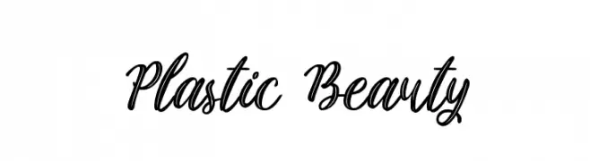 Herunterladen 224 Downloads@WebFont
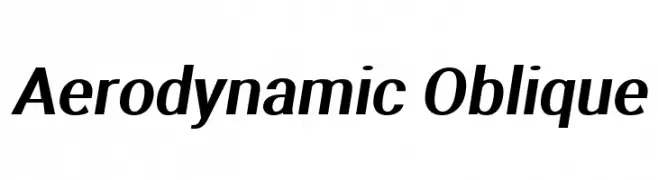
 -
![Aerodynamic Oblique Frei Schriftart Herunterladen]() Herunterladen 224 Downloads@WebFont
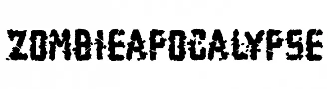
Herunterladen 224 Downloads@WebFont -
![Zombie Apocalypse Frei Schriftart Herunterladen]() Herunterladen 224 Downloads@WebFont
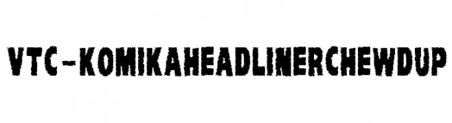
Herunterladen 224 Downloads@WebFont -
![VTC-KomikaHeadLinerChewdUp Frei Schriftart Herunterladen]() Herunterladen 224 Downloads@WebFont
Herunterladen 224 Downloads@WebFont -
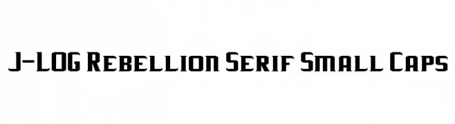
Schriftart von jlog3000. For commercial use please contact the owner.
( Fonts by John Ocasio. Free for personal use only )
A bold, angular font with a strong geometric structure and tight spacing.
![J-LOG Rebellion Serif Small Caps Frei Schriftart Herunterladen]() Herunterladen 223 Downloads@WebFont
Herunterladen 223 Downloads@WebFont -
-
![SlenderThin Frei Schriftart Herunterladen]() Herunterladen 223 Downloads@WebFont
Herunterladen 223 Downloads@WebFont -
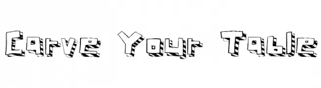
( Fonts by a Max Infeld - XEROGRAPHER FONTS - xerographer.blogspot.com . Personal-use only. For commercial use please contact owner. )
A bold, 3D carved font with a playful, textured design.
![Carve Your Table Frei Schriftart Herunterladen]() Herunterladen 223 Downloads@WebFont
Herunterladen 223 Downloads@WebFont -
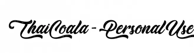
( Fonts by Typhoon Type - Suthi Srisopha - Personal-use only. For commercial use please contact owner. )
A bold, cursive font with a playful, dynamic, and slightly distressed appearance.
![Thai Coala - Personal Use Frei Schriftart Herunterladen]() Herunterladen 223 Downloads@WebFont
Herunterladen 223 Downloads@WebFont -
( Fonts by Graham Meade - GemFonts )
A rugged, chiseled font with an angular, handcrafted appearance.
![Chizzler Thin Frei Schriftart Herunterladen]() Herunterladen 223 Downloads@WebFont
Herunterladen 223 Downloads@WebFont -
Schriftart von danny91194. For commercial use please contact the owner.
( n )
A playful, outlined font with hollow letterforms and rounded edges.
![Londrina Outline Regular Frei Schriftart Herunterladen]() Herunterladen 223 Downloads@WebFont
Herunterladen 223 Downloads@WebFont


Welche Schriften sind gerade am populärsten?
Poppins, Roboto, Montserrat, Open Sans und Lato sind wegen ihrer klaren Formen und breiten Einsetzbarkeit sehr gefragt – von Markenauftritt über Landingpages bis hin zu Postern.
Welche Fonts eignen sich für Logos?
Geometrische Sans‑Serifs (z. B. Poppins, Familien im Gotham‑Stil) sind ein häufiger Griff für sauberes, skalierbares Branding. Für eine persönlichere Note bleiben Scripts und Handschrift‑Stile beliebt. Kombinieren Sie einen prägnanten Headline‑Font mit einer neutralen Brotschrift für Wiedererkennung und Harmonie.
Wie oft wird die Top‑Liste aktualisiert?
Regelmäßig – basierend auf realen Downloads und Interaktionen. Schauen Sie öfter vorbei, um aufstrebende Favoriten früh zu entdecken.
💡 Tipp: Seite bookmarken – Trends wechseln schnell, und heutige Top‑Schriften inspirieren morgen vielleicht das Rebranding.