Willkommen bei den Top‑Schriften – hier treffen Beliebtheit und Qualität aufeinander. Das sind die in diesem Jahr am häufigsten heruntergeladenen und genutzten Fonts. Wenn Sie sichere Optionen für Logo, Web oder Social suchen, starten Sie hier.
Jeder Top‑Font überzeugt durch Balance, Lesbarkeit und Vielseitigkeit. Sie finden moderne Sans‑Serifs, elegante Scripts, Vintage‑Serifs und minimalistische Displays.
-
( Fonts by Taylor Baybutt - ikon3.com - Free for personal use only )
A bold, hand-drawn font with an expressive and artistic style.
 Herunterladen 934 Downloads@WebFont
 -
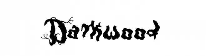
( Fonts by Otto Maurer Design )
An organic, branch-like font with a dark, mysterious aesthetic.
![Darkwood Frei Schriftart Herunterladen]() Herunterladen 934 Downloads@WebFont
Herunterladen 934 Downloads@WebFont -
( Fonts by Grzegorz l - www.glukfonts.pl )
A modern, geometric sans-serif font with clean lines and uniform strokes.
![Rawengulk Demibold Frei Schriftart Herunterladen]() Herunterladen 934 Downloads@WebFont
Herunterladen 934 Downloads@WebFont -
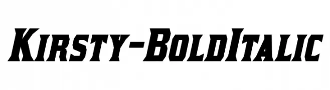
( Fonts by www.typodermicfonts.com - Ray Larabie )
A bold, italicized font with sharp angles and high contrast.
![Kirsty-BoldItalic Frei Schriftart Herunterladen]() Herunterladen 934 Downloads@WebFont
Herunterladen 934 Downloads@WebFont -
![Saroj Frei Schriftart Herunterladen]() Herunterladen 934 Downloads@WebFont
Herunterladen 934 Downloads@WebFont -
![Endless Showroom Regular Frei Schriftart Herunterladen]() Herunterladen 934 Downloads@WebFont
Herunterladen 934 Downloads@WebFont -
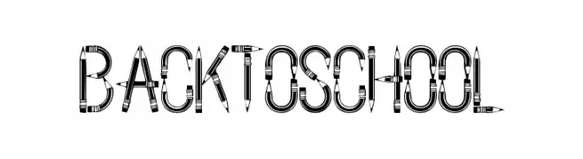
( Fonts by www.houseoflime.com )
A decorative font styled to look like pencils, perfect for school-themed designs.
![BackToSchool Frei Schriftart Herunterladen]() Herunterladen 934 Downloads@WebFont
Herunterladen 934 Downloads@WebFont -
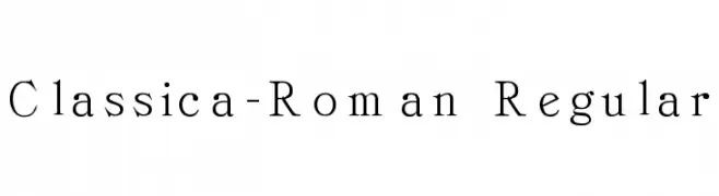
![Classica-Roman Regular Frei Schriftart Herunterladen]() Herunterladen 934 Downloads@WebFont
Herunterladen 934 Downloads@WebFont -
( Fonts by ShyFonts )
A bold, italic font with a futuristic and dynamic style.
![Viper Squadron Solid Italic Frei Schriftart Herunterladen]() Herunterladen 934 Downloads@WebFont
Herunterladen 934 Downloads@WebFont -
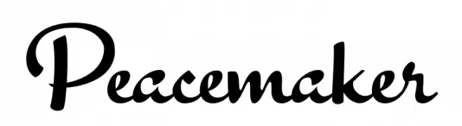
( Fonts by Billy Argel Fonts - www.billyargel.com - Personal-use only. For commercial use please contact owner. )
A classic script font with elegant, flowing lines and a modern touch.
![Peacemaker Frei Schriftart Herunterladen]() Herunterladen 933 Downloads@WebFont
Herunterladen 933 Downloads@WebFont -
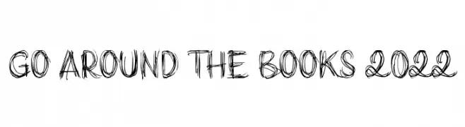
( Fonts by Poemhaiku - Huong Le Thi Thu - Personal-use only. For commercial use please contact owner. )
A sketch-like, hand-drawn font with bold, overlapping strokes and an artistic feel.
![Go around the books 2022 Frei Schriftart Herunterladen]() Herunterladen 933 Downloads@WebFont
Herunterladen 933 Downloads@WebFont -
( Fonts by Alifinart Studio - Personal-use only. For commercial use please contact owner. )
A modern, geometric sans-serif typeface with a clean and balanced design.
![MusticaPro-SemiBold Frei Schriftart Herunterladen]() Herunterladen 933 Downloads@WebFont
Herunterladen 933 Downloads@WebFont -
( Fonts by Almaz Studio )
A playful, hand-drawn font with rounded edges and a whimsical style.
![Doodge Frei Schriftart Herunterladen]() Herunterladen 933 Downloads@WebFont
Herunterladen 933 Downloads@WebFont -
( Fonts by armenia.renderforest.com - Personal-use only. For commercial use please contact owner. )
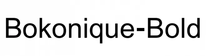
A bold, modern sans-serif font with a clean and uniform appearance.
![Bokonique-Bold Frei Schriftart Herunterladen]() Herunterladen 933 Downloads@WebFont
Herunterladen 933 Downloads@WebFont -
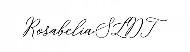
( Solidtype - bit.ly/2OxZn2V )
A sophisticated script font with flowing, interconnected characters and elegant flourishes.
![Rosabelia SLDT Frei Schriftart Herunterladen]() Herunterladen 933 Downloads@WebFont
Herunterladen 933 Downloads@WebFont -
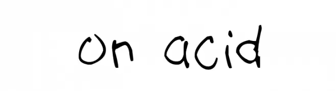
( Fonts by t )
A playful, bold handwritten font with irregular strokes and a lively appearance.
![on acid Frei Schriftart Herunterladen]() Herunterladen 933 Downloads@WebFont
Herunterladen 933 Downloads@WebFont -
![Quiet Streets Frei Schriftart Herunterladen]() Herunterladen 933 Downloads@WebFont
Herunterladen 933 Downloads@WebFont -
( Fonts by Castcraft Software - opti.netii.net - check the website before use )
A classic serif font with elegant curves and refined structure.
![OPTIEdwalianLight Frei Schriftart Herunterladen]() Herunterladen 933 Downloads@WebFont
Herunterladen 933 Downloads@WebFont -
![avia Frei Schriftart Herunterladen]() Herunterladen 933 Downloads@WebFont
Herunterladen 933 Downloads@WebFont -
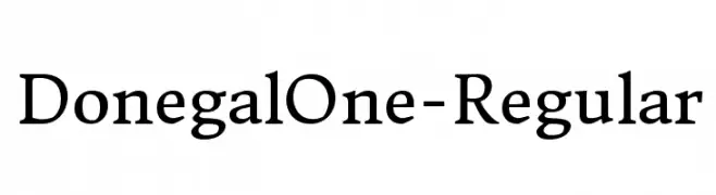
( Copyright (c) 2012 by Sorkin Type Co (www.sorkintype.com), with Reserved Font Name 'Donegal' )
A classic serif font with elegant curves and moderate contrast.
![DonegalOne-Regular Frei Schriftart Herunterladen]() Herunterladen 933 Downloads@WebFont
Herunterladen 933 Downloads@WebFont -
![PentaGram s Gothika Bold Frei Schriftart Herunterladen]() Herunterladen 933 Downloads@WebFont
Herunterladen 933 Downloads@WebFont -
( Fonts by www.typedepot.com )
A modern, rounded font with clean lines and smooth curves.
![CorkiRounded Frei Schriftart Herunterladen]() Herunterladen 933 Downloads@WebFont
Herunterladen 933 Downloads@WebFont -
Schriftart von JuanCasco. For commercial use please contact the owner.
( Fonts by Juan Casco - www.juancasco.net )
A bold, narrow font with sharp serifs and an elegant, sophisticated style.
![Schindler s Font Frei Schriftart Herunterladen]() Herunterladen 933 Downloads@WebFont
Herunterladen 933 Downloads@WebFont -
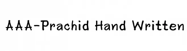
![AAA-Prachid Hand Written Frei Schriftart Herunterladen]() Herunterladen 933 Downloads@WebFont
Herunterladen 933 Downloads@WebFont -
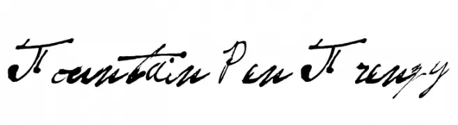
![Fountain Pen Frenzy Frei Schriftart Herunterladen]() Herunterladen 933 Downloads@WebFont
Herunterladen 933 Downloads@WebFont -
( Fonts by Manfred Klein - manfred-klein.ina-mar.com )
A bold, stencil-style font with geometric, cut-out characters.
![MKStencilsansBlack Frei Schriftart Herunterladen]() Herunterladen 933 Downloads@WebFont
Herunterladen 933 Downloads@WebFont -
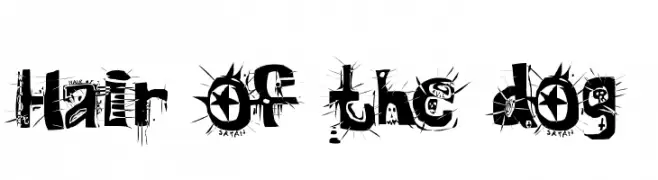
( Fonts by Mr Fisk - Mike Larsson - fontorama.net )
A bold, chaotic display font with a punk rock aesthetic and distressed look.
![Hair of the dog Frei Schriftart Herunterladen]() Herunterladen 933 Downloads@WebFont
Herunterladen 933 Downloads@WebFont -
![C Web Small Frei Schriftart Herunterladen]() Herunterladen 933 Downloads@WebFont
Herunterladen 933 Downloads@WebFont -
( Free for non-commercial use. www.johnmartz.com )
A bold, brush-style font with a lively, hand-painted look.
![Brushcut Frei Schriftart Herunterladen]() Herunterladen 933 Downloads
Herunterladen 933 Downloads -
( Fonts by Daniel Zadorozny - www.iconian.com - Free for personal use )
A bold, stencil-like font with geometric shapes and cutouts.
![U.S.A. Light Frei Schriftart Herunterladen]() Herunterladen 933 Downloads@WebFont
Herunterladen 933 Downloads@WebFont -
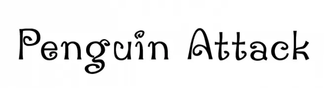
( Fonts by Dustin Norlander - www.cheapskatefonts.com )
A playful and whimsical font with bold curves and lively swirls.
![Penguin Attack Frei Schriftart Herunterladen]() Herunterladen 933 Downloads@WebFont
Herunterladen 933 Downloads@WebFont -
![Ben Cat Normal Normal Frei Schriftart Herunterladen]() Herunterladen 933 Downloads
Herunterladen 933 Downloads -
![Scramble Frei Schriftart Herunterladen]() Herunterladen 933 Downloads@WebFont
Herunterladen 933 Downloads@WebFont -
( Fonts by www.DigitalDreamDesign.net )
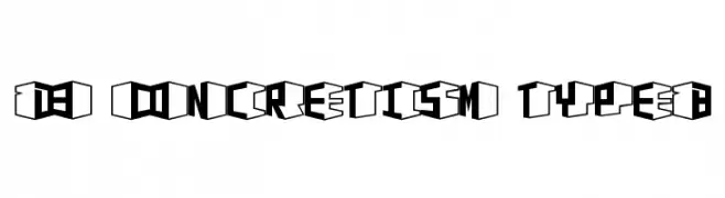
A bold, geometric 3D font with a modern, industrial aesthetic.
![D3 Concretism typeB Frei Schriftart Herunterladen]() Herunterladen 933 Downloads@WebFont
Herunterladen 933 Downloads@WebFont -
( Fonts by 50Fox Studio - www.50fox.com - Personal-use only. For commercial use please contact owner. )
A charming, elegant handwritten font with a classic calligraphy style.
![JaneAustin Frei Schriftart Herunterladen]() Herunterladen 932 Downloads@WebFont
Herunterladen 932 Downloads@WebFont


Welche Schriften sind gerade am populärsten?
Poppins, Roboto, Montserrat, Open Sans und Lato sind wegen ihrer klaren Formen und breiten Einsetzbarkeit sehr gefragt – von Markenauftritt über Landingpages bis hin zu Postern.
Welche Fonts eignen sich für Logos?
Geometrische Sans‑Serifs (z. B. Poppins, Familien im Gotham‑Stil) sind ein häufiger Griff für sauberes, skalierbares Branding. Für eine persönlichere Note bleiben Scripts und Handschrift‑Stile beliebt. Kombinieren Sie einen prägnanten Headline‑Font mit einer neutralen Brotschrift für Wiedererkennung und Harmonie.
Wie oft wird die Top‑Liste aktualisiert?
Regelmäßig – basierend auf realen Downloads und Interaktionen. Schauen Sie öfter vorbei, um aufstrebende Favoriten früh zu entdecken.
💡 Tipp: Seite bookmarken – Trends wechseln schnell, und heutige Top‑Schriften inspirieren morgen vielleicht das Rebranding.