Willkommen bei den Top‑Schriften – hier treffen Beliebtheit und Qualität aufeinander. Das sind die in diesem Jahr am häufigsten heruntergeladenen und genutzten Fonts. Wenn Sie sichere Optionen für Logo, Web oder Social suchen, starten Sie hier.
Jeder Top‑Font überzeugt durch Balance, Lesbarkeit und Vielseitigkeit. Sie finden moderne Sans‑Serifs, elegante Scripts, Vintage‑Serifs und minimalistische Displays.
-
 Herunterladen 223 Downloads@WebFont
 -
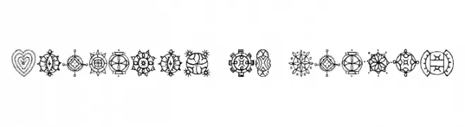
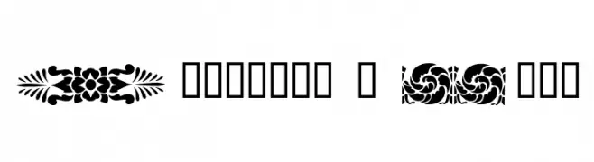
( Fonts by www.houseoflime.com )
Ornamental dingbat font with folk-inspired and geometric motifs.
![Treasury of Design Frei Schriftart Herunterladen]() Herunterladen 223 Downloads@WebFont
Herunterladen 223 Downloads@WebFont -
![Delinquent-Regular Frei Schriftart Herunterladen]() Herunterladen 223 Downloads@WebFont
Herunterladen 223 Downloads@WebFont -
![Queen Frei Schriftart Herunterladen]() Herunterladen 223 Downloads@WebFont
Herunterladen 223 Downloads@WebFont -
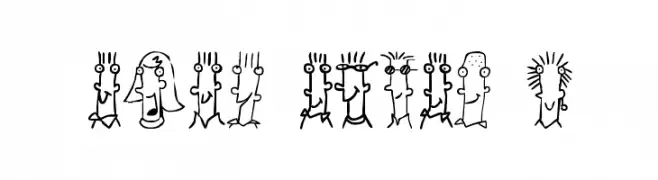
( Fonts by Grafito Design - dibujosenlinea.ideasintegrales.net )
A whimsical, cartoon-like font with unique character designs for each letter.
![BUEN CHICO 1 Frei Schriftart Herunterladen]() Herunterladen 223 Downloads@WebFont
Herunterladen 223 Downloads@WebFont -
-
( Copyright (c) 2013-2015 Post No Bills Project Authors (https://github.com/mooniak/post-no-bills-font). )
A modern, geometric sans-serif font with clean lines and consistent stroke width.
![Post No Bills Jaffna Regular Frei Schriftart Herunterladen]() Herunterladen 223 Downloads@WebFont
Herunterladen 223 Downloads@WebFont -
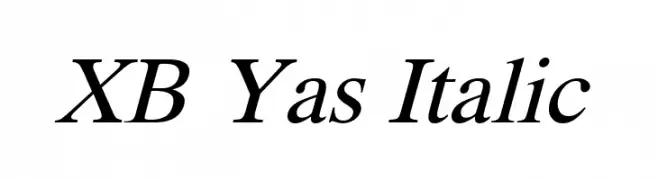
( Fonts by Behnam - Personal-use only. For commercial use please contact owner. )
An elegant serif italic typeface with smooth, flowing lines and a classic style.
![XB Yas Italic Frei Schriftart Herunterladen]() Herunterladen 223 Downloads@WebFont
Herunterladen 223 Downloads@WebFont -
![Dividers & Misc Frei Schriftart Herunterladen]() Herunterladen 223 Downloads@WebFont
Herunterladen 223 Downloads@WebFont -
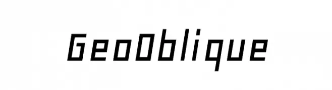
( Copyright (c) 2000-2010, Ben Weiner (ben@readingtype.org.uk) )
A modern, geometric oblique font with sharp angles and uniform stroke width.
![GeoOblique Frei Schriftart Herunterladen]() Herunterladen 223 Downloads@WebFont
Herunterladen 223 Downloads@WebFont -
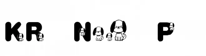
( Fonts by Kat`s Fun Fonts - Personal-use only. For commercial use please contact owner. )
A playful, decorative font with puppy illustrations in bold, rounded letters.
![KR Nick's Puppy 1 Frei Schriftart Herunterladen]() Herunterladen 223 Downloads@WebFont
Herunterladen 223 Downloads@WebFont


Welche Schriften sind gerade am populärsten?
Poppins, Roboto, Montserrat, Open Sans und Lato sind wegen ihrer klaren Formen und breiten Einsetzbarkeit sehr gefragt – von Markenauftritt über Landingpages bis hin zu Postern.
Welche Fonts eignen sich für Logos?
Geometrische Sans‑Serifs (z. B. Poppins, Familien im Gotham‑Stil) sind ein häufiger Griff für sauberes, skalierbares Branding. Für eine persönlichere Note bleiben Scripts und Handschrift‑Stile beliebt. Kombinieren Sie einen prägnanten Headline‑Font mit einer neutralen Brotschrift für Wiedererkennung und Harmonie.
Wie oft wird die Top‑Liste aktualisiert?
Regelmäßig – basierend auf realen Downloads und Interaktionen. Schauen Sie öfter vorbei, um aufstrebende Favoriten früh zu entdecken.
💡 Tipp: Seite bookmarken – Trends wechseln schnell, und heutige Top‑Schriften inspirieren morgen vielleicht das Rebranding.