Willkommen bei den Top‑Schriften – hier treffen Beliebtheit und Qualität aufeinander. Das sind die in diesem Jahr am häufigsten heruntergeladenen und genutzten Fonts. Wenn Sie sichere Optionen für Logo, Web oder Social suchen, starten Sie hier.
Jeder Top‑Font überzeugt durch Balance, Lesbarkeit und Vielseitigkeit. Sie finden moderne Sans‑Serifs, elegante Scripts, Vintage‑Serifs und minimalistische Displays.
-
( Free for personal use - Fonts by Markus Schroppel. For commercial license please donate to http://www.die-gute-schrift.de/donation.html )
A pixelated, retro-style font with a digital aesthetic.
 Herunterladen 223 Downloads@WebFont
 -
( Fonts by Kat`s Fun Fonts - Personal-use only. For commercial use please contact owner. )
A bold, dynamic font with thick strokes and a slight slant, perfect for impactful statements.
![KR Gunz Frei Schriftart Herunterladen]() Herunterladen 223 Downloads@WebFont
Herunterladen 223 Downloads@WebFont -
( Fonts by www.blambot.com )
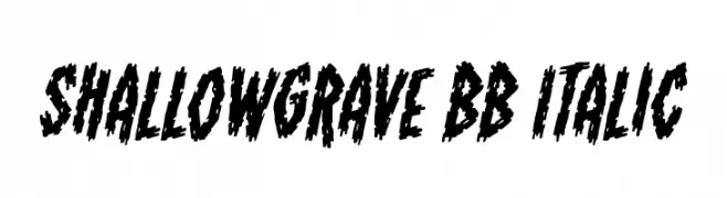
A bold, jagged, and italic font with a distressed, horror-themed style.
![ShallowGrave BB Italic Frei Schriftart Herunterladen]() Herunterladen 223 Downloads@WebFont
Herunterladen 223 Downloads@WebFont -
( Fonts by Renatal Charisti )
A playful handwritten font with rounded, casual letterforms.
![nenna Frei Schriftart Herunterladen]() Herunterladen 223 Downloads@WebFont
Herunterladen 223 Downloads@WebFont -
( Copyright 2014-2017 Indian Type Foundry (info@indiantypefoundry.com) )
A sleek, modern, and thin italic font with a minimalist design.
![Poppins Thin Italic Frei Schriftart Herunterladen]() Herunterladen 223 Downloads@WebFont
Herunterladen 223 Downloads@WebFont -
-
( Fonts by a Galdino Otten - galdinootten.com . Personal-use only. For commercial use please contact owner. )
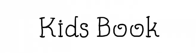
A playful, hand-drawn font with a whimsical and friendly style.
![Kids Book Frei Schriftart Herunterladen]() Herunterladen 223 Downloads@WebFont
Herunterladen 223 Downloads@WebFont -
( Fonts by www.woodcutter.es - woodcutter Manero - Personal-use only. For commercial use please contact owner. )
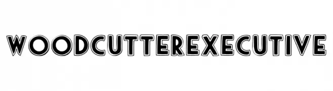
A bold, geometric font with outlined characters for a three-dimensional effect.
![woodcutter executive Frei Schriftart Herunterladen]() Herunterladen 223 Downloads@WebFont
Herunterladen 223 Downloads@WebFont -
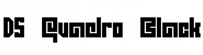
![DS Quadro Black Frei Schriftart Herunterladen]() Herunterladen 223 Downloads@WebFont
Herunterladen 223 Downloads@WebFont -
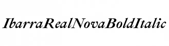
( Copyright 2007 The Ibarra Real Nova Project Authors (https://github.com/googlefonts/ibarrareal) )
A bold and italic serif font with a classic and elegant style.
![Ibarra Real Nova Bold Italic Frei Schriftart Herunterladen]() Herunterladen 223 Downloads@WebFont
Herunterladen 223 Downloads@WebFont -
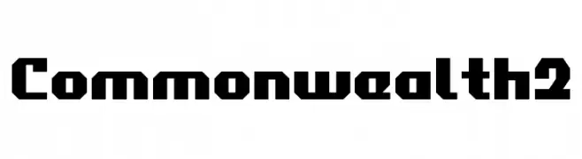
![Commonwealth2 Frei Schriftart Herunterladen]() Herunterladen 223 Downloads@WebFont
Herunterladen 223 Downloads@WebFont


Welche Schriften sind gerade am populärsten?
Poppins, Roboto, Montserrat, Open Sans und Lato sind wegen ihrer klaren Formen und breiten Einsetzbarkeit sehr gefragt – von Markenauftritt über Landingpages bis hin zu Postern.
Welche Fonts eignen sich für Logos?
Geometrische Sans‑Serifs (z. B. Poppins, Familien im Gotham‑Stil) sind ein häufiger Griff für sauberes, skalierbares Branding. Für eine persönlichere Note bleiben Scripts und Handschrift‑Stile beliebt. Kombinieren Sie einen prägnanten Headline‑Font mit einer neutralen Brotschrift für Wiedererkennung und Harmonie.
Wie oft wird die Top‑Liste aktualisiert?
Regelmäßig – basierend auf realen Downloads und Interaktionen. Schauen Sie öfter vorbei, um aufstrebende Favoriten früh zu entdecken.
💡 Tipp: Seite bookmarken – Trends wechseln schnell, und heutige Top‑Schriften inspirieren morgen vielleicht das Rebranding.