Willkommen bei den Top‑Schriften – hier treffen Beliebtheit und Qualität aufeinander. Das sind die in diesem Jahr am häufigsten heruntergeladenen und genutzten Fonts. Wenn Sie sichere Optionen für Logo, Web oder Social suchen, starten Sie hier.
Jeder Top‑Font überzeugt durch Balance, Lesbarkeit und Vielseitigkeit. Sie finden moderne Sans‑Serifs, elegante Scripts, Vintage‑Serifs und minimalistische Displays.
-
( carlosmatteoli.wix.com/qbotype )
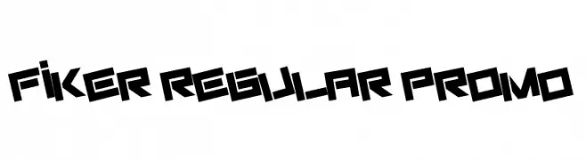
A bold, geometric font with sharp, angular characters and a futuristic style.
 Herunterladen 218 Downloads@WebFont
 -
( Fonts by www.gliphmaker.com. Personal-use only. For commercial use please contact owner. )
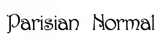
An elegant and decorative font with ornate serifs and artistic flourishes.
![Parisian Normal Frei Schriftart Herunterladen]() Herunterladen 218 Downloads@WebFont
Herunterladen 218 Downloads@WebFont -
( Fonts by Woodcutter Manero - http://www.woodcutter.es - Personal-use only. For commercial use please contact owner. )
A bold, distressed blackletter font with a vintage, Gothic style.
![Los Guripas Frei Schriftart Herunterladen]() Herunterladen 218 Downloads@WebFont
Herunterladen 218 Downloads@WebFont -
( Copyright (c) 2015, Cadson Demak (info@cadsondemak.com) )
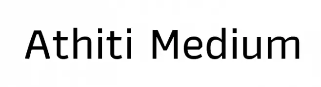
A modern, geometric sans-serif font with balanced proportions and medium weight.
![Athiti Medium Frei Schriftart Herunterladen]() Herunterladen 218 Downloads@WebFont
Herunterladen 218 Downloads@WebFont -
![Saltpeter N Fungus Frei Schriftart Herunterladen]() Herunterladen 218 Downloads@WebFont
Herunterladen 218 Downloads@WebFont -
-
( Fonts by www.TomzWeb.com - Thomas E. Harvey - NOT free - Commercial use requires license )
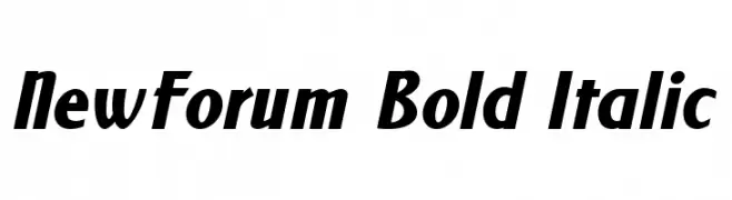
A bold, italicized font with strong, dynamic strokes and a modern appearance.
![NewForum Bold Italic Frei Schriftart Herunterladen]() Herunterladen 218 Downloads@WebFont
Herunterladen 218 Downloads@WebFont -
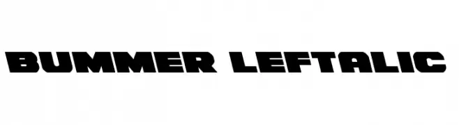
( Fonts by Daniel Zadorozny - www.iconian.com )
A bold, left-slanted font with wide, blocky characters and sharp angles.
![Bummer Leftalic Frei Schriftart Herunterladen]() Herunterladen 218 Downloads@WebFont
Herunterladen 218 Downloads@WebFont -
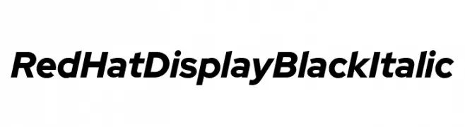
( Fonts by MCKL )
A bold, italicized font with a modern and sleek appearance.
![Red Hat Display Black Italic Frei Schriftart Herunterladen]() Herunterladen 218 Downloads@WebFont
Herunterladen 218 Downloads@WebFont -
( Copyright (c) 2012, Font Diner (www.fontdiner.com) )
A playful, curly handwritten font with decorative swirls.
![Butterfly Kids Regular Frei Schriftart Herunterladen]() Herunterladen 218 Downloads@WebFont
Herunterladen 218 Downloads@WebFont -
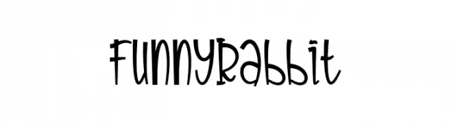
( Fonts by Letterayu )
A playful and whimsical font with curvy, energetic characters.
![Funny Rabbit Frei Schriftart Herunterladen]() Herunterladen 218 Downloads@WebFont
Herunterladen 218 Downloads@WebFont


Welche Schriften sind gerade am populärsten?
Poppins, Roboto, Montserrat, Open Sans und Lato sind wegen ihrer klaren Formen und breiten Einsetzbarkeit sehr gefragt – von Markenauftritt über Landingpages bis hin zu Postern.
Welche Fonts eignen sich für Logos?
Geometrische Sans‑Serifs (z. B. Poppins, Familien im Gotham‑Stil) sind ein häufiger Griff für sauberes, skalierbares Branding. Für eine persönlichere Note bleiben Scripts und Handschrift‑Stile beliebt. Kombinieren Sie einen prägnanten Headline‑Font mit einer neutralen Brotschrift für Wiedererkennung und Harmonie.
Wie oft wird die Top‑Liste aktualisiert?
Regelmäßig – basierend auf realen Downloads und Interaktionen. Schauen Sie öfter vorbei, um aufstrebende Favoriten früh zu entdecken.
💡 Tipp: Seite bookmarken – Trends wechseln schnell, und heutige Top‑Schriften inspirieren morgen vielleicht das Rebranding.