Willkommen bei den Top‑Schriften – hier treffen Beliebtheit und Qualität aufeinander. Das sind die in diesem Jahr am häufigsten heruntergeladenen und genutzten Fonts. Wenn Sie sichere Optionen für Logo, Web oder Social suchen, starten Sie hier.
Jeder Top‑Font überzeugt durch Balance, Lesbarkeit und Vielseitigkeit. Sie finden moderne Sans‑Serifs, elegante Scripts, Vintage‑Serifs und minimalistische Displays.
-
( Fonts by Vladimir Nikolic - www.creativefabrica.com/designer/vladimirnikolic/ - Personal-use only. For commercial use please contact owner. )
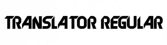
A bold, geometric font with a futuristic and angular design.
 Herunterladen 217 Downloads@WebFont
 -
( www.qkila.com )
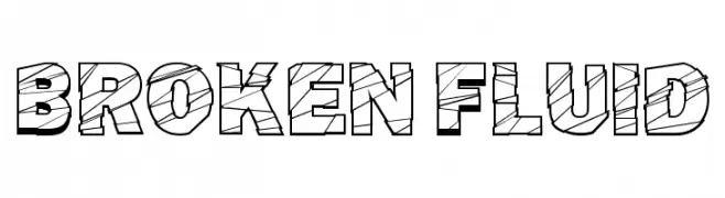
A bold, geometric font with a broken, fluid pattern and a three-dimensional look.
![Broken Fluid Frei Schriftart Herunterladen]() Herunterladen 217 Downloads@WebFont
Herunterladen 217 Downloads@WebFont -
( Fonts by Masato Shimojima - Personal-use only. For commercial use please contact owner. )
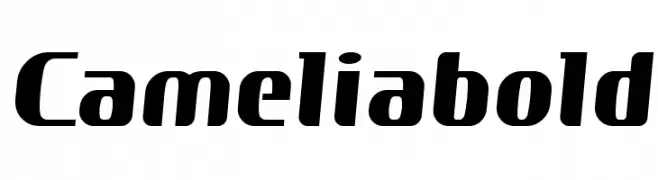
A bold, modern font with rounded edges and a slightly condensed form.
![Cameliabold Frei Schriftart Herunterladen]() Herunterladen 217 Downloads@WebFont
Herunterladen 217 Downloads@WebFont -
( Fonts by Daniel Gauthier )
A bold, pixelated display font with a retro digital aesthetic.
![KingBus Frei Schriftart Herunterladen]() Herunterladen 217 Downloads@WebFont
Herunterladen 217 Downloads@WebFont -
![Cigar-Box-Guitar Frei Schriftart Herunterladen]() Herunterladen 217 Downloads@WebFont
Herunterladen 217 Downloads@WebFont -
-
( Fonts by Brother Grounds Studio )
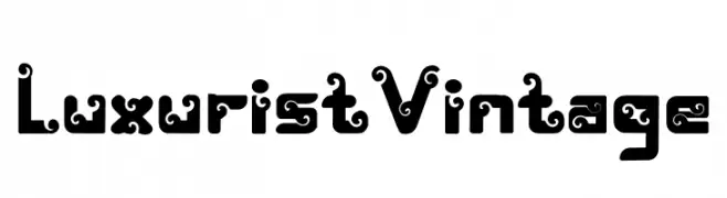
A bold, decorative font with vintage-inspired swirls and curls.
![Luxurist Vintage Frei Schriftart Herunterladen]() Herunterladen 217 Downloads@WebFont
Herunterladen 217 Downloads@WebFont -
( Fonts by Daniel Gauthier )
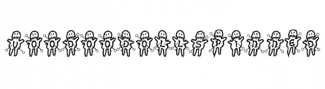
A playful, voodoo doll-themed decorative font with a whimsical style.
![VoodooDollsPinned Frei Schriftart Herunterladen]() Herunterladen 217 Downloads@WebFont
Herunterladen 217 Downloads@WebFont -
( Fonts by Creatype Studio - Rian Rahardi - Personal-use only. For commercial use please contact owner. )
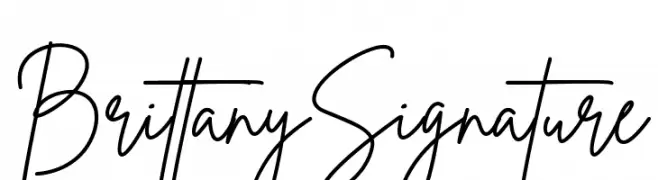
A fluid and elegant handwritten script with connected strokes and a natural flow.
![Brittany Signature Frei Schriftart Herunterladen]() Herunterladen 217 Downloads@WebFont
Herunterladen 217 Downloads@WebFont -
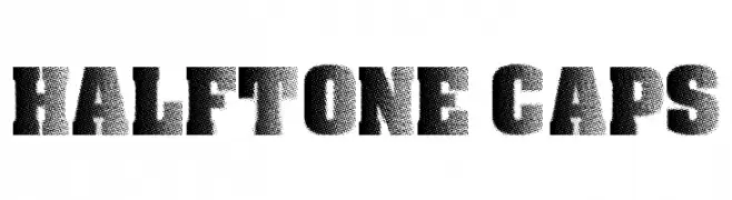
![Halftone CAPS Frei Schriftart Herunterladen]() Herunterladen 217 Downloads@WebFont
Herunterladen 217 Downloads@WebFont -
( Fonts by Apostrophic Lab )
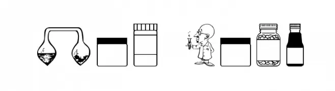
A laboratory-themed dingbat font with science icons and cartoon scientists.
![Lab Bats Frei Schriftart Herunterladen]() Herunterladen 217 Downloads@WebFont
Herunterladen 217 Downloads@WebFont


Welche Schriften sind gerade am populärsten?
Poppins, Roboto, Montserrat, Open Sans und Lato sind wegen ihrer klaren Formen und breiten Einsetzbarkeit sehr gefragt – von Markenauftritt über Landingpages bis hin zu Postern.
Welche Fonts eignen sich für Logos?
Geometrische Sans‑Serifs (z. B. Poppins, Familien im Gotham‑Stil) sind ein häufiger Griff für sauberes, skalierbares Branding. Für eine persönlichere Note bleiben Scripts und Handschrift‑Stile beliebt. Kombinieren Sie einen prägnanten Headline‑Font mit einer neutralen Brotschrift für Wiedererkennung und Harmonie.
Wie oft wird die Top‑Liste aktualisiert?
Regelmäßig – basierend auf realen Downloads und Interaktionen. Schauen Sie öfter vorbei, um aufstrebende Favoriten früh zu entdecken.
💡 Tipp: Seite bookmarken – Trends wechseln schnell, und heutige Top‑Schriften inspirieren morgen vielleicht das Rebranding.