Willkommen bei den Top‑Schriften – hier treffen Beliebtheit und Qualität aufeinander. Das sind die in diesem Jahr am häufigsten heruntergeladenen und genutzten Fonts. Wenn Sie sichere Optionen für Logo, Web oder Social suchen, starten Sie hier.
Jeder Top‑Font überzeugt durch Balance, Lesbarkeit und Vielseitigkeit. Sie finden moderne Sans‑Serifs, elegante Scripts, Vintage‑Serifs und minimalistische Displays.
-
( www.tattoowoo.com )
A bold, hand-drawn font with a graffiti-like texture and playful style.
 Herunterladen 214 Downloads@WebFont
 -
( www.behance.net/SebastianMejiaQ )
A modern, geometric font with intricate line and dot details.
![Inspira Frei Schriftart Herunterladen]() Herunterladen 214 Downloads@WebFont
Herunterladen 214 Downloads@WebFont -
( Fonts by Darcy Baldwin - darcybaldwin.com. Free for personal use only )
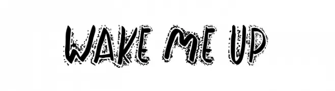
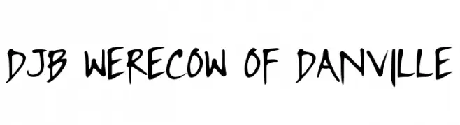
A playful, handwritten font with bold strokes and a casual, energetic style.
![DJB WERECOW OF DANVILLE Frei Schriftart Herunterladen]() Herunterladen 214 Downloads@WebFont
Herunterladen 214 Downloads@WebFont -
( Fonts by Iconian Fonts )
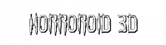
A bold, 3D font with a jagged, horror-inspired design.
![Horroroid 3D Frei Schriftart Herunterladen]() Herunterladen 214 Downloads@WebFont
Herunterladen 214 Downloads@WebFont -
( Fonts by Graham Meade - GemFonts )
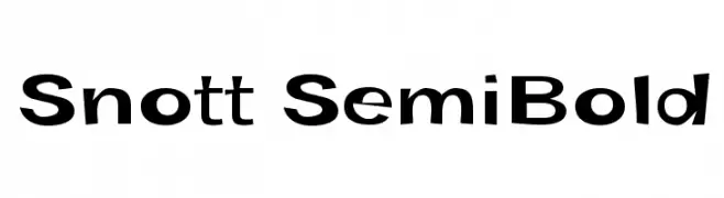
A bold, playful font with dynamic and slightly slanted letterforms.
![Snott SemiBold Frei Schriftart Herunterladen]() Herunterladen 214 Downloads@WebFont
Herunterladen 214 Downloads@WebFont -
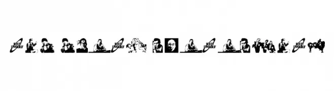
-
![RED DWARF CHARACTERS Frei Schriftart Herunterladen]() Herunterladen 214 Downloads@WebFont
Herunterladen 214 Downloads@WebFont -
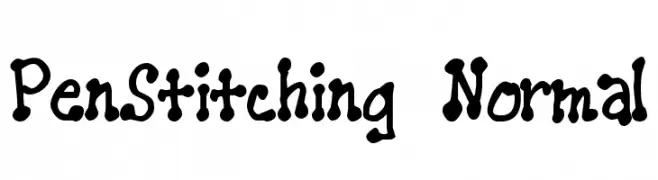
![PenStitching Normal Frei Schriftart Herunterladen]() Herunterladen 214 Downloads@WebFont
Herunterladen 214 Downloads@WebFont -
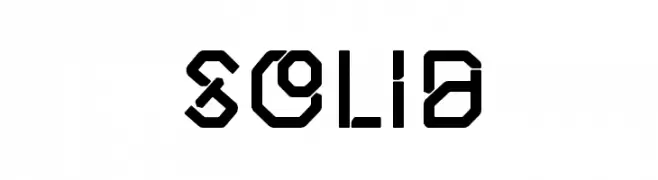
( headfirst - Morice Kastoun - www.morice.co )
A bold, geometric font with a futuristic and industrial style.
![Solid Frei Schriftart Herunterladen]() Herunterladen 214 Downloads@WebFont
Herunterladen 214 Downloads@WebFont -
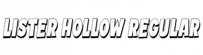
( Fonts by Vladimir Nikolic )
A bold, three-dimensional font with a hollow interior and dynamic slant.
![Lister Hollow Regular Frei Schriftart Herunterladen]() Herunterladen 214 Downloads@WebFont
Herunterladen 214 Downloads@WebFont -
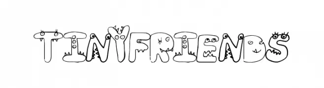
( Fonts by a Max Infeld - XEROGRAPHER FONTS - xerographer.blogspot.com . Personal-use only. For commercial use please contact owner. )
A playful, cartoon-like font with quirky characters and expressive features.
![TinyFriends Frei Schriftart Herunterladen]() Herunterladen 214 Downloads@WebFont
Herunterladen 214 Downloads@WebFont

Welche Schriften sind gerade am populärsten?
Poppins, Roboto, Montserrat, Open Sans und Lato sind wegen ihrer klaren Formen und breiten Einsetzbarkeit sehr gefragt – von Markenauftritt über Landingpages bis hin zu Postern.
Welche Fonts eignen sich für Logos?
Geometrische Sans‑Serifs (z. B. Poppins, Familien im Gotham‑Stil) sind ein häufiger Griff für sauberes, skalierbares Branding. Für eine persönlichere Note bleiben Scripts und Handschrift‑Stile beliebt. Kombinieren Sie einen prägnanten Headline‑Font mit einer neutralen Brotschrift für Wiedererkennung und Harmonie.
Wie oft wird die Top‑Liste aktualisiert?
Regelmäßig – basierend auf realen Downloads und Interaktionen. Schauen Sie öfter vorbei, um aufstrebende Favoriten früh zu entdecken.
💡 Tipp: Seite bookmarken – Trends wechseln schnell, und heutige Top‑Schriften inspirieren morgen vielleicht das Rebranding.