Willkommen bei den Top‑Schriften – hier treffen Beliebtheit und Qualität aufeinander. Das sind die in diesem Jahr am häufigsten heruntergeladenen und genutzten Fonts. Wenn Sie sichere Optionen für Logo, Web oder Social suchen, starten Sie hier.
Jeder Top‑Font überzeugt durch Balance, Lesbarkeit und Vielseitigkeit. Sie finden moderne Sans‑Serifs, elegante Scripts, Vintage‑Serifs und minimalistische Displays.
-
( Fonts by Niskala Huruf )
A bold, rounded font with a playful and whimsical style.
 Herunterladen 903 Downloads@WebFont
 -
( Fonts by Kong Font - https://fontkong.com/ - Personal-use only. For commercial use please contact owner. )
A modern, high-contrast font with elegant and sophisticated styling.
![Pinkerston Frei Schriftart Herunterladen]() Herunterladen 903 Downloads@WebFont
Herunterladen 903 Downloads@WebFont -
( Fonts by Farul Arjianto - creativemarket.com/typefar - Personal-use only. For commercial use please contact owner. )
A bold, dynamic script font with elegant curves and a modern classic style.
![Wandertucker Frei Schriftart Herunterladen]() Herunterladen 903 Downloads@WebFont
Herunterladen 903 Downloads@WebFont -
( Fonts by Syaf Rizal - Khurasan - Personal-use only. For commercial use please contact owner. )
A bold and dynamic brush script font with sweeping strokes.
![Are You Okay Frei Schriftart Herunterladen]() Herunterladen 903 Downloads@WebFont
Herunterladen 903 Downloads@WebFont -
![HENAVE Regular Frei Schriftart Herunterladen]() Herunterladen 903 Downloads@WebFont
Herunterladen 903 Downloads@WebFont -
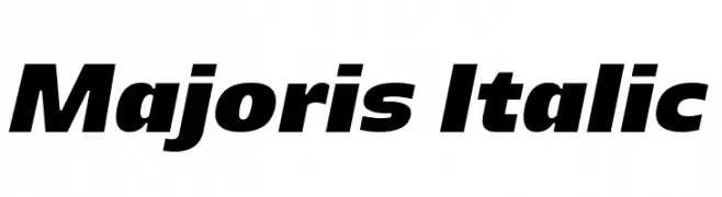
( Bernd Montag )
A bold, italic font with dynamic slanted letterforms for impactful designs.
![Majoris Italic Frei Schriftart Herunterladen]() Herunterladen 903 Downloads@WebFont
Herunterladen 903 Downloads@WebFont -
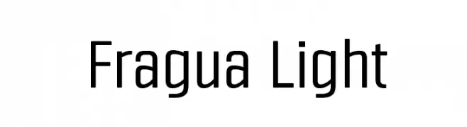
![Fragua Light Frei Schriftart Herunterladen]() Herunterladen 903 Downloads@WebFont
Herunterladen 903 Downloads@WebFont -
( Fonts by a Neale Davidson - www.pixelsagas.com. Personal-use only. For commercial use please contact owner. )
A modern, italicized font with bold strokes and a dynamic appearance.
![Montalban Italic Frei Schriftart Herunterladen]() Herunterladen 903 Downloads@WebFont
Herunterladen 903 Downloads@WebFont -
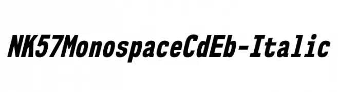
( Fonts by Typodermic Fonts )
A bold, italic, monospaced font with high contrast and a modern, dynamic style.
![NK57MonospaceCdEb-Italic Frei Schriftart Herunterladen]() Herunterladen 903 Downloads@WebFont
Herunterladen 903 Downloads@WebFont -
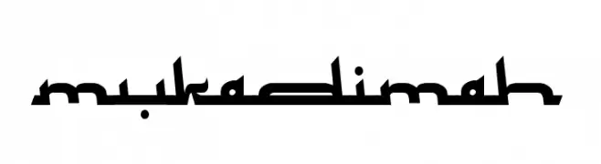
( Fonts by Adien Gunarta - naraaksara.com - Personal-use only. For commercial use please contact owner. )
A bold, angular font with geometric shapes and a modern calligraphic influence.
![Mukadimah Frei Schriftart Herunterladen]() Herunterladen 903 Downloads@WebFont
Herunterladen 903 Downloads@WebFont -
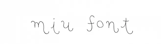
![miu font Frei Schriftart Herunterladen]() Herunterladen 903 Downloads@WebFont
Herunterladen 903 Downloads@WebFont -
( Fonts by Galdino Otten - galdinootten.com )
A bold, distressed font with a vintage, rugged appearance.
![Old Typography Frei Schriftart Herunterladen]() Herunterladen 903 Downloads@WebFont
Herunterladen 903 Downloads@WebFont -
![Spooky Regular Frei Schriftart Herunterladen]() Herunterladen 903 Downloads@WebFont
Herunterladen 903 Downloads@WebFont -
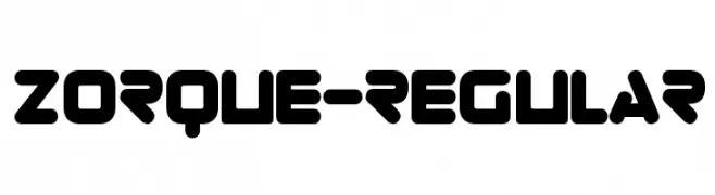
( Fonts by www.typodermicfonts.com - Ray Larabie )
A bold, futuristic font with rounded edges and a geometric design.
![Zorque-Regular Frei Schriftart Herunterladen]() Herunterladen 903 Downloads@WebFont
Herunterladen 903 Downloads@WebFont -
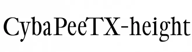
( Fonts by Manfred Klein. Free for private and charity use. Free for commercial with donation to organizations )
A classic serif font with elegant strokes and balanced proportions.
![CybaPeeTX-height Frei Schriftart Herunterladen]() Herunterladen 903 Downloads@WebFont
Herunterladen 903 Downloads@WebFont -
( Fonts by www.peter-wiegel.de. Personal-use only. For commercial use please contact owner. )
A bold, condensed font with thick strokes and a modern geometric style.
![Berlin Email Heavy Frei Schriftart Herunterladen]() Herunterladen 903 Downloads@WebFont
Herunterladen 903 Downloads@WebFont -
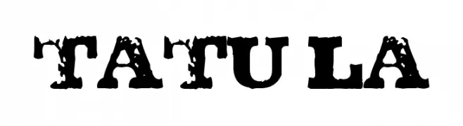
![TATU LA Frei Schriftart Herunterladen]() Herunterladen 903 Downloads@WebFont
Herunterladen 903 Downloads@WebFont -
( Fonts by Nick Curtis - www.nicksfonts.com )
An artistic and decorative font with geometric and playful elements.
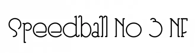
![Speedball No 3 NF Frei Schriftart Herunterladen]() Herunterladen 903 Downloads@WebFont
Herunterladen 903 Downloads@WebFont -
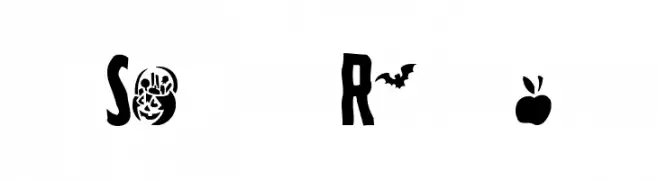
( Fonts by Mr Fisk - Mike Larsson - fontorama.net )
A playful, skeleton-themed font perfect for Halloween projects.
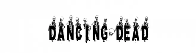
![DANCING-DEAD Frei Schriftart Herunterladen]() Herunterladen 903 Downloads@WebFont
Herunterladen 903 Downloads@WebFont -
( Fonts by Khurasan )
A bold, rounded font with a playful and friendly style.
![Hello Roti Frei Schriftart Herunterladen]() Herunterladen 902 Downloads@WebFont
Herunterladen 902 Downloads@WebFont -
( Fonts by zulkhairilettering - Zulkhairi M Saleh - Personal-use only. For commercial use please contact owner. )
A bold, expressive script font with a handwritten style.
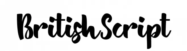
![BritishScript Frei Schriftart Herunterladen]() Herunterladen 902 Downloads@WebFont
Herunterladen 902 Downloads@WebFont -
( Fonts by Syaf Rizal - www.creativefabrica.com/ref/53/ - Personal-use only. For commercial use please contact owner. )
A bold, energetic brush script with a hand-painted look.
![Flashing Frei Schriftart Herunterladen]() Herunterladen 902 Downloads@WebFont
Herunterladen 902 Downloads@WebFont -
( Fonts by Geyret.T.Kenji - Personal-use only. For commercial use please contact owner. )
A bold, classic serif font with strong strokes and elegant serifs.
![UKIJ Nasq Bold Frei Schriftart Herunterladen]() Herunterladen 902 Downloads@WebFont
Herunterladen 902 Downloads@WebFont -
( Fonts by Muhammad Sirojuddin - lettersiro.com - Personal-use only. For commercial use please contact owner. )
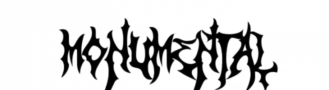
A bold, decorative font with sharp, angular edges and a gothic flair.
![Monumental Frei Schriftart Herunterladen]() Herunterladen 902 Downloads@WebFont
Herunterladen 902 Downloads@WebFont -
Schriftart von fenomen75. For commercial use please contact the owner.
( free for personal use only )
A modern, geometric font with a futuristic outline design.
![STEPS Outline Frei Schriftart Herunterladen]() Herunterladen 902 Downloads@WebFont
Herunterladen 902 Downloads@WebFont -
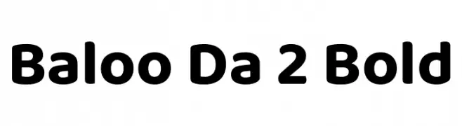
( Copyright (c) 2015 Ek Type (www.ektype.in) )
A bold, rounded font with a playful and friendly style.
![Baloo Da 2 Bold Frei Schriftart Herunterladen]() Herunterladen 902 Downloads@WebFont
Herunterladen 902 Downloads@WebFont -
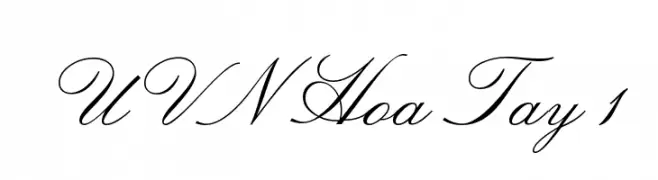
![UVN Hoa Tay 1 Frei Schriftart Herunterladen]() Herunterladen 902 Downloads@WebFont
Herunterladen 902 Downloads@WebFont -
( Dirtyline Studio - Hendra Maulia - creativemarket.com/h_m )
A bold, cursive font with dynamic, flowing strokes and elegant flourishes.
![Shanders Free Frei Schriftart Herunterladen]() Herunterladen 902 Downloads@WebFont
Herunterladen 902 Downloads@WebFont -
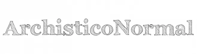
( Fonts by Emilie Rollandin - www.archistico.com. Personal-use only. For commercial use please contact owner. )
A hand-drawn serif font with a sketch-like, textured appearance.
![Archistico Normal Frei Schriftart Herunterladen]() Herunterladen 902 Downloads@WebFont
Herunterladen 902 Downloads@WebFont -
( Fonts by Castcraft Software - OPTI Fonts Archive - opti.netii.net - Personal-use only. For commercial use please contact owner. )
A classic, high-contrast serif font with elegant, narrow characters.
![OPTIRacer Frei Schriftart Herunterladen]() Herunterladen 902 Downloads@WebFont
Herunterladen 902 Downloads@WebFont -
( Fonts by Castcraft Software - opti.netii.net - check the website before use )
A classic old-style serif font with elegant serifs and high contrast.
![OPTIForquetOldstyle-Suppl Frei Schriftart Herunterladen]() Herunterladen 902 Downloads@WebFont
Herunterladen 902 Downloads@WebFont -
( mistifonts.com/ )
A playful handwritten font with rounded, casual letters.
![Girls Have Many Secrets Frei Schriftart Herunterladen]() Herunterladen 902 Downloads@WebFont
Herunterladen 902 Downloads@WebFont -
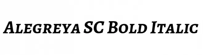
( Copyright 2011 The Alegreya Project Authors (https://github.com/huertatipografica/Alegreya) )
A bold, italic serif font with a dynamic and sophisticated style.
![Alegreya SC Bold Italic Frei Schriftart Herunterladen]() Herunterladen 902 Downloads@WebFont
Herunterladen 902 Downloads@WebFont -
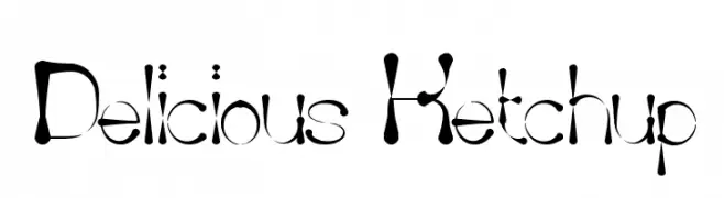
( Fonts by weknow - Wino S Kadir )
A playful, bold font with a whimsical, liquid-like design.
![Delicious Ketchup Frei Schriftart Herunterladen]() Herunterladen 902 Downloads@WebFont
Herunterladen 902 Downloads@WebFont -
( Fonts by Manfred Klein. Free for private and charity use. Free for commercial with donation to organizations )
Cartoonish, bike-themed decorative font with hand-drawn characters.
![Bikers Frei Schriftart Herunterladen]() Herunterladen 902 Downloads@WebFont
Herunterladen 902 Downloads@WebFont


Welche Schriften sind gerade am populärsten?
Poppins, Roboto, Montserrat, Open Sans und Lato sind wegen ihrer klaren Formen und breiten Einsetzbarkeit sehr gefragt – von Markenauftritt über Landingpages bis hin zu Postern.
Welche Fonts eignen sich für Logos?
Geometrische Sans‑Serifs (z. B. Poppins, Familien im Gotham‑Stil) sind ein häufiger Griff für sauberes, skalierbares Branding. Für eine persönlichere Note bleiben Scripts und Handschrift‑Stile beliebt. Kombinieren Sie einen prägnanten Headline‑Font mit einer neutralen Brotschrift für Wiedererkennung und Harmonie.
Wie oft wird die Top‑Liste aktualisiert?
Regelmäßig – basierend auf realen Downloads und Interaktionen. Schauen Sie öfter vorbei, um aufstrebende Favoriten früh zu entdecken.
💡 Tipp: Seite bookmarken – Trends wechseln schnell, und heutige Top‑Schriften inspirieren morgen vielleicht das Rebranding.