Willkommen bei den Top‑Schriften – hier treffen Beliebtheit und Qualität aufeinander. Das sind die in diesem Jahr am häufigsten heruntergeladenen und genutzten Fonts. Wenn Sie sichere Optionen für Logo, Web oder Social suchen, starten Sie hier.
Jeder Top‑Font überzeugt durch Balance, Lesbarkeit und Vielseitigkeit. Sie finden moderne Sans‑Serifs, elegante Scripts, Vintage‑Serifs und minimalistische Displays.
-
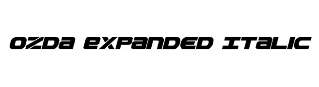
( Fonts by Daniel Zadorozny - www.iconian.com )
A bold, italicized, and expanded font with a futuristic and dynamic style.
 Herunterladen 900 Downloads@WebFont
 -
( Fonts by Daniel Zadorozny - www.iconian.com - Free for personal use )
A bold, italicized font with a futuristic and dynamic style.
![Starduster Italic Frei Schriftart Herunterladen]() Herunterladen 900 Downloads@WebFont
Herunterladen 900 Downloads@WebFont -
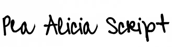
( Free for a personal use. For a commercial use please visit www.kevinandamanda.com )
A playful, handwritten script font with fluid, cursive strokes.
![Pea Alicia Script Frei Schriftart Herunterladen]() Herunterladen 900 Downloads@WebFont
Herunterladen 900 Downloads@WebFont -
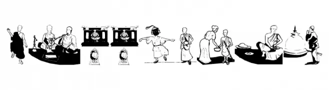
( Fonts by Manfred Klein. Free for private and charity use. Free for commercial with donation to organizations )
An illustrative, Buddhism-themed decorative font with pictorial glyphs.
![Buddhism Frei Schriftart Herunterladen]() Herunterladen 900 Downloads@WebFont
Herunterladen 900 Downloads@WebFont -
![IM FELL Great Primer Roman SC Frei Schriftart Herunterladen]() Herunterladen 900 Downloads@WebFont
Herunterladen 900 Downloads@WebFont -
![AsmatFont2007 Frei Schriftart Herunterladen]() Herunterladen 900 Downloads@WebFont
Herunterladen 900 Downloads@WebFont -
![avenue Regular Frei Schriftart Herunterladen]() Herunterladen 900 Downloads@WebFont
Herunterladen 900 Downloads@WebFont -
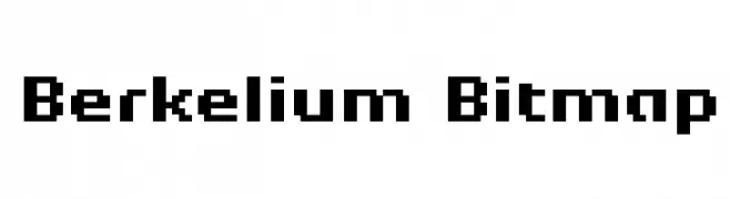
( Fonts by Kreative Korporation - www.kreativekorp.com )
A pixelated, retro-style font with a digital, blocky appearance.
![Berkelium Bitmap Frei Schriftart Herunterladen]() Herunterladen 900 Downloads@WebFont
Herunterladen 900 Downloads@WebFont -
![gurilpI Frei Schriftart Herunterladen]() Herunterladen 900 Downloads
Herunterladen 900 Downloads -
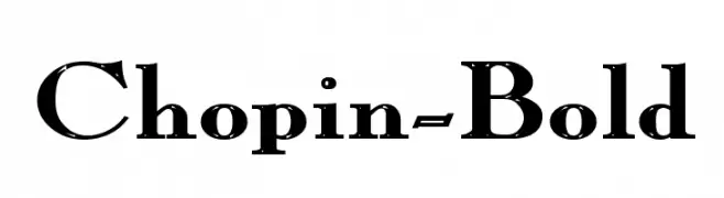
![Chopin-Bold Frei Schriftart Herunterladen]() Herunterladen 900 Downloads
Herunterladen 900 Downloads -
( Fonts by www.fugit-tempus.de )
A bold, angular font with a geometric and modern style.
![SwedieCruel Frei Schriftart Herunterladen]() Herunterladen 900 Downloads@WebFont
Herunterladen 900 Downloads@WebFont -
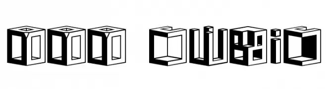
![DDD Cubic Frei Schriftart Herunterladen]() Herunterladen 900 Downloads@WebFont
Herunterladen 900 Downloads@WebFont -
( Fonts by Anton Chernogorov - Personal-use only. For commercial use please contact owner. )
A bold, condensed font with strong vertical emphasis and uniform width.
![Condensed Bold Frei Schriftart Herunterladen]() Herunterladen 899 Downloads@WebFont
Herunterladen 899 Downloads@WebFont -
( Fonts by Zetafonts - Personal-use only. For commercial use please contact owner. )
A bold, italicized font with a strong, modern presence.
![HeadingNow Trial 57 Extrabold Italic Frei Schriftart Herunterladen]() Herunterladen 899 Downloads@WebFont
Herunterladen 899 Downloads@WebFont -
( Fonts by Denny Subagja - Personal-use only. For commercial use please contact owner. )
A bold, brush-style script font with a dynamic, handwritten feel.
![Aprilia Frei Schriftart Herunterladen]() Herunterladen 899 Downloads@WebFont
Herunterladen 899 Downloads@WebFont -
( Fonts by Velvetyne )
A modern, geometric sans-serif font with clean lines and uniform strokes.
![Sporting Grotesque Frei Schriftart Herunterladen]() Herunterladen 899 Downloads@WebFont
Herunterladen 899 Downloads@WebFont -
( Fonts by Fikryal studio )
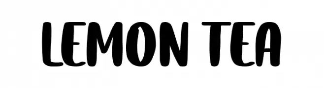
A bold, playful handwritten font with thick strokes and rounded edges.
![Lemon Tea Frei Schriftart Herunterladen]() Herunterladen 899 Downloads@WebFont
Herunterladen 899 Downloads@WebFont -
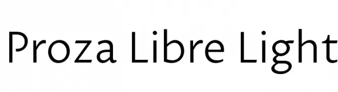
( Fonts by Jasper de Waard - Personal-use only. For commercial use please contact owner. )
A modern, light sans-serif font with excellent readability and balanced proportions.
![Proza Libre Light Frei Schriftart Herunterladen]() Herunterladen 899 Downloads@WebFont
Herunterladen 899 Downloads@WebFont -
( Zetafonts - www.zetafonts.com )
A bold, modern sans-serif font with clean lines and a strong presence.
![Body Grotesque Trial Bold Frei Schriftart Herunterladen]() Herunterladen 899 Downloads@WebFont
Herunterladen 899 Downloads@WebFont -
( Rachma BT - bit.ly/bonjourtype )
A dynamic and elegant script font with fluid, decorative letterforms.
![Siesta Frei Schriftart Herunterladen]() Herunterladen 899 Downloads@WebFont
Herunterladen 899 Downloads@WebFont -
( Marta Coronado - www.behance.net/martacoronadog )
A modern, rounded font with a clean and geometric design.
![Cona Regular Frei Schriftart Herunterladen]() Herunterladen 899 Downloads@WebFont
Herunterladen 899 Downloads@WebFont -
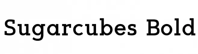
( Fonts by Kelvin Ma - letterpunch.blogspot.com - Personal-use only. For commercial use please contact owner. )
A bold, robust font with thick strokes and a strong presence.
![Sugarcubes Bold Frei Schriftart Herunterladen]() Herunterladen 899 Downloads@WebFont
Herunterladen 899 Downloads@WebFont -
( Fonts by Daniel Zadorozny - www.iconian.com )
A bold, dynamic 3D font with a slanted, energetic style.
![Hydro Squad 3D Frei Schriftart Herunterladen]() Herunterladen 899 Downloads@WebFont
Herunterladen 899 Downloads@WebFont -
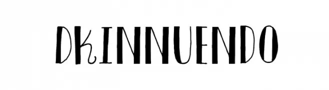
![DKInnuendo Frei Schriftart Herunterladen]() Herunterladen 899 Downloads@WebFont
Herunterladen 899 Downloads@WebFont -
( Fonts by Darcy Baldwin - darcybaldwin.com. Free for personal use only )
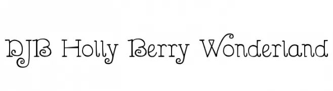
A whimsical, decorative font with playful curls and loops.
![DJB Holly Berry Wonderland Frei Schriftart Herunterladen]() Herunterladen 899 Downloads@WebFont
Herunterladen 899 Downloads@WebFont -
( Google Web Fonts )
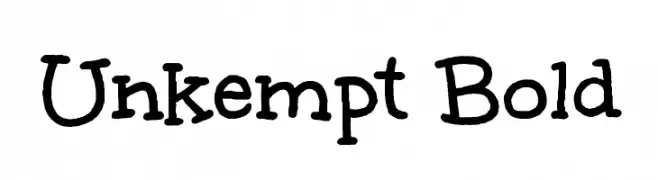
A playful, hand-drawn font with irregular, whimsical strokes.
![Unkempt Bold Frei Schriftart Herunterladen]() Herunterladen 899 Downloads@WebFont
Herunterladen 899 Downloads@WebFont -
( Free - www.pleine-page.fr )
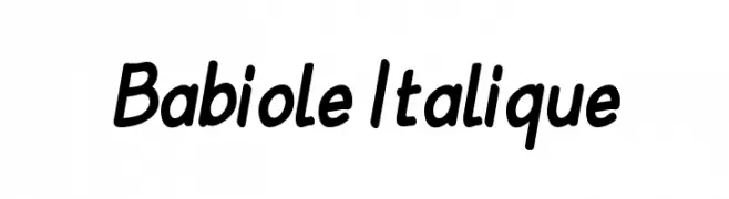
A playful, handwritten-style font with a casual, italicized appearance.
![Babiole Italique Frei Schriftart Herunterladen]() Herunterladen 899 Downloads@WebFont
Herunterladen 899 Downloads@WebFont -
( Fonts by Adult Ramblings - Anastacia E. Zittel - Personal-use only. For commercial use please contact owner. )
Hand-drawn clothing and accessory icons in a playful style.
![AEZ clothes Frei Schriftart Herunterladen]() Herunterladen 899 Downloads@WebFont
Herunterladen 899 Downloads@WebFont -
( Fonts by Abstract Type Design - Patrick Durr )
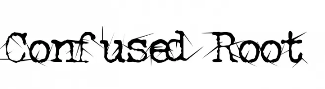
A chaotic, thorn-like decorative font with sharp, jagged embellishments.
![Confused Root Frei Schriftart Herunterladen]() Herunterladen 899 Downloads@WebFont
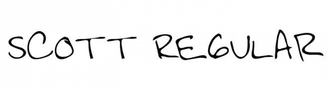
Herunterladen 899 Downloads@WebFont -
![Scott Regular Frei Schriftart Herunterladen]() Herunterladen 899 Downloads@WebFont
Herunterladen 899 Downloads@WebFont -
![DS BroadBrush Frei Schriftart Herunterladen]() Herunterladen 899 Downloads@WebFont
Herunterladen 899 Downloads@WebFont -
( Fonts by Pizzadude )
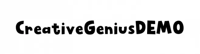
A playful, bold font with rounded, dynamic letters.
![Creative Genius DEMO Frei Schriftart Herunterladen]() Herunterladen 898 Downloads@WebFont
Herunterladen 898 Downloads@WebFont -
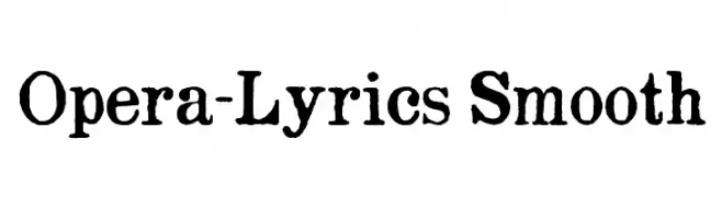
( Fonts by maltedMedia - Dennis Bathory-Kitsz - Personal-use only. For commercial use please contact owner. )
A bold, vintage-style font with a textured, distressed appearance.
![Opera-Lyrics Smooth Frei Schriftart Herunterladen]() Herunterladen 898 Downloads@WebFont
Herunterladen 898 Downloads@WebFont -
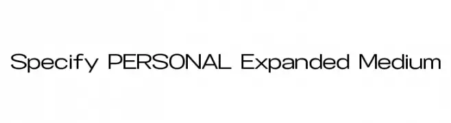
( Måns Grebäck - www.mansgreback.com )
A modern, expanded sans-serif font with a clean and professional appearance.
![Specify PERSONAL Expanded Medium Frei Schriftart Herunterladen]() Herunterladen 898 Downloads@WebFont
Herunterladen 898 Downloads@WebFont -
![Hartford Frei Schriftart Herunterladen]() Herunterladen 898 Downloads@WebFont
Herunterladen 898 Downloads@WebFont


Welche Schriften sind gerade am populärsten?
Poppins, Roboto, Montserrat, Open Sans und Lato sind wegen ihrer klaren Formen und breiten Einsetzbarkeit sehr gefragt – von Markenauftritt über Landingpages bis hin zu Postern.
Welche Fonts eignen sich für Logos?
Geometrische Sans‑Serifs (z. B. Poppins, Familien im Gotham‑Stil) sind ein häufiger Griff für sauberes, skalierbares Branding. Für eine persönlichere Note bleiben Scripts und Handschrift‑Stile beliebt. Kombinieren Sie einen prägnanten Headline‑Font mit einer neutralen Brotschrift für Wiedererkennung und Harmonie.
Wie oft wird die Top‑Liste aktualisiert?
Regelmäßig – basierend auf realen Downloads und Interaktionen. Schauen Sie öfter vorbei, um aufstrebende Favoriten früh zu entdecken.
💡 Tipp: Seite bookmarken – Trends wechseln schnell, und heutige Top‑Schriften inspirieren morgen vielleicht das Rebranding.