Willkommen bei den Top‑Schriften – hier treffen Beliebtheit und Qualität aufeinander. Das sind die in diesem Jahr am häufigsten heruntergeladenen und genutzten Fonts. Wenn Sie sichere Optionen für Logo, Web oder Social suchen, starten Sie hier.
Jeder Top‑Font überzeugt durch Balance, Lesbarkeit und Vielseitigkeit. Sie finden moderne Sans‑Serifs, elegante Scripts, Vintage‑Serifs und minimalistische Displays.
-
( Fonts by Daniel Zadorozny - www.iconian.com )
A bold, angular, and slightly italicized font with a futuristic and dynamic style.
 Herunterladen 211 Downloads@WebFont
 -
![Common Tongue Frei Schriftart Herunterladen]() Herunterladen 211 Downloads
Herunterladen 211 Downloads -
( Woodcutter - woodcutter Manero - www.woodcutter.es )
A decorative dingbat font of bold sea life silhouettes.
![Sea Life Frei Schriftart Herunterladen]() Herunterladen 211 Downloads@WebFont
Herunterladen 211 Downloads@WebFont -
( Fonts by Manfred Klein. Free for private and charity use. Free for commercial with donation to organizations )
A bold, gothic-style Blackletter font with intricate detailing.
![DirtyThinkwitz Frei Schriftart Herunterladen]() Herunterladen 211 Downloads@WebFont
Herunterladen 211 Downloads@WebFont -
![Ding Rooster Frei Schriftart Herunterladen]() Herunterladen 211 Downloads@WebFont
Herunterladen 211 Downloads@WebFont -
-
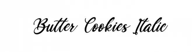
( Fonts by Kong Font - https://fontkong.com/ - Personal-use only. For commercial use please contact owner. )
An elegant, flowing script font with an italic slant and interconnected characters.
![Butter Cookies Italic Frei Schriftart Herunterladen]() Herunterladen 211 Downloads@WebFont
Herunterladen 211 Downloads@WebFont -
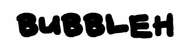
![BUBBLEH Frei Schriftart Herunterladen]() Herunterladen 211 Downloads@WebFont
Herunterladen 211 Downloads@WebFont -
( Fonts by twinletter )
A bold, hand-drawn font with a rugged, graffiti-inspired aesthetic.
![Jacbos Personal Use Frei Schriftart Herunterladen]() Herunterladen 211 Downloads@WebFont
Herunterladen 211 Downloads@WebFont -
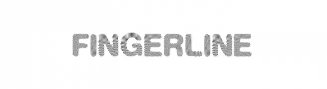
( Fonts by Rulihoki Studio )
A bold, modern font with diagonal line textures for a dynamic look.
![Finger Line Frei Schriftart Herunterladen]() Herunterladen 211 Downloads@WebFont
Herunterladen 211 Downloads@WebFont -
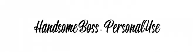
![Handsome Boss - Personal Use Frei Schriftart Herunterladen]() Herunterladen 211 Downloads@WebFont
Herunterladen 211 Downloads@WebFont


Welche Schriften sind gerade am populärsten?
Poppins, Roboto, Montserrat, Open Sans und Lato sind wegen ihrer klaren Formen und breiten Einsetzbarkeit sehr gefragt – von Markenauftritt über Landingpages bis hin zu Postern.
Welche Fonts eignen sich für Logos?
Geometrische Sans‑Serifs (z. B. Poppins, Familien im Gotham‑Stil) sind ein häufiger Griff für sauberes, skalierbares Branding. Für eine persönlichere Note bleiben Scripts und Handschrift‑Stile beliebt. Kombinieren Sie einen prägnanten Headline‑Font mit einer neutralen Brotschrift für Wiedererkennung und Harmonie.
Wie oft wird die Top‑Liste aktualisiert?
Regelmäßig – basierend auf realen Downloads und Interaktionen. Schauen Sie öfter vorbei, um aufstrebende Favoriten früh zu entdecken.
💡 Tipp: Seite bookmarken – Trends wechseln schnell, und heutige Top‑Schriften inspirieren morgen vielleicht das Rebranding.