Willkommen bei den Top‑Schriften – hier treffen Beliebtheit und Qualität aufeinander. Das sind die in diesem Jahr am häufigsten heruntergeladenen und genutzten Fonts. Wenn Sie sichere Optionen für Logo, Web oder Social suchen, starten Sie hier.
Jeder Top‑Font überzeugt durch Balance, Lesbarkeit und Vielseitigkeit. Sie finden moderne Sans‑Serifs, elegante Scripts, Vintage‑Serifs und minimalistische Displays.
-
 Herunterladen 891 Downloads@WebFont
 -
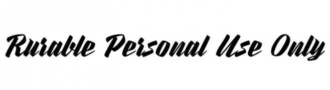
( Fonts by Jonathan Harris - www.tattoowoo.com )
A bold, expressive brush-style font with dynamic, hand-painted strokes.
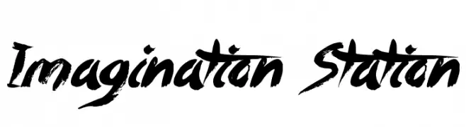
![Imagination Station Frei Schriftart Herunterladen]() Herunterladen 891 Downloads@WebFont
Herunterladen 891 Downloads@WebFont -
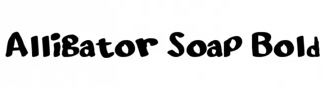
![Alligator Soap Bold Frei Schriftart Herunterladen]() Herunterladen 891 Downloads@WebFont
Herunterladen 891 Downloads@WebFont -
( Copyright (c) 2011 by Anna GiedryÅ› (http://ancymonic.com) )
A modern, light sans-serif font with excellent legibility and minimal contrast.
![SignikaNegative-Light Frei Schriftart Herunterladen]() Herunterladen 891 Downloads@WebFont
Herunterladen 891 Downloads@WebFont -
( Fonts by a Nick Polyarush - alteran-x.deviantart.com . Personal-use only. For commercial use please contact owner. )
An intricate and decorative font with geometric and mystical designs.
![Vulcan Script Frei Schriftart Herunterladen]() Herunterladen 891 Downloads@WebFont
Herunterladen 891 Downloads@WebFont -
![rilakkumadingbat-Bold Frei Schriftart Herunterladen]() Herunterladen 891 Downloads@WebFont
Herunterladen 891 Downloads@WebFont -
![BF Mnemonika Regular Regular Frei Schriftart Herunterladen]() Herunterladen 891 Downloads@WebFont
Herunterladen 891 Downloads@WebFont -
![Moderno Frei Schriftart Herunterladen]() Herunterladen 891 Downloads@WebFont
Herunterladen 891 Downloads@WebFont -
![A Drink For All Ages Frei Schriftart Herunterladen]() Herunterladen 891 Downloads@WebFont
Herunterladen 891 Downloads@WebFont -
![Anywhere Frei Schriftart Herunterladen]() Herunterladen 891 Downloads@WebFont
Herunterladen 891 Downloads@WebFont -
( Fonts by Daniel Zadorozny - www.iconian.com - Free for personal use )
A modern, geometric font with clean lines and a versatile style.
![Eco-Files Frei Schriftart Herunterladen]() Herunterladen 891 Downloads@WebFont
Herunterladen 891 Downloads@WebFont -
( Fonts by Uddi Uddi )
A playful, bubbly font with rounded edges and quirky cutouts.
![Larson Frei Schriftart Herunterladen]() Herunterladen 891 Downloads@WebFont
Herunterladen 891 Downloads@WebFont -
( Fonts by Nick Curtis - www.nicksfonts.com )
A classic serif font with elegant proportions and balanced stroke contrast.
![ChanticleerRoman Frei Schriftart Herunterladen]() Herunterladen 891 Downloads
Herunterladen 891 Downloads -
( Fonts by allsuperfont.com - Personal-use only. For commercial use please contact owner. )
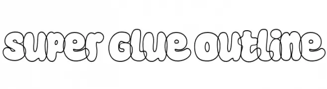
A playful, bold outline font with bubble-like, rounded shapes.
![Super Glue Outline Frei Schriftart Herunterladen]() Herunterladen 890 Downloads@WebFont
Herunterladen 890 Downloads@WebFont -
( Fonts by Khurasan )
A bold, playful handwritten font with rounded edges and a dynamic slant.
![Skincake Frei Schriftart Herunterladen]() Herunterladen 890 Downloads@WebFont
Herunterladen 890 Downloads@WebFont -
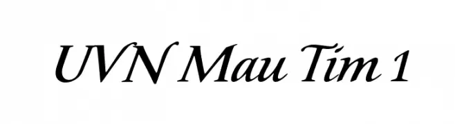
![UVN Mau Tim 1 Frei Schriftart Herunterladen]() Herunterladen 890 Downloads@WebFont
Herunterladen 890 Downloads@WebFont -
( deFharo - Fernando Haro - defharo.com )
A bold, modern font with strong, thick strokes and a slightly condensed style.
![Octagen Black Black Frei Schriftart Herunterladen]() Herunterladen 890 Downloads@WebFont
Herunterladen 890 Downloads@WebFont -
( Sabrtype - creativemarket.com/Sabrtype )
A bold, dynamic script font with elegant, flowing letterforms.
![Andallan Frei Schriftart Herunterladen]() Herunterladen 890 Downloads@WebFont
Herunterladen 890 Downloads@WebFont -
( Jp - João Pedro Castro )
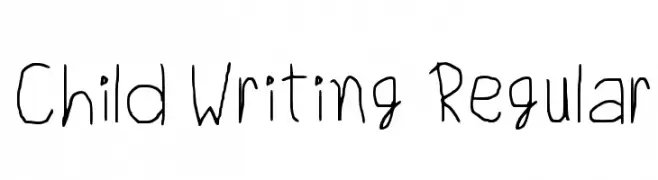
A playful, child-like handwritten font with thin, irregular strokes.
![Child Writing Regular Frei Schriftart Herunterladen]() Herunterladen 890 Downloads@WebFont
Herunterladen 890 Downloads@WebFont -
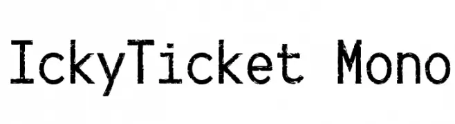
![IckyTicket Mono Frei Schriftart Herunterladen]() Herunterladen 890 Downloads@WebFont
Herunterladen 890 Downloads@WebFont -
( Fonts by www.studiotypo.com - Personal-use only. For commercial use please contact owner. )
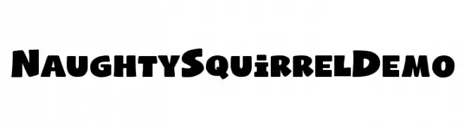
A playful, bold, and chunky font with a whimsical style.
![Naughty Squirrel Demo Frei Schriftart Herunterladen]() Herunterladen 890 Downloads@WebFont
Herunterladen 890 Downloads@WebFont -
( Fonts by rolandhuse.com - Runes & Fonts - Personal-use only. For commercial use please contact owner. )
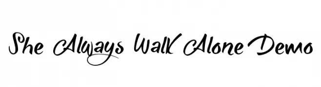
A dynamic and elegant script font with flowing, ornate letterforms.
![She Always Walk Alone Demo Frei Schriftart Herunterladen]() Herunterladen 890 Downloads@WebFont
Herunterladen 890 Downloads@WebFont -
( Fonts by Castcraft Software - OPTI Fonts Archive - opti.netii.net - Personal-use only. For commercial use please contact owner. )
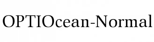
A classic serif font with high contrast and elegant strokes.
![OPTIOcean-Normal Frei Schriftart Herunterladen]() Herunterladen 890 Downloads@WebFont
Herunterladen 890 Downloads@WebFont -
Schriftart von defharo. For commercial use please contact the owner.
![Bastardilla Frei Schriftart Herunterladen]() Herunterladen 890 Downloads@WebFont
Herunterladen 890 Downloads@WebFont -
![blacksabbath70 Frei Schriftart Herunterladen]() Herunterladen 890 Downloads@WebFont
Herunterladen 890 Downloads@WebFont -
( Free - www.pleine-page.fr )
A playful, rounded font with smooth curves and a friendly appearance.
![Babiole Light Frei Schriftart Herunterladen]() Herunterladen 890 Downloads@WebFont
Herunterladen 890 Downloads@WebFont -
![NFL Varsity Block F Frei Schriftart Herunterladen]() Herunterladen 890 Downloads@WebFont
Herunterladen 890 Downloads@WebFont -
![AEZ executive hearts Frei Schriftart Herunterladen]() Herunterladen 890 Downloads@WebFont
Herunterladen 890 Downloads@WebFont -
![TratexSvart Frei Schriftart Herunterladen]() Herunterladen 890 Downloads@WebFont
Herunterladen 890 Downloads@WebFont -
( Fonts by The Scriptorium - Dave Nalle )
A bold, medieval-inspired font with sharp, angular lines and intricate serifs.
![Stonecross Frei Schriftart Herunterladen]() Herunterladen 890 Downloads@WebFont
Herunterladen 890 Downloads@WebFont -
![Capitalist Frei Schriftart Herunterladen]() Herunterladen 890 Downloads@WebFont
Herunterladen 890 Downloads@WebFont -
![SoulMission Frei Schriftart Herunterladen]() Herunterladen 890 Downloads@WebFont
Herunterladen 890 Downloads@WebFont -
![Distant Galaxy Italic Frei Schriftart Herunterladen]() Herunterladen 890 Downloads@WebFont
Herunterladen 890 Downloads@WebFont -
( Fonts by Omega Font Labs )
A whimsical, playful font with uneven, hand-drawn letterforms.
![Space Woozies Frei Schriftart Herunterladen]() Herunterladen 890 Downloads@WebFont
Herunterladen 890 Downloads@WebFont -
![SuperHawgA Frei Schriftart Herunterladen]() Herunterladen 890 Downloads@WebFont
Herunterladen 890 Downloads@WebFont


Welche Schriften sind gerade am populärsten?
Poppins, Roboto, Montserrat, Open Sans und Lato sind wegen ihrer klaren Formen und breiten Einsetzbarkeit sehr gefragt – von Markenauftritt über Landingpages bis hin zu Postern.
Welche Fonts eignen sich für Logos?
Geometrische Sans‑Serifs (z. B. Poppins, Familien im Gotham‑Stil) sind ein häufiger Griff für sauberes, skalierbares Branding. Für eine persönlichere Note bleiben Scripts und Handschrift‑Stile beliebt. Kombinieren Sie einen prägnanten Headline‑Font mit einer neutralen Brotschrift für Wiedererkennung und Harmonie.
Wie oft wird die Top‑Liste aktualisiert?
Regelmäßig – basierend auf realen Downloads und Interaktionen. Schauen Sie öfter vorbei, um aufstrebende Favoriten früh zu entdecken.
💡 Tipp: Seite bookmarken – Trends wechseln schnell, und heutige Top‑Schriften inspirieren morgen vielleicht das Rebranding.