Willkommen bei den Top‑Schriften – hier treffen Beliebtheit und Qualität aufeinander. Das sind die in diesem Jahr am häufigsten heruntergeladenen und genutzten Fonts. Wenn Sie sichere Optionen für Logo, Web oder Social suchen, starten Sie hier.
Jeder Top‑Font überzeugt durch Balance, Lesbarkeit und Vielseitigkeit. Sie finden moderne Sans‑Serifs, elegante Scripts, Vintage‑Serifs und minimalistische Displays.
-
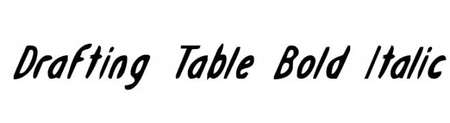
( Fonts by Daniel Zadorozny - www.iconian.com )
A bold, italicized font with dynamic and fluid strokes.
 Herunterladen 210 Downloads@WebFont
 -
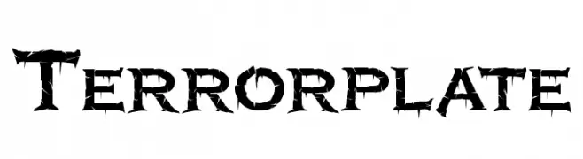
( Sein_sk8 - Juan Rubio - www.behance.net/sein )
A bold, thorn-like font with sharp, jagged edges, perfect for horror themes.
![Terrorplate Frei Schriftart Herunterladen]() Herunterladen 210 Downloads@WebFont
Herunterladen 210 Downloads@WebFont -
![RansomThreat Frei Schriftart Herunterladen]() Herunterladen 210 Downloads@WebFont
Herunterladen 210 Downloads@WebFont -
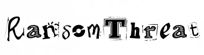
( Fonts by Lee Batchelor http://leeviathan.com/portfolio/fonts/ )
A playful, casual handwritten font with smooth, flowing lines.
![PopcornMountain-Std Frei Schriftart Herunterladen]() Herunterladen 210 Downloads@WebFont
Herunterladen 210 Downloads@WebFont -
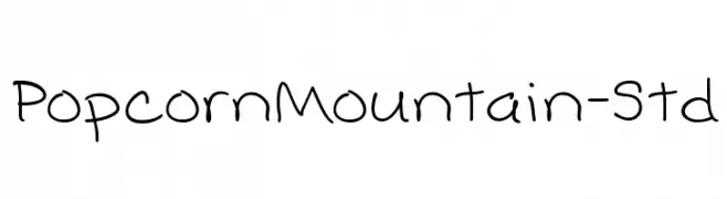
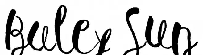
( Fonts by Leonard Posavec )
A whimsical and artistic handwritten font with fluid, dynamic strokes.
![Baley Sun Frei Schriftart Herunterladen]() Herunterladen 210 Downloads@WebFont
Herunterladen 210 Downloads@WebFont -
-
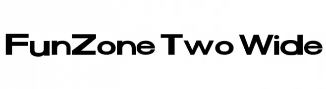
( Fonts by Dan P. Lyons - Personal-use only. For commercial use please contact owner. )
A bold, modern font with wide, uniform characters.
![FunZone Two Wide Frei Schriftart Herunterladen]() Herunterladen 210 Downloads@WebFont
Herunterladen 210 Downloads@WebFont -
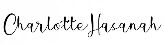
( Fonts by Situjuh Nazara - 7ntypes.com - Personal-use only. For commercial use please contact owner. )
An elegant, flowing script font with a handwritten style.
![Charlotte Hasanah Frei Schriftart Herunterladen]() Herunterladen 210 Downloads@WebFont
Herunterladen 210 Downloads@WebFont -
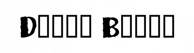
( Font by Berry Brooks - Fontocide )
A bold, hand-drawn font with an expressive and dynamic style.
![Dizzy Bitch Frei Schriftart Herunterladen]() Herunterladen 210 Downloads@WebFont
Herunterladen 210 Downloads@WebFont -
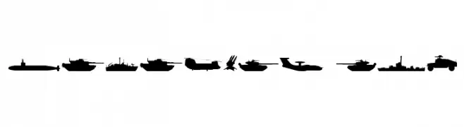
( Fonts by Daniel Zadorozny - www.iconian.com - Free for personal use )
Military-themed dingbat font with vehicle and equipment silhouettes.
![Military RPG Frei Schriftart Herunterladen]() Herunterladen 210 Downloads@WebFont
Herunterladen 210 Downloads@WebFont -
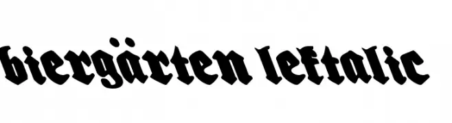
( Fonts by Daniel Zadorozny - www.iconian.com - Free for personal use )
A bold, blackletter-inspired font with a gothic and medieval flair.
![Biergärten Leftalic Frei Schriftart Herunterladen]() Herunterladen 210 Downloads@WebFont
Herunterladen 210 Downloads@WebFont
Welche Schriften sind gerade am populärsten?
Poppins, Roboto, Montserrat, Open Sans und Lato sind wegen ihrer klaren Formen und breiten Einsetzbarkeit sehr gefragt – von Markenauftritt über Landingpages bis hin zu Postern.
Welche Fonts eignen sich für Logos?
Geometrische Sans‑Serifs (z. B. Poppins, Familien im Gotham‑Stil) sind ein häufiger Griff für sauberes, skalierbares Branding. Für eine persönlichere Note bleiben Scripts und Handschrift‑Stile beliebt. Kombinieren Sie einen prägnanten Headline‑Font mit einer neutralen Brotschrift für Wiedererkennung und Harmonie.
Wie oft wird die Top‑Liste aktualisiert?
Regelmäßig – basierend auf realen Downloads und Interaktionen. Schauen Sie öfter vorbei, um aufstrebende Favoriten früh zu entdecken.
💡 Tipp: Seite bookmarken – Trends wechseln schnell, und heutige Top‑Schriften inspirieren morgen vielleicht das Rebranding.