Willkommen bei den Top‑Schriften – hier treffen Beliebtheit und Qualität aufeinander. Das sind die in diesem Jahr am häufigsten heruntergeladenen und genutzten Fonts. Wenn Sie sichere Optionen für Logo, Web oder Social suchen, starten Sie hier.
Jeder Top‑Font überzeugt durch Balance, Lesbarkeit und Vielseitigkeit. Sie finden moderne Sans‑Serifs, elegante Scripts, Vintage‑Serifs und minimalistische Displays.
-
 Herunterladen 882 Downloads@WebFont
 -
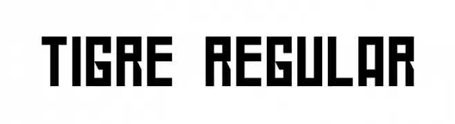
( Fonts by www.typodermicfonts.com - Ray Larabie )
A bold, condensed, and modern geometric font with high legibility.
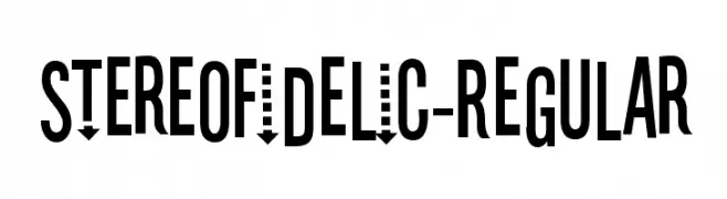
![Stereofidelic-Regular Frei Schriftart Herunterladen]() Herunterladen 882 Downloads@WebFont
Herunterladen 882 Downloads@WebFont -
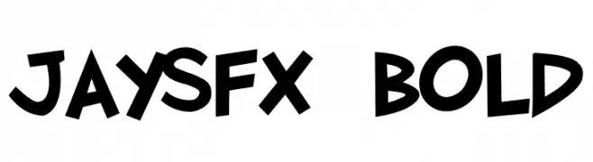
( Fonts by Jason Arthur - JibbaJabba Fonts - www.myspace.com/jasonarthurloaded )
A bold, playful font with a dynamic and energetic style.
![JaySFX Bold Frei Schriftart Herunterladen]() Herunterladen 882 Downloads@WebFont
Herunterladen 882 Downloads@WebFont -
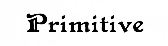
( Fonts by Manfred Klein. Free for private and charity use. Free for commercial with donation to organizations )
A bold, classic serif font with thick strokes and elegant curves.
![Cock-Bold Frei Schriftart Herunterladen]() Herunterladen 882 Downloads@WebFont
Herunterladen 882 Downloads@WebFont -
( Fonts by Rick Mueller )
A bold, decorative font with medieval influences and intricate serifs.
![Primitive Frei Schriftart Herunterladen]() Herunterladen 882 Downloads@WebFont
Herunterladen 882 Downloads@WebFont -
( Fonts by Apostrophic Lab )
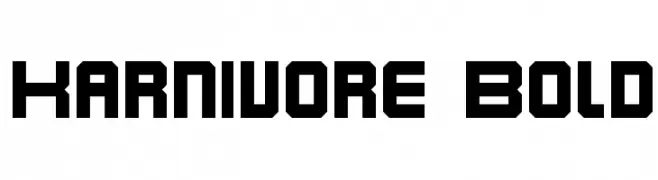
A bold, geometric font with angular, blocky letters.
![Karnivore Bold Frei Schriftart Herunterladen]() Herunterladen 882 Downloads@WebFont
Herunterladen 882 Downloads@WebFont -
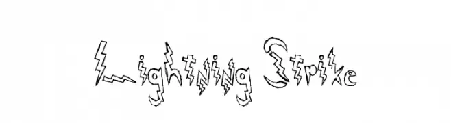
![Lightning Strike Frei Schriftart Herunterladen]() Herunterladen 882 Downloads@WebFont
Herunterladen 882 Downloads@WebFont -
![BD Alm Frei Schriftart Herunterladen]() Herunterladen 882 Downloads@WebFont
Herunterladen 882 Downloads@WebFont -
( Fonts by Daniel Zadorozny - www.iconian.com - Free for personal use )
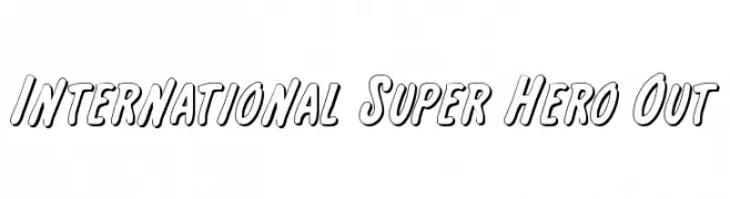
A bold, outlined font with a playful, comic book style.
![International Super Hero Out Frei Schriftart Herunterladen]() Herunterladen 882 Downloads@WebFont
Herunterladen 882 Downloads@WebFont -
( Fonts by Original fonts by Vernon Adams / Changes by Cristiano Sobral - Personal-use only. For commercial use please contact owner. )
A modern, clean sans-serif font with uniform stroke width and excellent readability.
![Winston Medium Frei Schriftart Herunterladen]() Herunterladen 881 Downloads@WebFont
Herunterladen 881 Downloads@WebFont -
( Fonts by Hanoded )
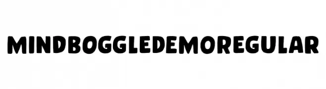
A bold, playful font with rounded, hand-drawn characters and unique textured symbols.
![Mind Boggle DEMO Regular Frei Schriftart Herunterladen]() Herunterladen 881 Downloads@WebFont
Herunterladen 881 Downloads@WebFont -
( Fonts by Octotype - www.foundmyfont.com - Personal-use only. For commercial use please contact owner. )
An elegant script font with flowing, decorative strokes.
![Melancholight Frei Schriftart Herunterladen]() Herunterladen 881 Downloads@WebFont
Herunterladen 881 Downloads@WebFont -
![Nordica Classic Ultra Light Extended Frei Schriftart Herunterladen]() Herunterladen 881 Downloads@WebFont
Herunterladen 881 Downloads@WebFont -
( Fonts by a Jayvee Enaguas - harvettfox96.deviantart.com. Personal-use only. For commercial use please contact owner. )
A bold, geometric font with a modern, digital aesthetic.
![Sadana Square Frei Schriftart Herunterladen]() Herunterladen 881 Downloads@WebFont
Herunterladen 881 Downloads@WebFont -
![Roboto Slab Thin Frei Schriftart Herunterladen]() Herunterladen 881 Downloads@WebFont
Herunterladen 881 Downloads@WebFont -
![MTV Lowercase 1 Frei Schriftart Herunterladen]() Herunterladen 881 Downloads@WebFont
Herunterladen 881 Downloads@WebFont -
( Fonts by Deepak Dogra )
A playful handwritten font with tall, narrow letterforms and a casual style.
![Liniga Frei Schriftart Herunterladen]() Herunterladen 881 Downloads@WebFont
Herunterladen 881 Downloads@WebFont -
( Fonts by Castcraft Software - opti.netii.net - check the website before use )
A classic calligraphic font with elegant, flowing strokes and refined serifs.
![AuthorCalligraphyOpti-Regular Frei Schriftart Herunterladen]() Herunterladen 881 Downloads@WebFont
Herunterladen 881 Downloads@WebFont -
![KARATE Frei Schriftart Herunterladen]() Herunterladen 881 Downloads@WebFont
Herunterladen 881 Downloads@WebFont -
![accessories Frei Schriftart Herunterladen]() Herunterladen 881 Downloads@WebFont
Herunterladen 881 Downloads@WebFont -
![Shebrew Medium Frei Schriftart Herunterladen]() Herunterladen 881 Downloads@WebFont
Herunterladen 881 Downloads@WebFont -
( Fonts by Dieter Steffmann )
A festive, decorative font with Easter-themed elements and bold styling.
![Happy Easter Frei Schriftart Herunterladen]() Herunterladen 881 Downloads@WebFont
Herunterladen 881 Downloads@WebFont -
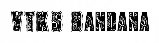
( Fonts by Douglas Vitkauskas - www.vtksdesign.com. Personal-use only. For commercial use please contact owner. )
A bold, decorative font with intricate bandana-inspired patterns.
![VTKS Bandana Frei Schriftart Herunterladen]() Herunterladen 881 Downloads@WebFont
Herunterladen 881 Downloads@WebFont -
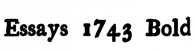
![Essays 1743 Bold Frei Schriftart Herunterladen]() Herunterladen 881 Downloads@WebFont
Herunterladen 881 Downloads@WebFont -
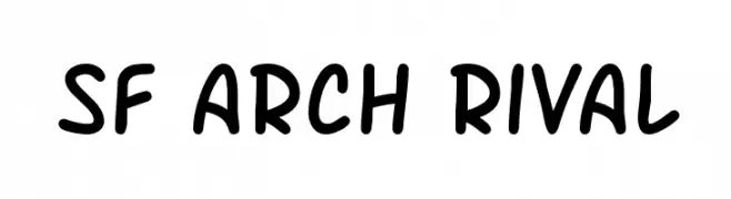
( Fonts by ShyFonts )
A playful, hand-drawn font with rounded, bold characters.
![SF Arch Rival Frei Schriftart Herunterladen]() Herunterladen 881 Downloads@WebFont
Herunterladen 881 Downloads@WebFont -
( Fonts by Jonathan Paterson )
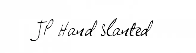
A dynamic, slanted handwritten font with fluid strokes and a personal touch.
![JP Hand Slanted Frei Schriftart Herunterladen]() Herunterladen 881 Downloads@WebFont
Herunterladen 881 Downloads@WebFont -
( Fonts by Daniel Zadorozny - www.iconian.com - Free for personal use )
A bold, decorative font with a gradient effect and horizontal stripe pattern.
![U.S.A. Gradient Frei Schriftart Herunterladen]() Herunterladen 881 Downloads@WebFont
Herunterladen 881 Downloads@WebFont -
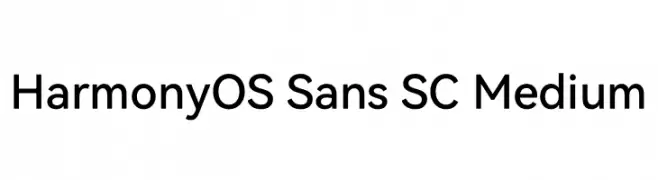
( Fonts by huawei.com - Personal-use only. For commercial use please contact owner. )
A modern, geometric sans-serif font with balanced proportions and clear readability.
![HarmonyOS Sans SC Medium Frei Schriftart Herunterladen]() Herunterladen 880 Downloads@WebFont
Herunterladen 880 Downloads@WebFont -
( Fonts by Lafontype - Anugrah Pasau - Personal-use only. For commercial use please contact owner. )
A bold, modern sans-serif font with clean lines and strong presence.
![Cedora-Bold Frei Schriftart Herunterladen]() Herunterladen 880 Downloads@WebFont
Herunterladen 880 Downloads@WebFont -
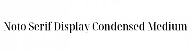
( Noto is a trademark of Google Inc. Noto fonts are open source. All Noto fonts are published under the SIL Open Font License, Version 1.1 )
A modern, condensed serif font with medium weight and elegant serifs.
![Noto Serif Display Condensed Medium Frei Schriftart Herunterladen]() Herunterladen 880 Downloads@WebFont
Herunterladen 880 Downloads@WebFont -
( Fonts by Cristiano Sobral - Personal-use only. For commercial use please contact owner. )
A bold, italic, modern sans-serif font with a clean and dynamic style.
![Argentum Sans Bold Italic Frei Schriftart Herunterladen]() Herunterladen 880 Downloads@WebFont
Herunterladen 880 Downloads@WebFont -
( Fonts by Billy Argel - www.billyargel.com - Personal-use only. For commercial use please contact owner. )
A bold, cursive font with a flowing, handwritten style and high contrast.
![Reminiscent Drive Personal Use Frei Schriftart Herunterladen]() Herunterladen 880 Downloads@WebFont
Herunterladen 880 Downloads@WebFont -
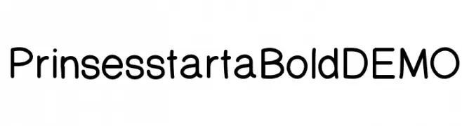
( Fonts by Shara Weber )
A modern, rounded sans-serif font with excellent readability.
![PrinsesstartaBoldDEMO Frei Schriftart Herunterladen]() Herunterladen 880 Downloads@WebFont
Herunterladen 880 Downloads@WebFont -
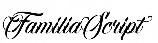
![FamiliaScript Frei Schriftart Herunterladen]() Herunterladen 880 Downloads@WebFont
Herunterladen 880 Downloads@WebFont -
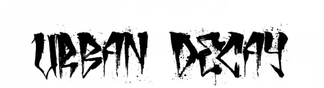
![urban decay Frei Schriftart Herunterladen]() Herunterladen 880 Downloads@WebFont
Herunterladen 880 Downloads@WebFont


Welche Schriften sind gerade am populärsten?
Poppins, Roboto, Montserrat, Open Sans und Lato sind wegen ihrer klaren Formen und breiten Einsetzbarkeit sehr gefragt – von Markenauftritt über Landingpages bis hin zu Postern.
Welche Fonts eignen sich für Logos?
Geometrische Sans‑Serifs (z. B. Poppins, Familien im Gotham‑Stil) sind ein häufiger Griff für sauberes, skalierbares Branding. Für eine persönlichere Note bleiben Scripts und Handschrift‑Stile beliebt. Kombinieren Sie einen prägnanten Headline‑Font mit einer neutralen Brotschrift für Wiedererkennung und Harmonie.
Wie oft wird die Top‑Liste aktualisiert?
Regelmäßig – basierend auf realen Downloads und Interaktionen. Schauen Sie öfter vorbei, um aufstrebende Favoriten früh zu entdecken.
💡 Tipp: Seite bookmarken – Trends wechseln schnell, und heutige Top‑Schriften inspirieren morgen vielleicht das Rebranding.