Willkommen bei den Top‑Schriften – hier treffen Beliebtheit und Qualität aufeinander. Das sind die in diesem Jahr am häufigsten heruntergeladenen und genutzten Fonts. Wenn Sie sichere Optionen für Logo, Web oder Social suchen, starten Sie hier.
Jeder Top‑Font überzeugt durch Balance, Lesbarkeit und Vielseitigkeit. Sie finden moderne Sans‑Serifs, elegante Scripts, Vintage‑Serifs und minimalistische Displays.
-
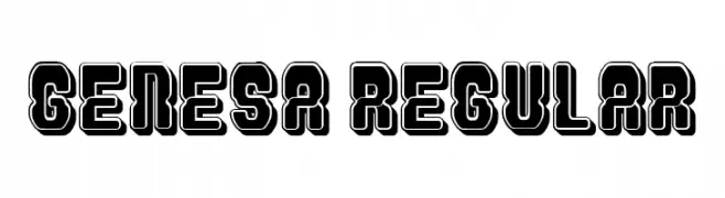
( Fonts by Vladimir Nikolic - www.creativefabrica.com/designer/vladimirnikolic/ - Personal-use only. For commercial use please contact owner. )
A bold, geometric font with a three-dimensional, retro-futuristic style.
 Herunterladen 204 Downloads@WebFont
 -
( Fonts by yomeiko - Personal-use only. For commercial use please contact owner. )
A playful, hand-drawn font with rounded, smooth strokes and a whimsical style.
![Milky Regular Frei Schriftart Herunterladen]() Herunterladen 204 Downloads@WebFont
Herunterladen 204 Downloads@WebFont -
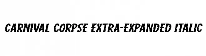
( Fonts by Iconian Fonts )
A bold, distressed, and extra-expanded italic font with a grunge aesthetic.
![Carnival Corpse Extra-Expanded Italic Frei Schriftart Herunterladen]() Herunterladen 204 Downloads@WebFont
Herunterladen 204 Downloads@WebFont -
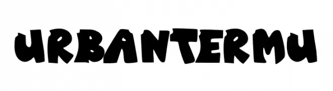
( Fonts by Muhammad Yafinuha )
A bold, playful font with a graffiti-like, hand-drawn aesthetic.
![Urban Termu Frei Schriftart Herunterladen]() Herunterladen 204 Downloads@WebFont
Herunterladen 204 Downloads@WebFont -
![Mystic Etchings Normal Frei Schriftart Herunterladen]() Herunterladen 204 Downloads
Herunterladen 204 Downloads -
-
![tudy1311 Frei Schriftart Herunterladen]() Herunterladen 204 Downloads@WebFont
Herunterladen 204 Downloads@WebFont -
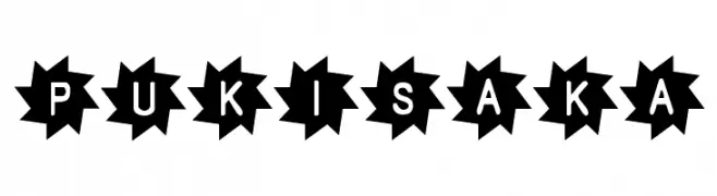
![Pukisaka Frei Schriftart Herunterladen]() Herunterladen 204 Downloads@WebFont
Herunterladen 204 Downloads@WebFont -
( Fonts by Manfred Klein Fonteria )
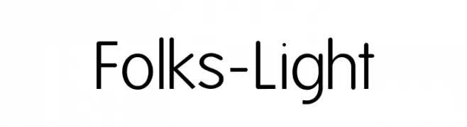
A clean, modern sans-serif font with a light weight and balanced spacing.
![Folks-Light Frei Schriftart Herunterladen]() Herunterladen 204 Downloads@WebFont
Herunterladen 204 Downloads@WebFont -
( Fonts by Iconian Fonts )
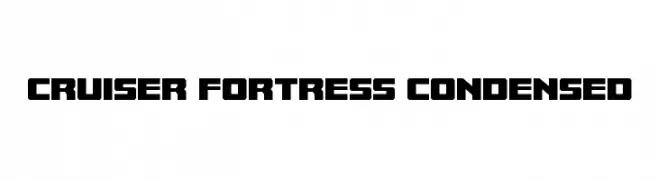
A bold, geometric font with a modern, industrial style.
![Cruiser Fortress Condensed Frei Schriftart Herunterladen]() Herunterladen 204 Downloads@WebFont
Herunterladen 204 Downloads@WebFont -
( Vladimir Nikolic - www.coroflot.com/vladimirnikolic )
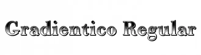
A bold, decorative font with a unique gradient effect and intricate detailing.
![Gradientico Regular Frei Schriftart Herunterladen]() Herunterladen 204 Downloads@WebFont
Herunterladen 204 Downloads@WebFont


Welche Schriften sind gerade am populärsten?
Poppins, Roboto, Montserrat, Open Sans und Lato sind wegen ihrer klaren Formen und breiten Einsetzbarkeit sehr gefragt – von Markenauftritt über Landingpages bis hin zu Postern.
Welche Fonts eignen sich für Logos?
Geometrische Sans‑Serifs (z. B. Poppins, Familien im Gotham‑Stil) sind ein häufiger Griff für sauberes, skalierbares Branding. Für eine persönlichere Note bleiben Scripts und Handschrift‑Stile beliebt. Kombinieren Sie einen prägnanten Headline‑Font mit einer neutralen Brotschrift für Wiedererkennung und Harmonie.
Wie oft wird die Top‑Liste aktualisiert?
Regelmäßig – basierend auf realen Downloads und Interaktionen. Schauen Sie öfter vorbei, um aufstrebende Favoriten früh zu entdecken.
💡 Tipp: Seite bookmarken – Trends wechseln schnell, und heutige Top‑Schriften inspirieren morgen vielleicht das Rebranding.